


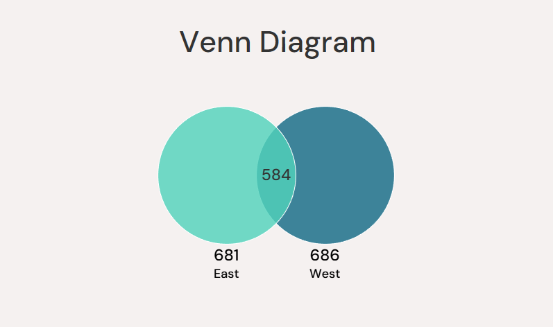
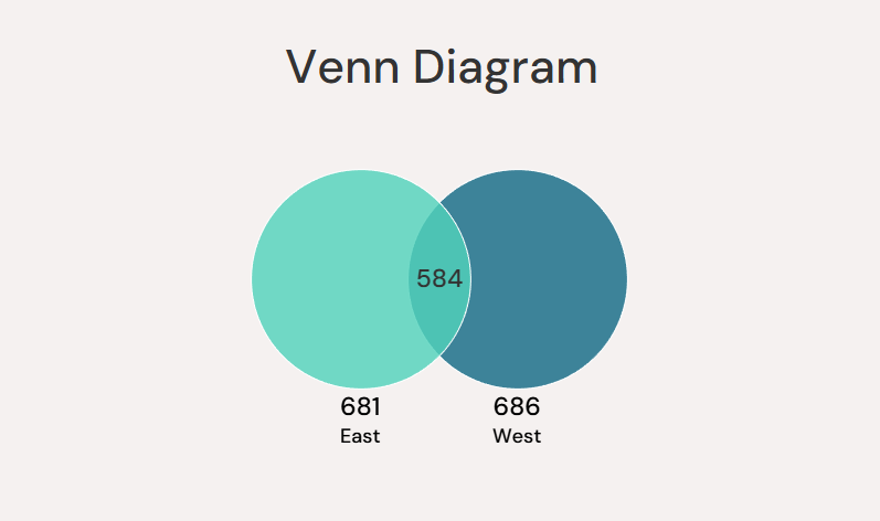
If you want to display the overlap between two distinct metric, a Venn Diagram is an obvious choice. However, Tableau does not natively allow for the construction of these. In this blog, I will walk you through how to create one. I'll be using the Superstore Sales dataset to make a Venn Diagram that visualizes the number of customers in the East region, the West region, and in both. This is the final product:
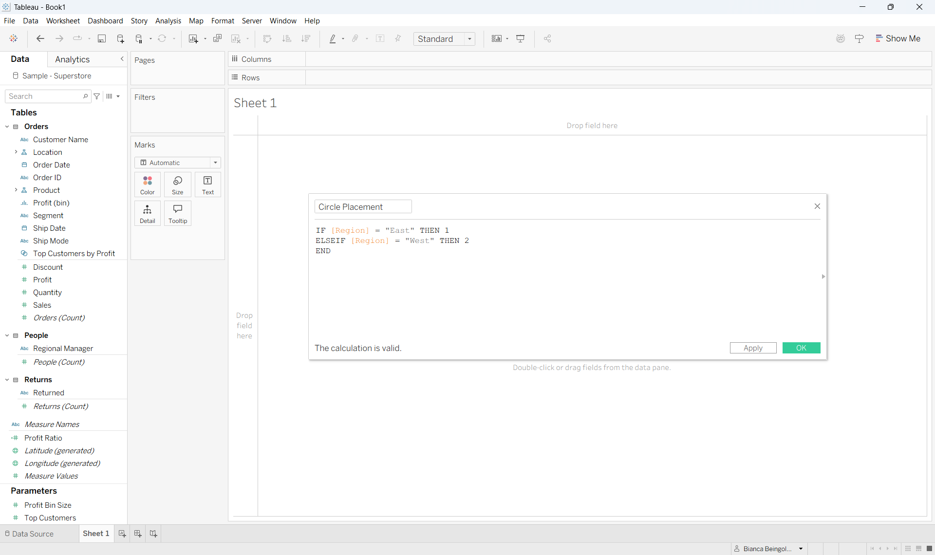
Start off by creating a Calculated Field called Circle Placement with the following value:
IF [Region] = "East" THEN 1
ELSEIF [Region] = "West" THEN 2
END
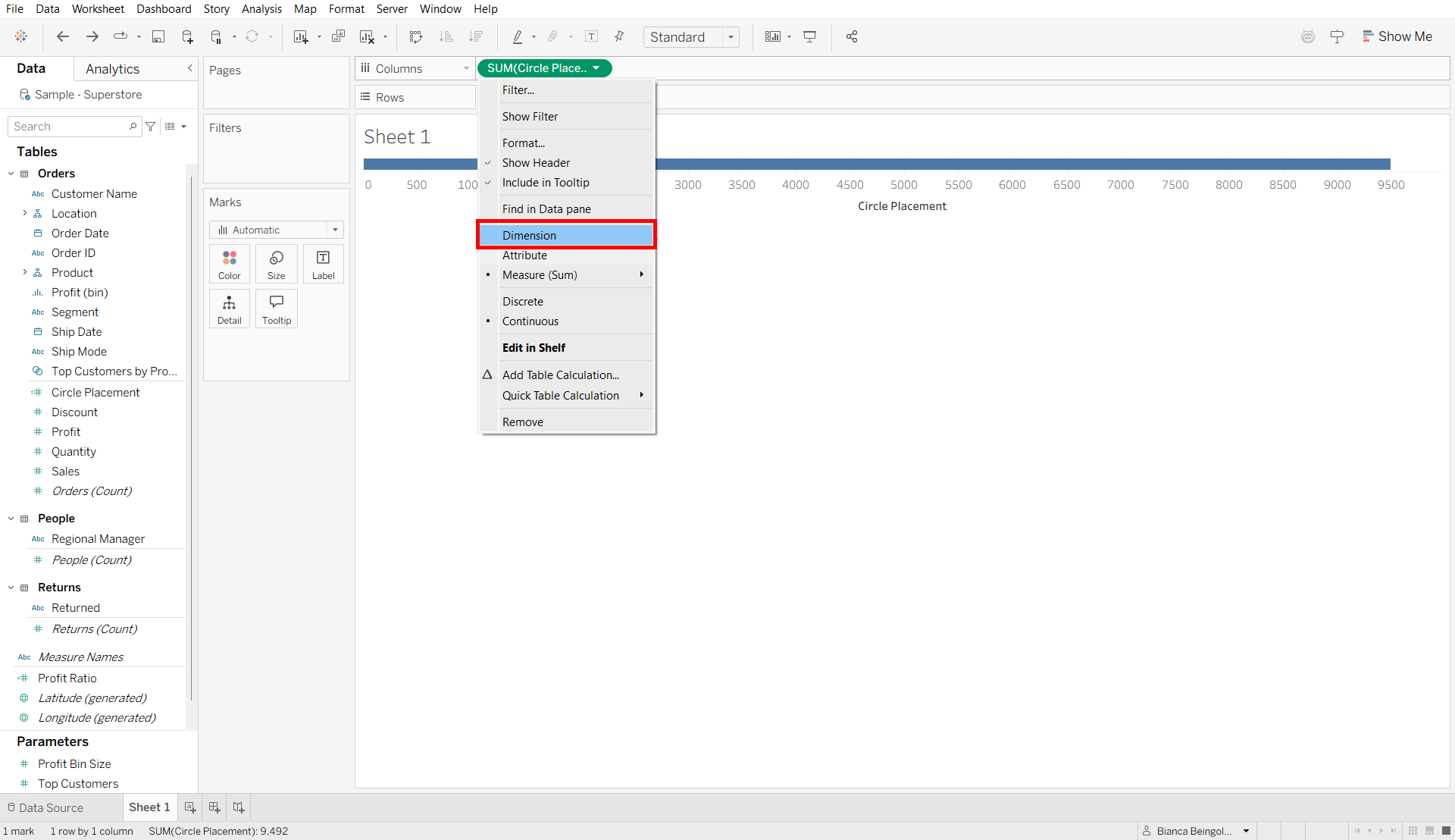
Drag it to Columns, and convert it to a Dimension.
Drag Region to Color and change the Marks type to Circle.
Now, drag the bottom bar of your chart down to enlarge the view. Increase the size of the circles (in the Marks card), too.
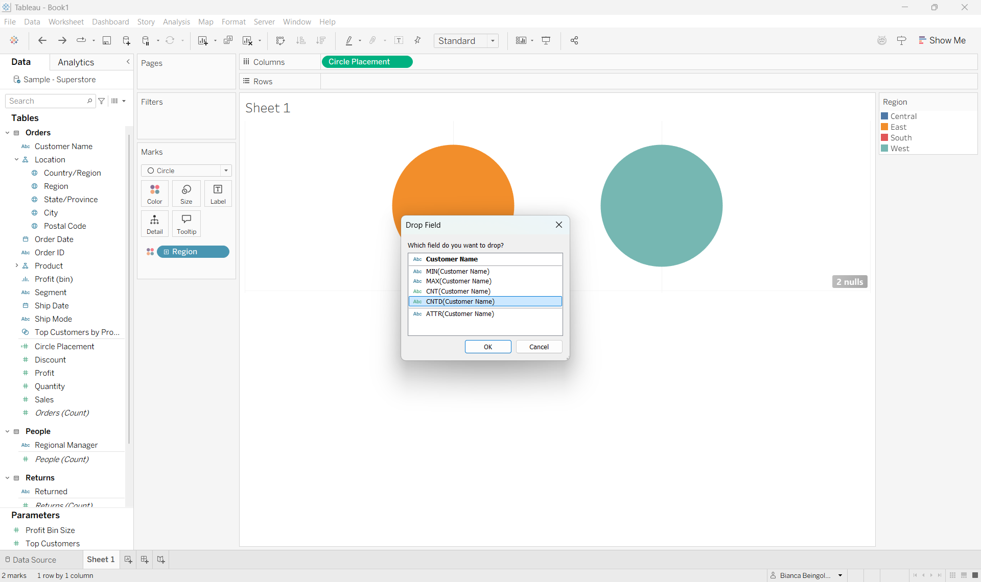
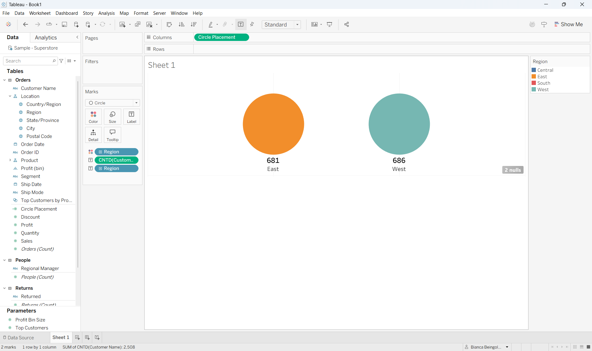
Then, holding down right click drag Customer Name to Label and select Count Distinct of Customer Name when prompted. This will give us the non-repeating counts of customers for each region.
Also drag Region to Label, and go to the Label card to format them as desired. I also changed the alignment to be set to Bottom Center.
This is what you should see at this point:
Now let's put the Venn in this diagram!
Click on your Columns tab and type in 'AVG(0)'. This will create a second axis which will allow us to display the overlap.
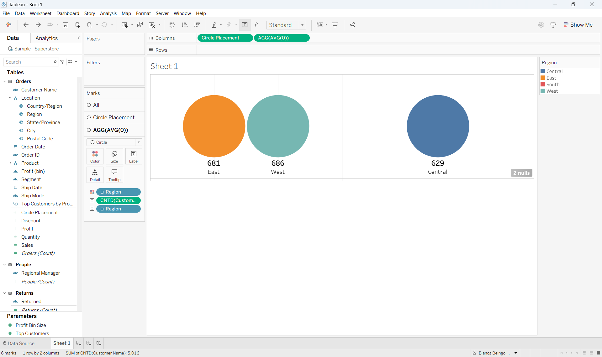
From here, remove all the fields from the AGG(AVG(0)) shelf and change its mark type to Text.
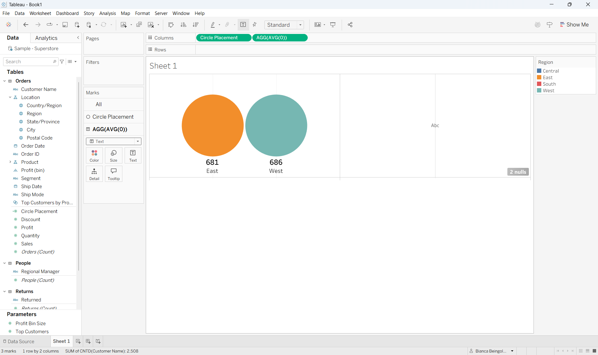
Now we want to create the calculation that will show the number of customers that have orders in both the East and West region (the overlap). To do this, create a new Calculated Field, call it East AND West Customers, and give it the following value:
COUNTD (
IF ({ FIXED [Customer Name]: SUM(IF [Region] = "East" THEN 1 END) } > 0
AND
{ FIXED [Customer Name]: SUM(IF [Region] = "West" THEN 1 END) } > 0)
THEN [Customer Name]
END)
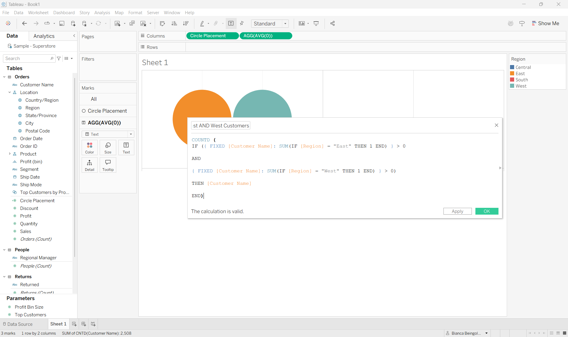
This calculation is basically telling Tableau to show us the customers that have placed orders in the East region and in the West region.
{ FIXED [Customer Name]: ... } groups the calculation at the individual customer level; SUM(IF [Region] = "East" THEN 1 END) > 0 checks that the number of orders placed in the East region (at the customer level) is positive; and the rest of the expression requires that both the condition for the East and the identical condition for the West be met simultaneously. When this is the case, customer name is returned. Distinct customer names are then totaled.
With that, drag East AND West Customers to the Text field of the AGG(AVG(0)) shelf and format it to match the other counts in the view.
From the dropdown in the right pill of the Columns tab, click Dual Axis (no need to synchronize axes since the second axis is grounded at zero).
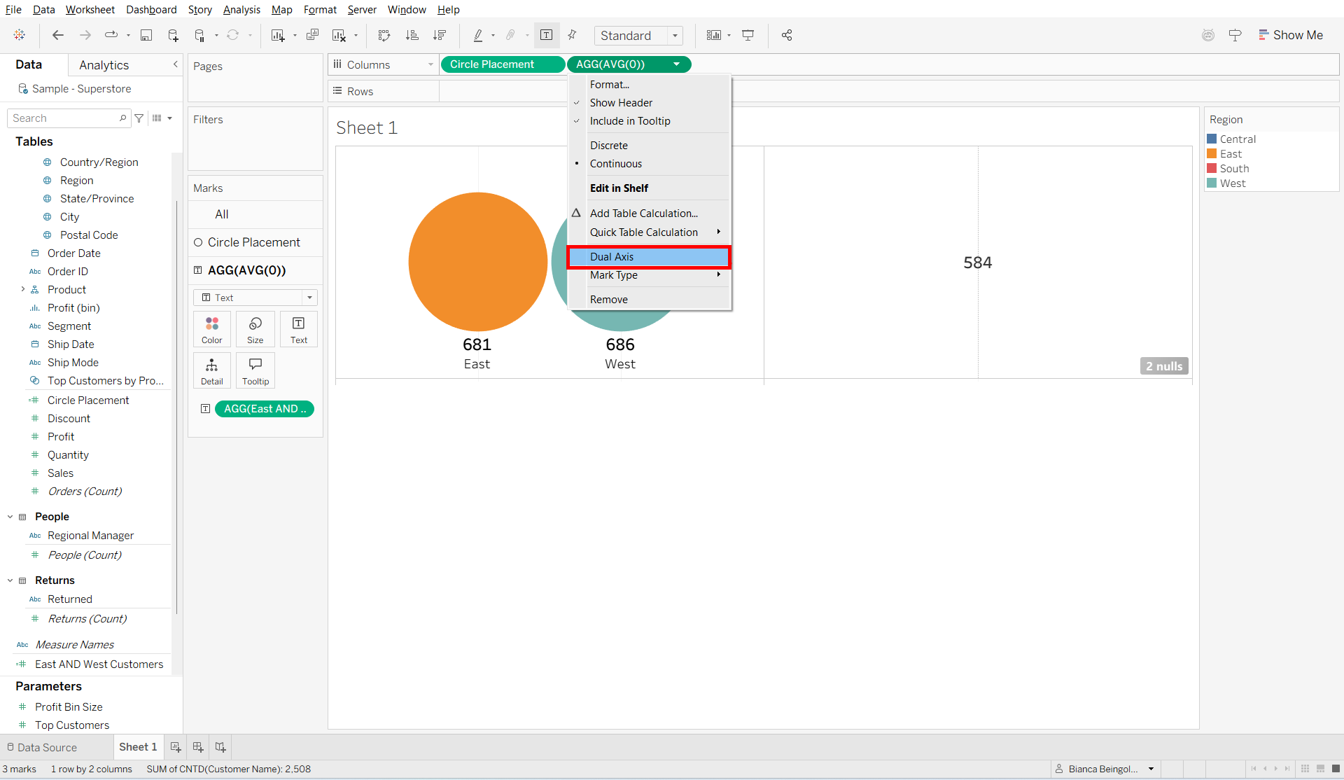
Now, to actually make the circles overlap, drag the right edge of the visual to the left.
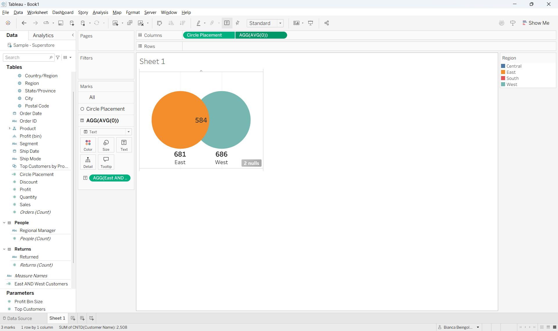
Go ahead and add a border to your circles, change the colors, and reduce the opacity. Make sure to also un-show headers and remove gridlines.
I will say, since this is a chart type that is not native to Tableau, you might find that the formatting is a little clunky, especially when it comes time to enlarge it to fit into your dashboard. Still, I find that it works nicely for small visuals.
And there you have it, you've built a Venn Diagram in Tableau!
Sources: