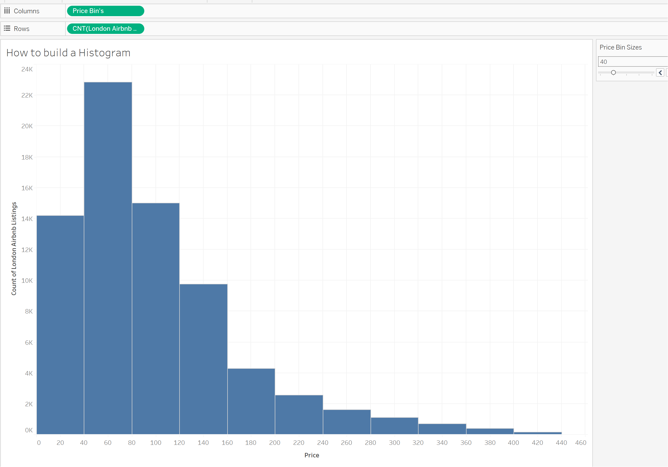
A histogram is a graphical representation of the distribution of a dataset. It provides a visual summary of the underlying frequency or probability distribution of a set of continuous or discrete data.
Histograms are commonly used in statistics and data analysis to understand the shape, spread, and central tendency of a data set.
In this blog I'm going to outline how to build a Histogram in Tableau and how you can use a parameter to allow the end user to change the bin sizes.
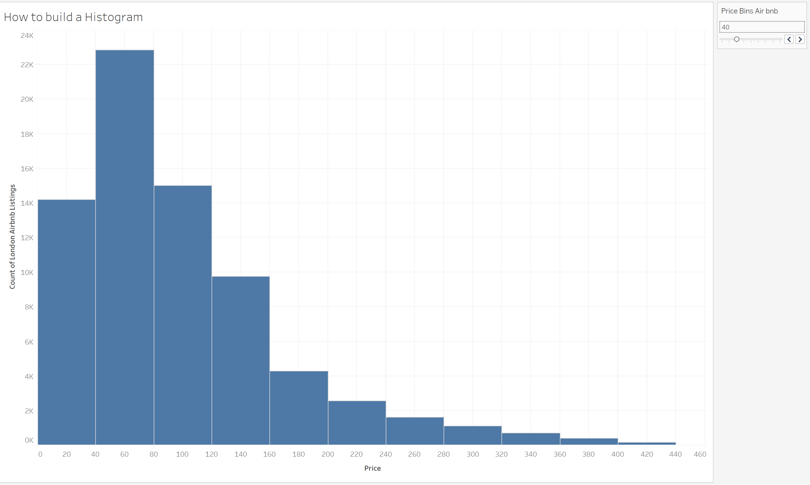
Our final histogram will look into the distribution of different Airbnb's listed in London and the distribution of them according to price. On the right hand side you can then see the parameter which allows the end user to change those bin sizes on the X axis.
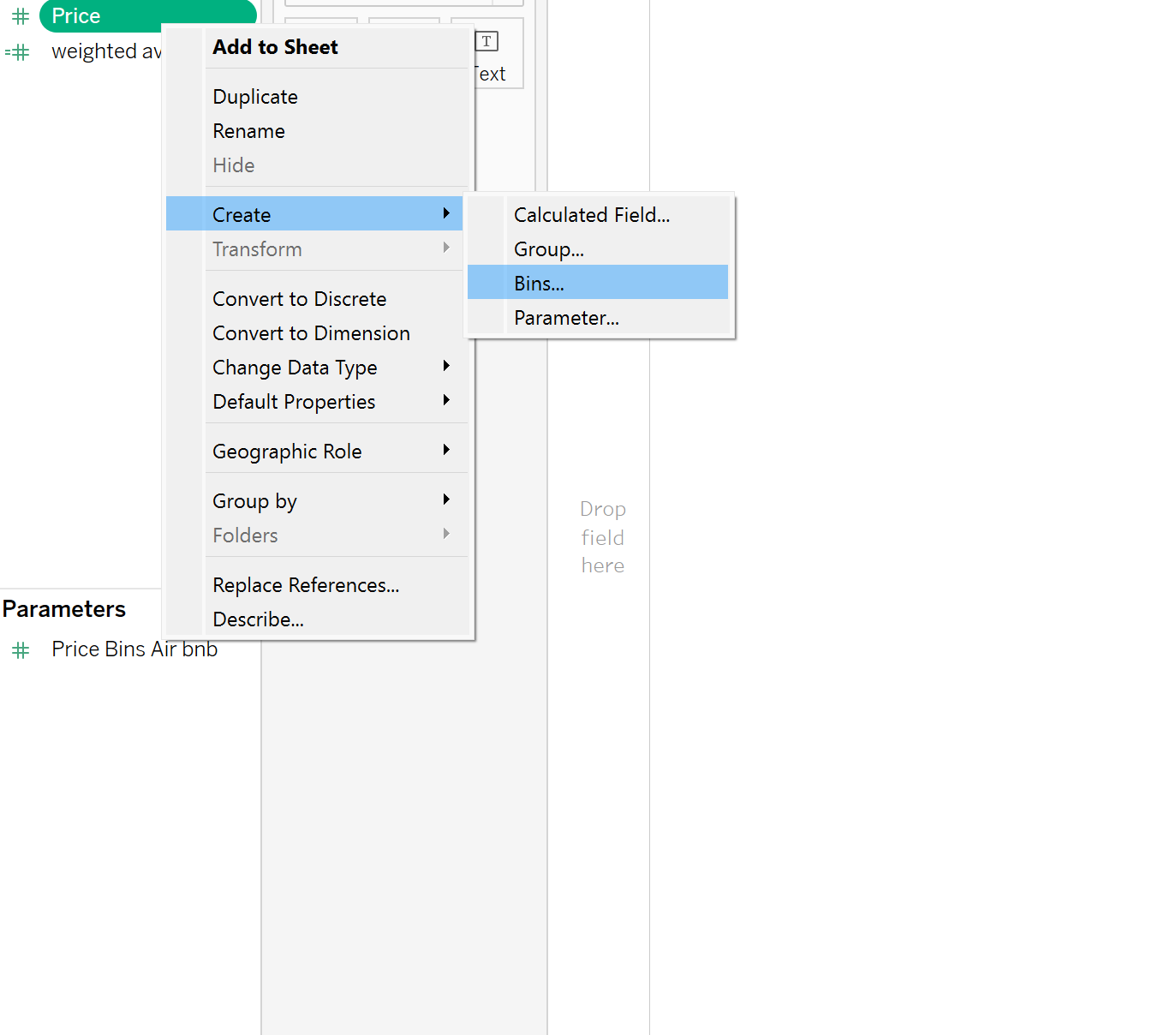
Step 1: Creating the Bins
Right-click on the category which you would like to be along your x-axis. Select Create>Bins.
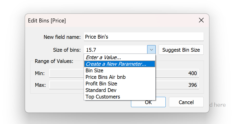
A window will appear, if you would like to have non adjustable bins, then simply select 'OK' and Tableau will give you appropriate sized bins. If you would like to make it adjustable then select 'create a new parameter' .
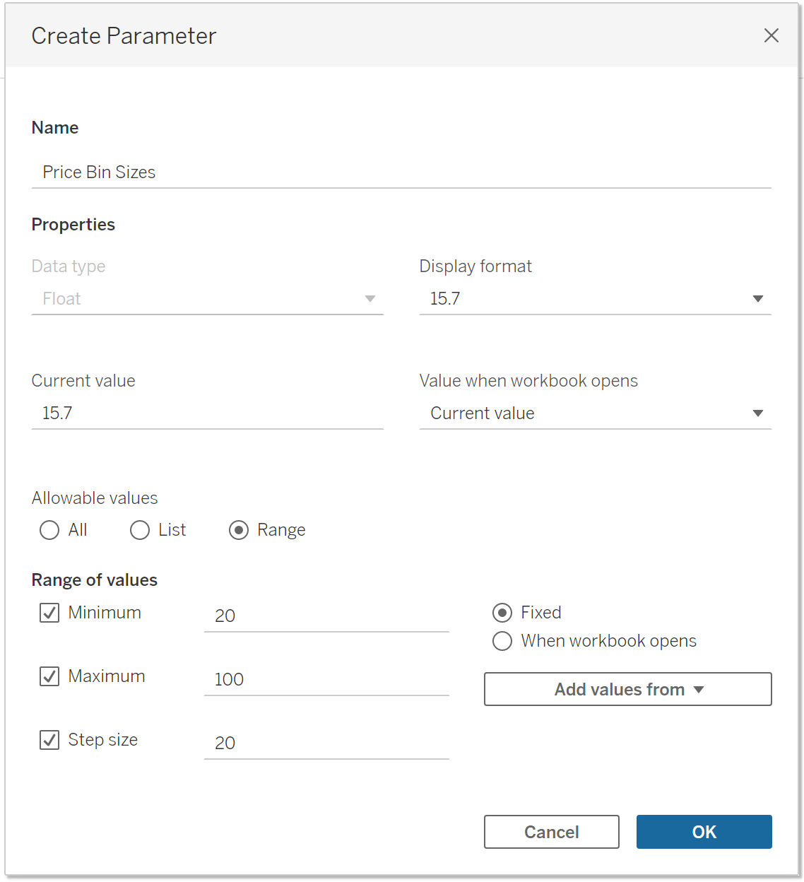
Another pop up will appear, in which you will create your adjustable parameter. I've labelled mine 'Price Bin Sizes' and select 'Range'. In this instance I have kept the Range suggested and Step size, have a play around to suit you. The step size is the number in which the user can increase the bin size by and the min/max is the range of values which will appear on the parameter.
Select OK on all pop up windows.
Step 2: Building the Histogram
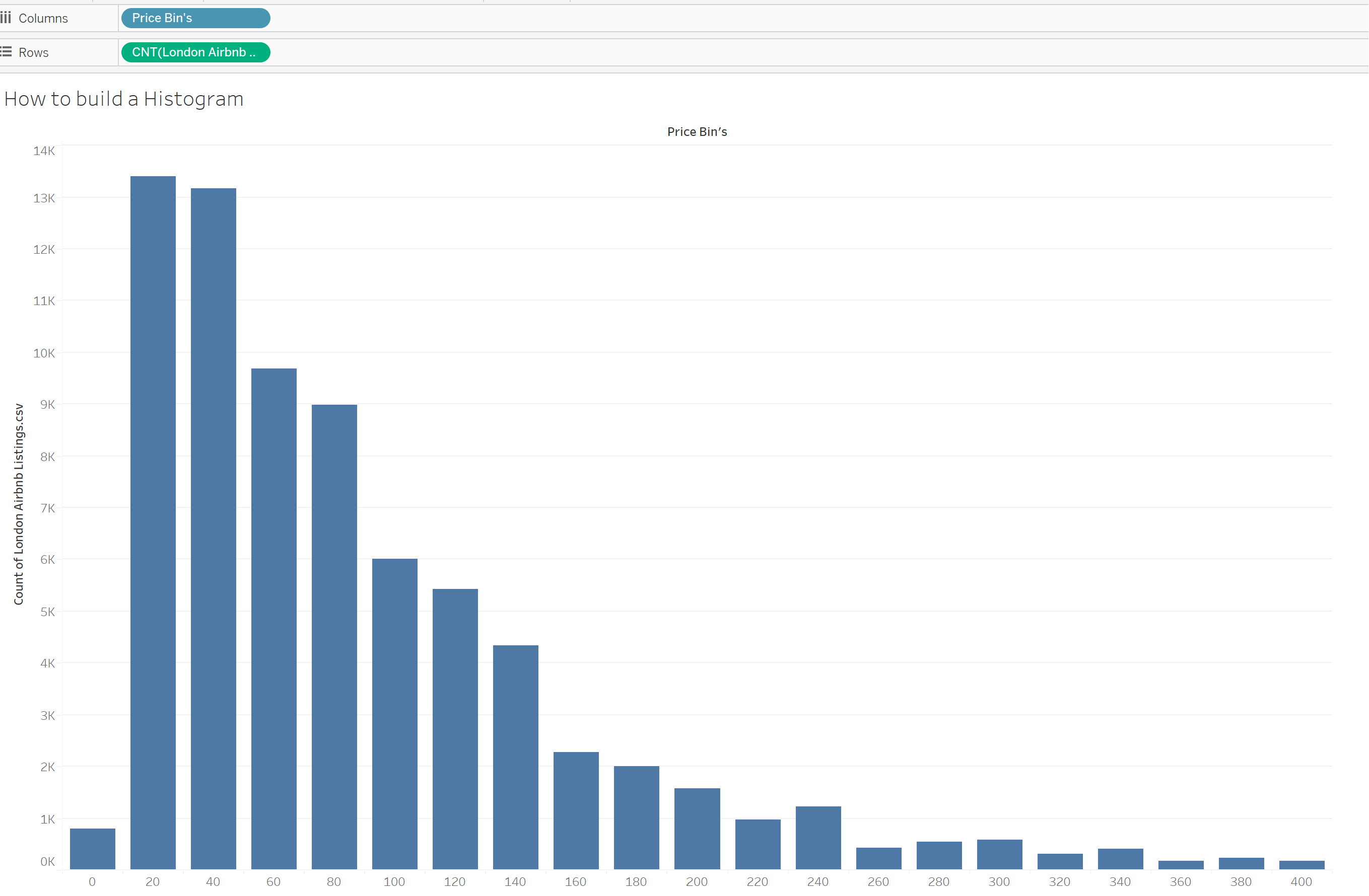
You will now have a Price Bins Field in the Left hand pane. This can be selected and dragged onto the Columns, and in my case the Count of Airbnb Listings onto my rows.
Producing a histogram like below:
To be able to show and use the adjustable parameter, locate the parameter in the bottom corner. Right click and select show parameter and it will appear on the right hand side:

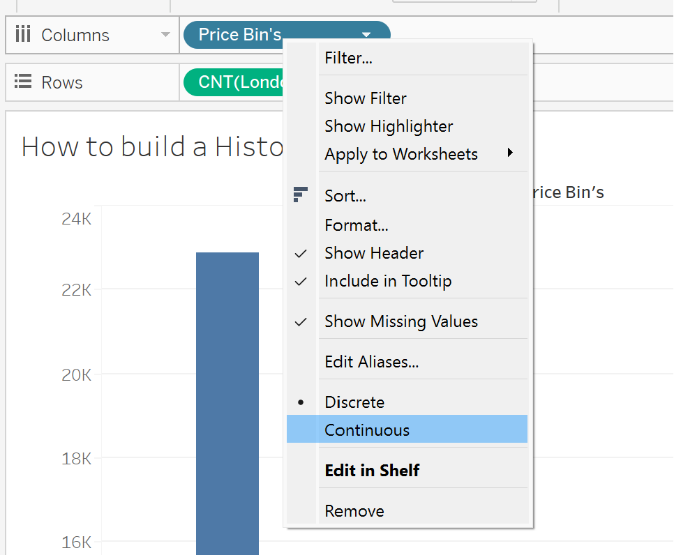
Often people can get confused by the Y-axis, so to be able to see the range of values for the bins. To do so, right click on the Price Bin's in the columns and change it to continuous:
Then after editing the name of axis and formatting colours/labels as you like, you will have a dynamic histogram, allowing the user to choose bin sizes.
