Bump charts, also referred to as ranking charts, serve as powerful tools for visually depicting changes in rank or position over time. Whether you're monitoring the performance of products, teams, or other entities across various categories, bump charts offer a concise and insightful representation of evolving rankings. In this blog, I'll guide you through the process of creating a bump chart, complete with the ability to highlight specific categories and emphasize key information on your chart.
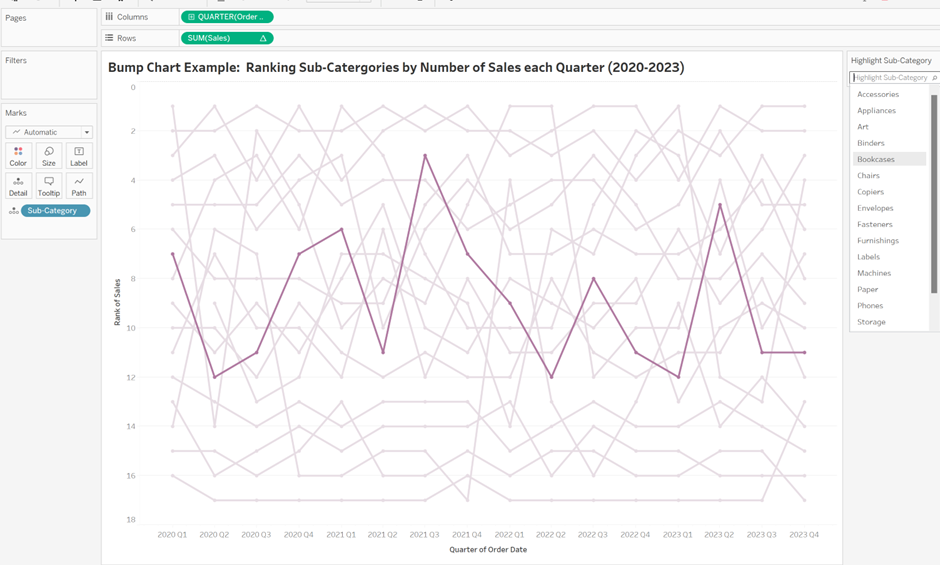
(P.S., while the steps provided are applicable to most datasets, I'll use the Superstore dataset for demonstration purposes.)
1. Setting Up the Initial Chart
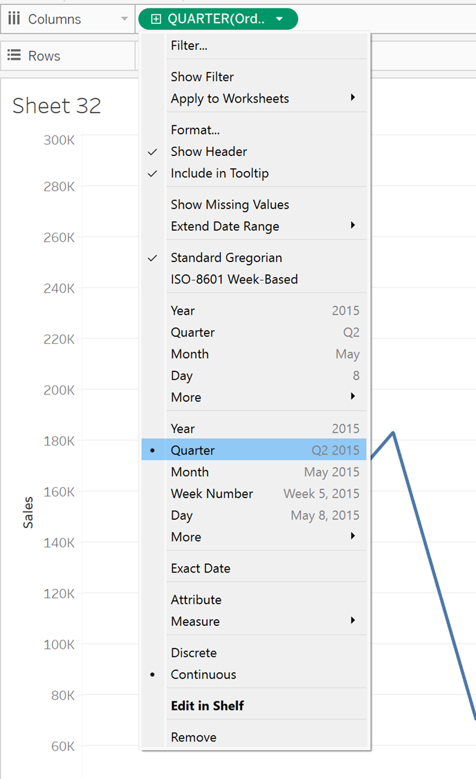
Start by dragging the 'Sales' field into Rows, which will automatically sum the values. Next, right-click and drag your 'Order Date' to Columns, selecting 'Quarters' (Continuous/Green). Alternatively, you can drag in 'Order Date,' right-click, and choose the second option for 'Quarters.'
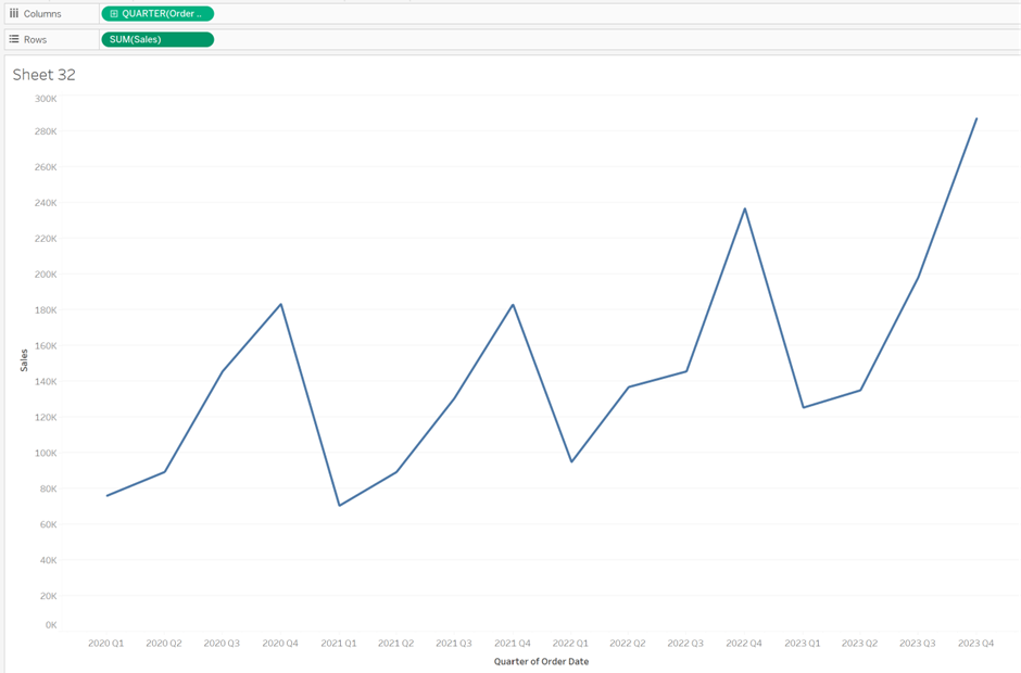
This setup will yield a chart that looks like the following:
2. Adding Sub-categories to the Detail
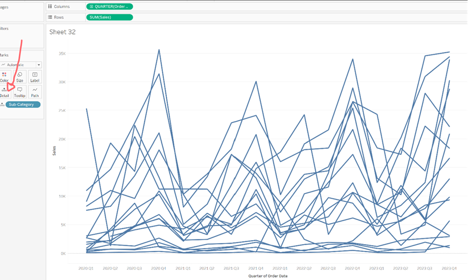
Now, drag 'Sub-category' onto the detail in the Marks section. For those using their own data, place the field you want to separate the line by (e.g., names of football players if ranking players). This will generate a graph displaying the data:
3. Ranking the Categories
To rank the categories by sales for each specific date (Quarter and Year), right-click on 'SUM(SALES)' in the Rows section. Click on 'Add Table Calculation,' and in the pop-up window, edit the table calculation to be a rank. Choose whether it should be ascending or descending based on your preference. Select 'Specific Dimensions,' and choose the relevant fields. As we are ranking each line(sub-category) per time frame(Quarter Year) I have ticked Sub-category and unticked Quarter of Order Date
(If you are working with an alternative dataset, click on the box with the label that matches the field dropped into the details section from step 2. Untick the field that represents the sections (or date) it is ranked within.)
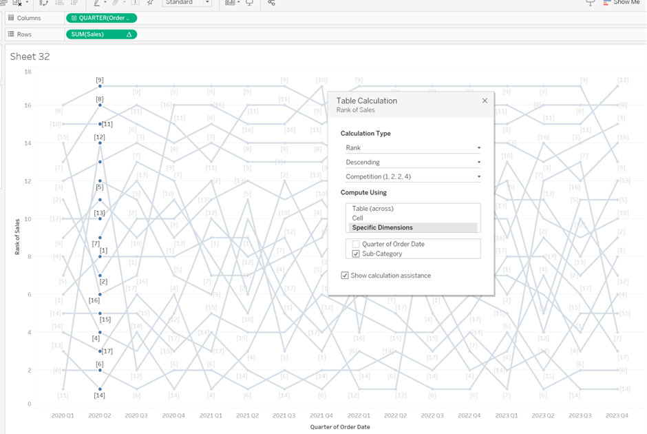
Close the table calculation window once done as it applies automatically.
4. Highlighting
With the ranking applied, proceed to add the highlight function. To highlight a line, right-click on the 'Sub-category' details, and click 'Show Highlighter.' A dropdown will appear on the right, allowing you to hover over options to highlight specific lines on your bump chart.
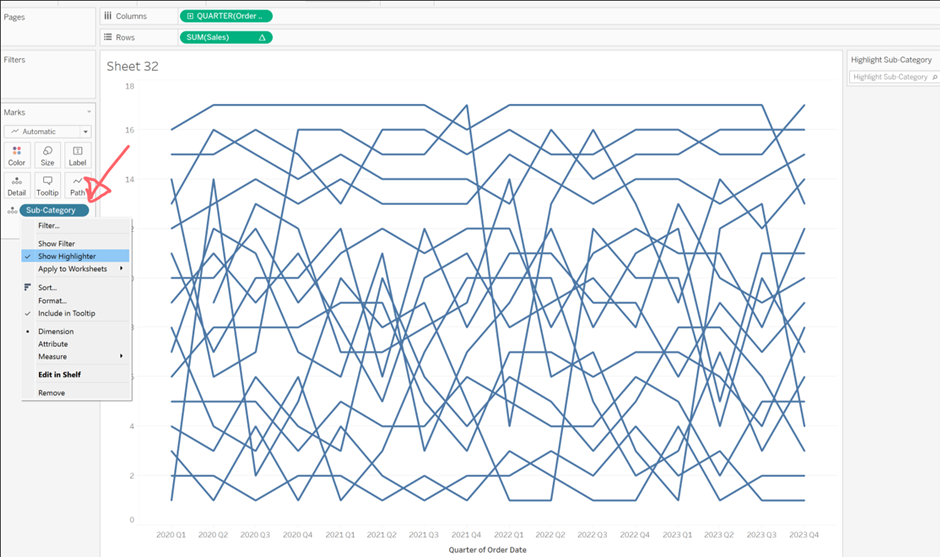
5. Reversing the Axis
I prefer the top-selling sub-category at the top, so, right-click on the Y axis header (Rank of Sales), click 'Edit Axis,' and under scale, select 'Reversed.'
6. Final Touches
Formatting is subjective, but you can choose to have dots appear at each point by selecting colour in the Marks pane and in the middle section under effects choose the middle option with circle markers. It is also nice to add a title by double-clicking on the title and typing your desired text. Lastly, select a color for the graph; in this example, I chose purple.
Here's the final result, with bookcases highlighted as the sub-category:

