A Control Chart is essentially a line chart with reference lines for the average as well as one standard deviation above and below the average. This can be useful to measure targets and performance to be able to see when profits or performance is below or above the mean by one standard deviation. (This can be edited for however many standard deviations is relevant to the user too!)
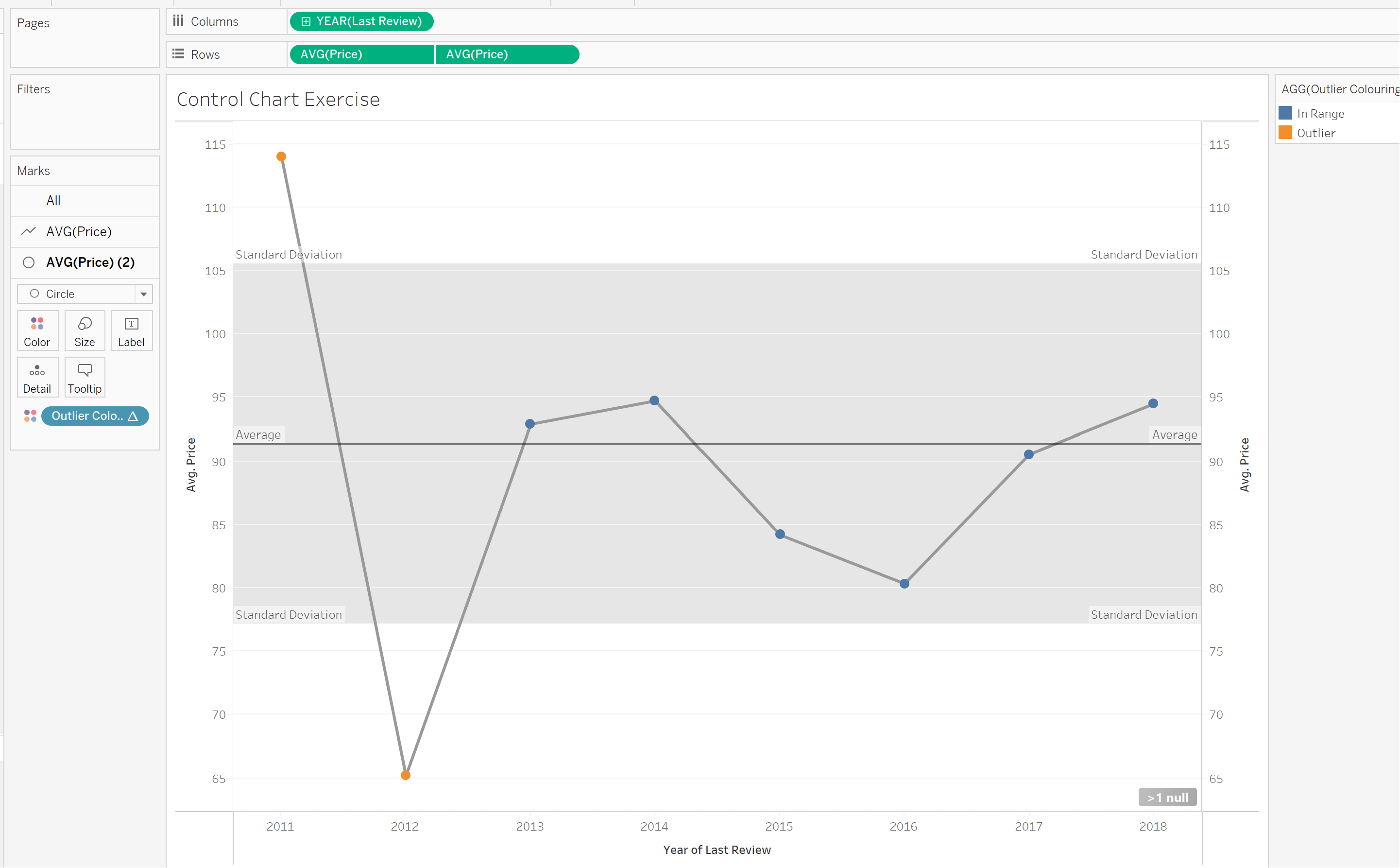
In this example, we are going to use Airbnb's Data to have an idea of which years we're outliers for the average price of a listing. We have then coloured the Outliers, just to highlight them to the user.
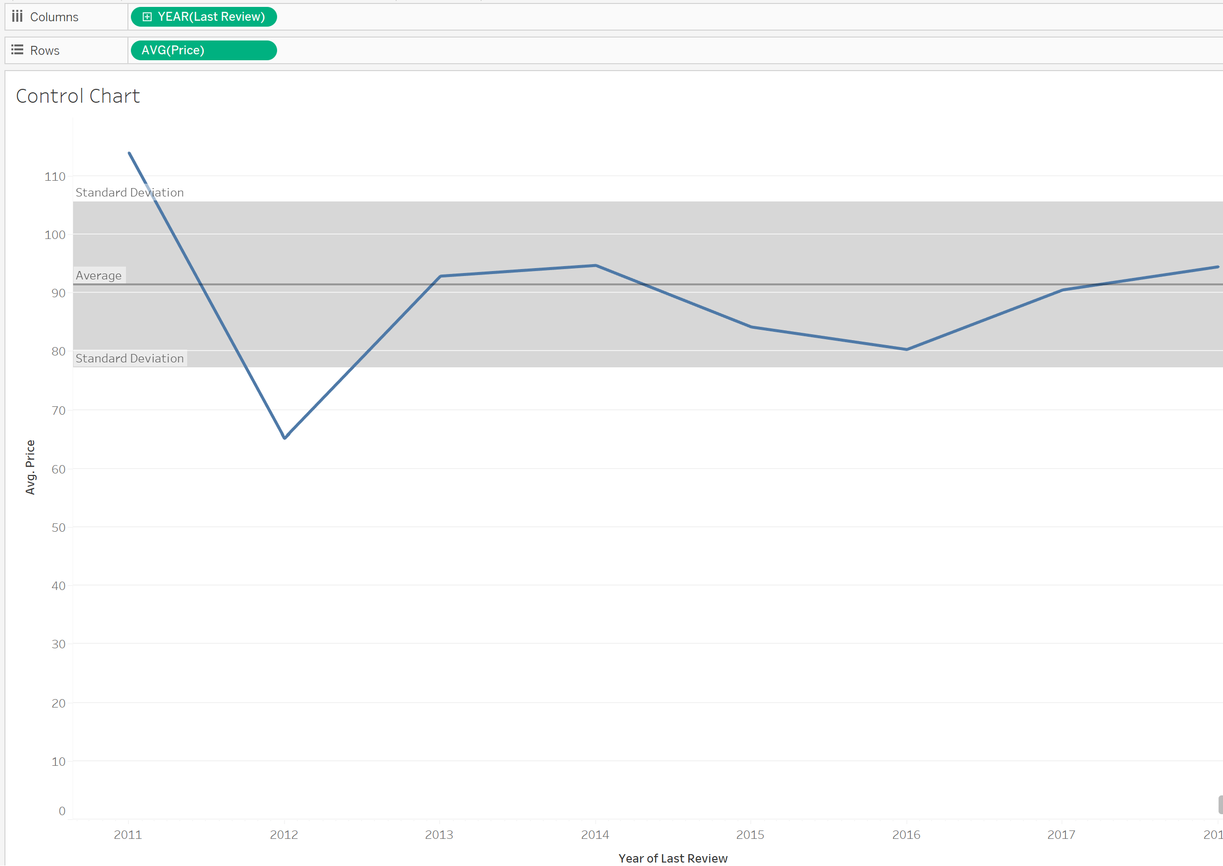
Step 1: Build a basic line chart.
As we are building a line chart, ensure your X-axis (Columns) are continuous fields! In this instance, I'm placing the average price on the rows and years on the columns. Double check your aggregation on the rows value as it can automatically use sum and I want average.
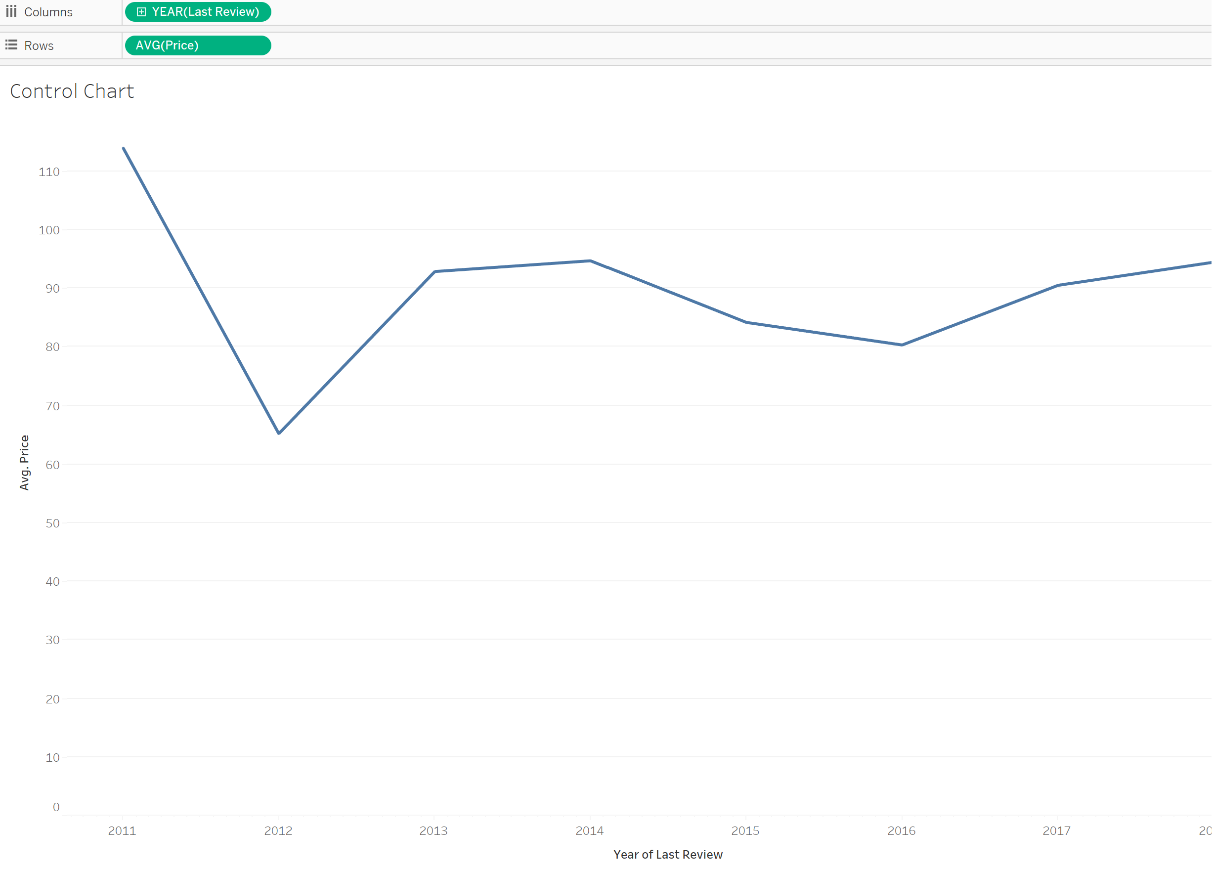
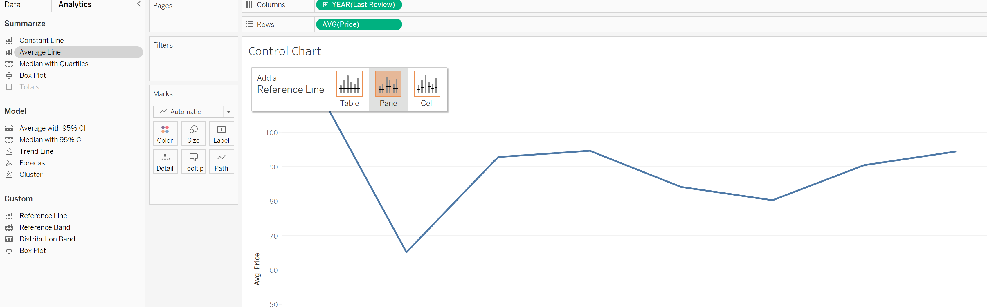
Step 2: Adding an Average line
In the left hand data pane, there is an analytics tab. Select the average line and drag it across, into the view. In this case I'm dropping it across the pane as the view is not split so dropping it into table or pane is the same. Try it out with your own data!
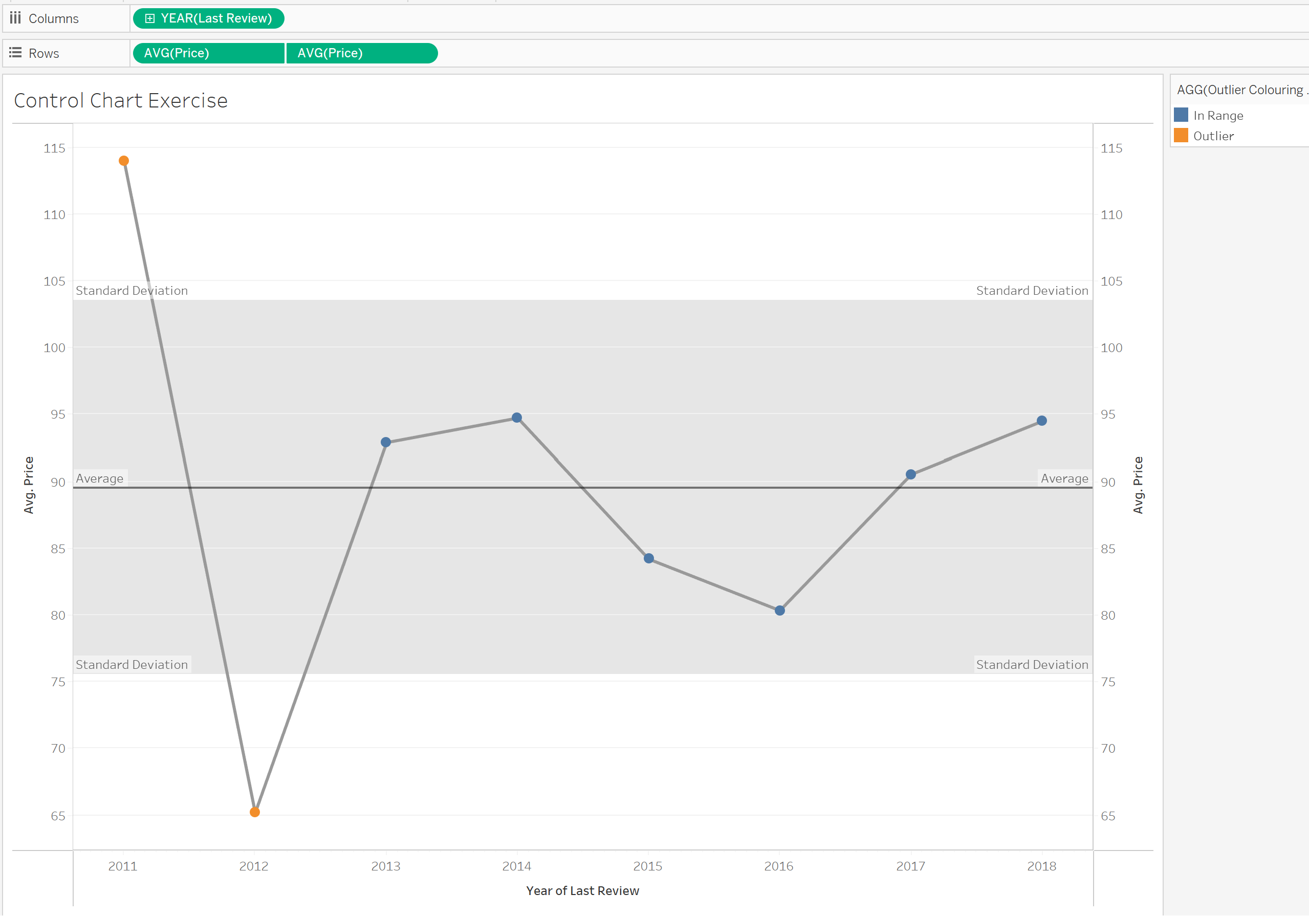
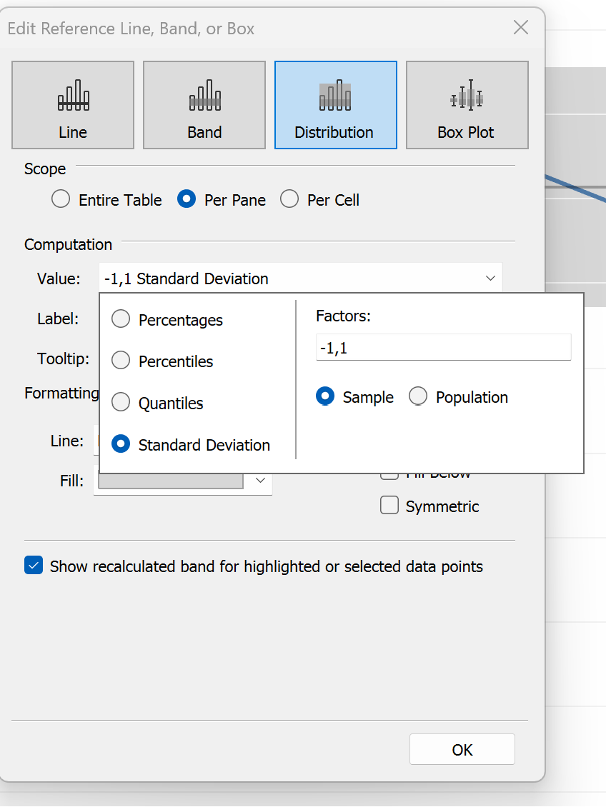
Step 3: Adding the Standard Deviations
In the same Analytics tab there is 'Distribution Band'. Similarly with the Average line, select this and drag it into the view. Drop it across in the same pane/table choice as the average line from the previous step and a window will pop up.
Under 'Computation' , select the drop down > Standard deviation. It will automatically use -1 and 1 as the default, if you would like to look at more standard deviations out, then edit these numbers. When that's done select OK.
You now have a control chart which should look something like this:
Bonus Step 4: Colouring Outliers
To do this we want to create additional marks. So we will want to duplicate and synchronize the Y-Axis. To look like below:
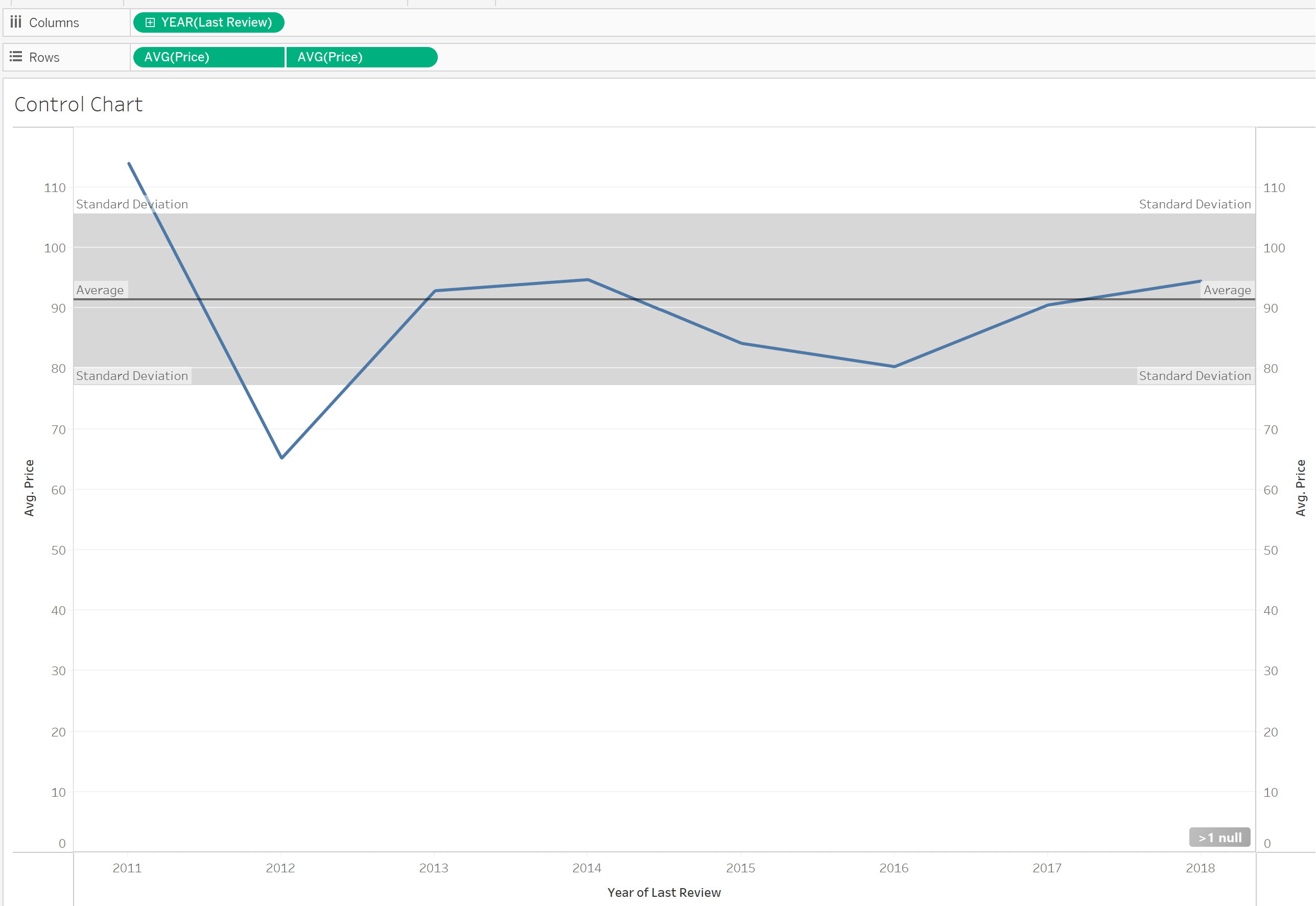
Press 'ctrl + R' on your key board and click your Rows item (in this case Avg(Price)) and drag it across so there are two of them in the rows.
Then right click on the on the second one and select Dual Axis. Then right click on the second axis and select synchronise axis.
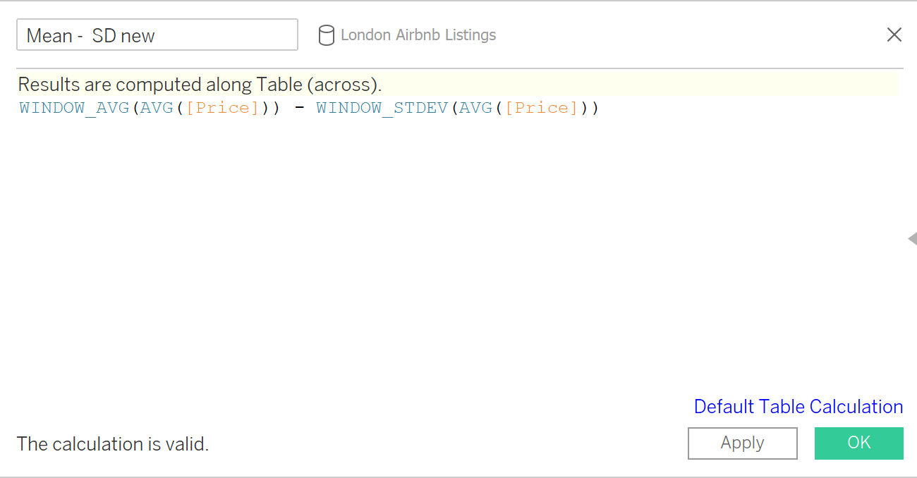
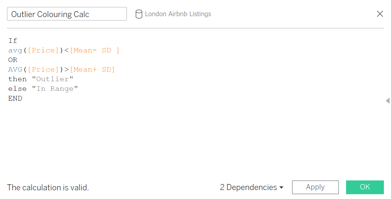
We then want to create 3 calculated fields for that final IF statement to colour those points.
1: Points below the Standard Deviation:
2: Points above the standard Deviation:
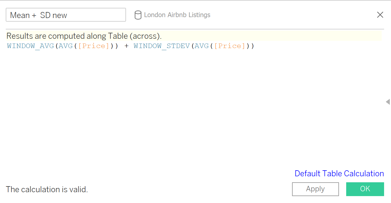
3: If statement:
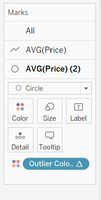
Then drop the If statement calculated field onto one of the paths in the marks card and change the marks to a circle instead of a line like so:
Then your final chart is completed: