


I have been reworking a dashboard that I first created before I started at The Data School. It was my first ever use of Tableau and looked at house building in the UK between 1949 and 2025.
Having prepared the data I needed, I was able to start building in Tableau. Using a few charts and some simple parameter actions, I had a dashboard that very closely resembled my initial sketch:
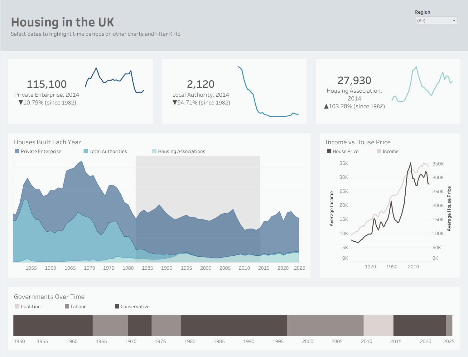
However, looking at this I realised it created more questions than it answered. The different charts didn’t connect much and after reflecting on my user story, I realised I needed to rethink some things.
I reopened Excalidraw (very literally returning to the drawing board) and began a new sketch:
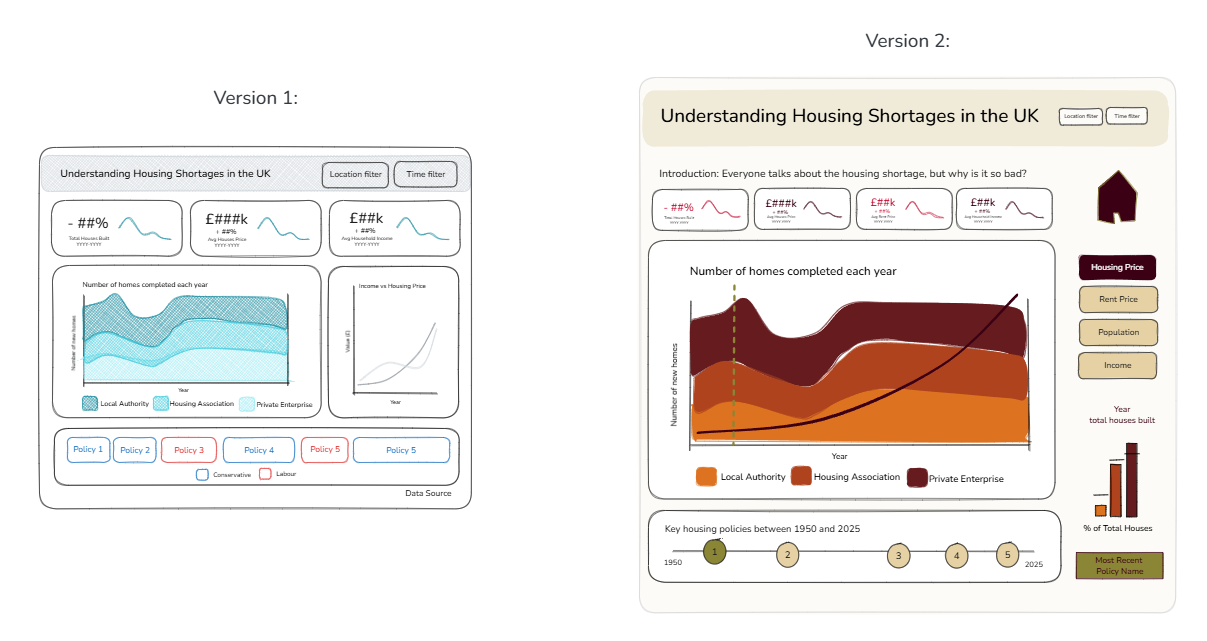
Main changes:
- Split original line chart into KPIs, and only one KPI for homes built, thinking more carefully about the stories I wanted to tell.
- Overlay lines for demographic trends onto the main area chart, with buttons on the right for user to select view.
- Changed government chart to show just policies, with details of governments in tooltips.
- Added a small bar chart showing houses built in a given year with a line showing average homes built each year across total time period.
- Dashboard actions to show a select year across charts to increase comparison.
- Warmer colour palette to make it more engaging.
My main goal was to change the view from including three charts that had very little obvious connection, to centering the dashboard around the main area chart, with the policy chart directly underneath as this was my main point of comparison. I then wanted to use the space around to show as many insights as possible relating to the users actions.
The final dashboard:
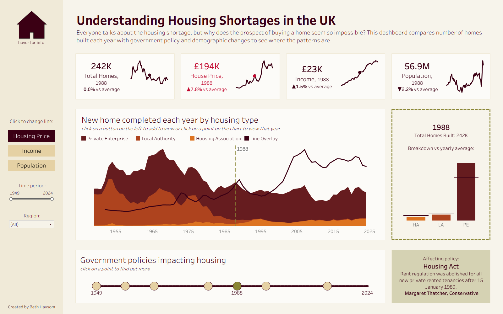
My goal for this dashboard was to create a tool to help understand structural drivers of affordable housing shortages, comparing home built each year with house price and government policy.
At the top of the dashboard I included dynamic KPIs for total homes built, house price, income and population. These show the metrics for a selected year against averages, which highlight in red when the value is above/below average.
The main chart below this shows the new homes built each year by private enterprises, local authorities and housing associations. Over this there is a line showing housing prices for this time (adjusted for inflation), with the option to change this to show income or population change using buttons on the left. I found this chart interesting because it shows that private housing has remained very consistent throughout this time, while affordable options (local authority and housing association) have almost disappeared. This corresponds with the increase in house prices.
On the right of this there is a bar chart showing houses for a selected year against the average, which can be changed by clicking any point on the first chart.
Along the bottom is a timeline of key housing related government policies. When the user clicks on a policy, this will change the selected year in all other charts, and show details about the policy on the bottom right. (When the selected year isn’t one in which a policy was introduced, this will show the most recent policy affecting that date).
Some key impacts I noticed here were the 1980 Right to Buy policy, which was followed by a sharp decrease in Local Authority houses being built, and the 1996 Buy to Let policy, which led to the sharpest increase in house prices. With the 2026 Renters Rights Act now introduced, it will be interesting to see the impact this has going forward.
Check out the final dashboard here. I’ve really enjoyed creating it and hope that everyone enjoys exploring it!