For the first day of dashboard week, we were tasked with building a dashboard that considered accessibility, focused on a specific brief. My brief was to create a dashboard that considered accessibility for Cognitive Disabilities, with a particular focus on dyslexia and dyscalculia. To achieve this, I really wanted to refine the dashboard included so that it would be quick and easy to interpret.
Considerations for Cognitive Processing
A lot of the considerations for this brief built on usual best practices for dashboard building. The dashboard should take into account information processing speeds/patterns; attention and working memory; reasoning, comprehension and analysis, and visual perception. Some features that can achieve this include:
- Text: Using larger text and fewer marks, with fonts that are easy to read (Verdana is good for this)
- Colour: Limit to 5-7 colours or shapes, with strong contrasts between these (soft colours are often easier to process for people with learning disabilities)
- Content: Include main takeaways in titles, and use BANs to ensure key insights can be found quickly
The Brief
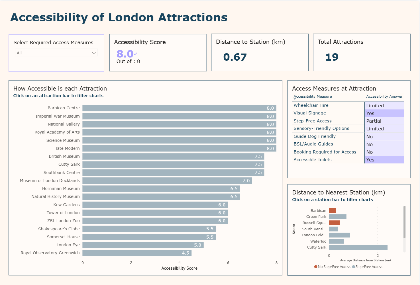
My brief asked me to create a dashboard in Power BI looking at London’s top attractions, to help the user identify which were easily accessible.
The Dashboard
The final dashboard shows the accessibility of London’s top attractions, by how they meet a given list of accessibility measures. Due to my goal of refining the dashboard to reduce cognitive overload, I decided to include a single drop down filter, three KPIs and three charts which related to one another.
I put the filter in the top left corner, in line with the KPIs, so it was the first thing the user would see, with a clear direction. This allowed the user to select all of the accessibility measures that applied to them, and filtered the charts and KPIs accordingly.
I calculated an accessibility score for each attraction, to show how many of the accessibility measures it met. This was shown clearly in a KPI, which was filtered by a bar chart below, showing the score for each individual attraction. I included both of these to help reduce cognitive processing, by offering the key takeaway alongside a deeper look. Also filtered by the bar chart is a heat map showing each accessibility measure, coloured by whether an attraction meets it or not.
Finally I included a bar chart showing the distance from nearest tube stations to the given attractions. This is colour coded to show whether or not the station has step free access. By clicking on a bar the user can filter the rest of the charts, so that they can compare the attractions around a given station, allowing for easier planning for a trip.