


Stacked bar charts can be very useful, but they often have one rather large downside: if you have two similar sized segments within the same bar, how can you tell which is larger?
Let’s take a look at the following stacked bar chart:
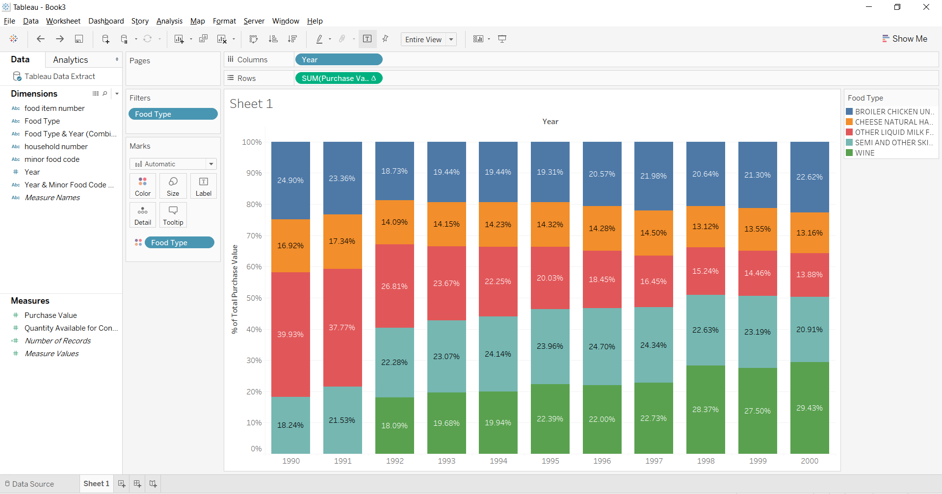
Here we are looking at the percent of total purchase value, of the top 5 foods sold between 1990-2000; as you can see, the colours are in the same order for each bar. I have also included the labels for each segment in each bar to demonstrate that they are not sorted by their value (even though this is already pretty obvious).
After you’ve built your original view, here are the steps to sort the colours by their value:
- In the Dimensions pane, hold down the CTRL button, and select the field which appears in your rows and the field which is shown by colour – in this case we select both the Year field, and the Food Type field.
- Click on the drop down arrow on one of the highlighted fields, and select Create > Combined Field.
- In the Marks card, right click on your colour field (in this case Food Type), and select Attribute.
- Drag the combined field made in step 2 to Detail in the Marks card.
- Right click on the combined field in the Marks card, and select Sort
- Under Sort order, select Descending;
- Under Sort by, select Field;
- Under Field, select the same field and aggregation that appears in your rows – in this case we choose Purchase Value and Sum;
- Click Okay.
These steps achieve our desired result:
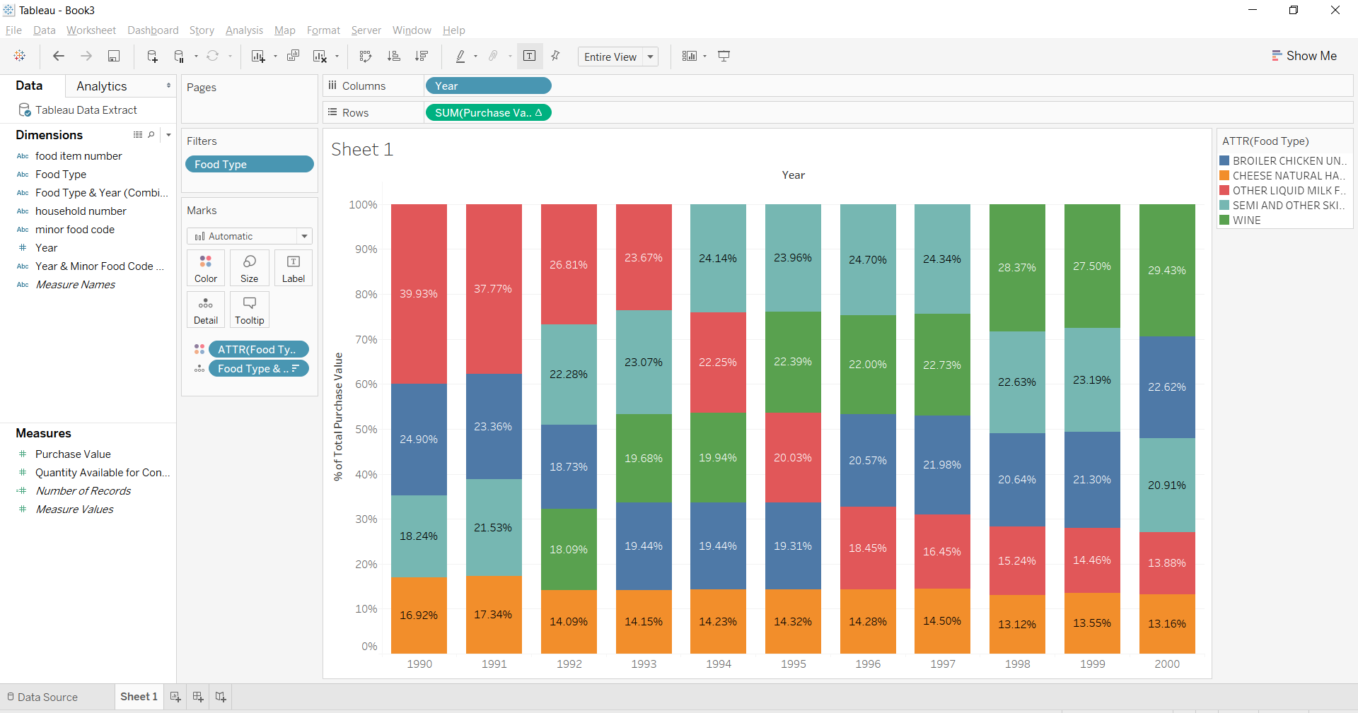
As we can see from the labels of each segment, they are stacked in order of descending value.
Here is a video showing the above steps in action:
[youtube https://www.youtube.com/watch?v=mPHJkv0pP0Q&w=560&h=315]
If you want to see how I built the whole worksheet (including the sorting), check out this video:
[youtube https://www.youtube.com/watch?v=YMVAi-hYFeQ&w=560&h=315]
Try it for yourself!