


It’s the second day of The Data School for DS4, and our first attempt at Makeover Monday! (Yes, we know it’s a Tuesday, let’s ignore that…)
We’re looking at how the global temperature has changed since 1850. The data we were given does not have many different variables, but we soon realised that there was still plenty we could do! Here’s the original visualisation:
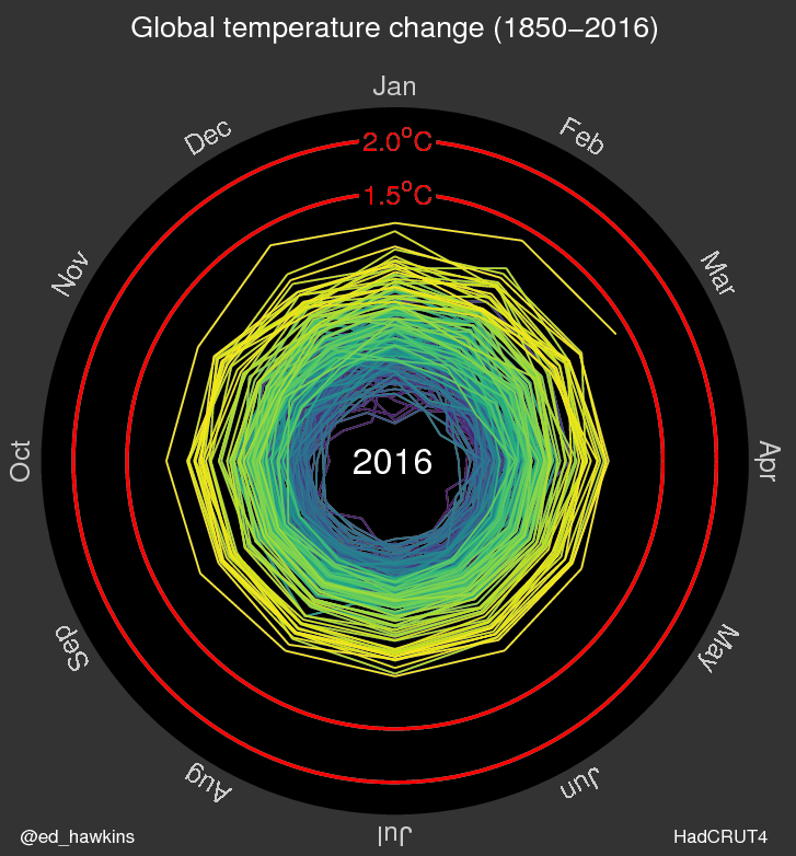
http://www.climate-lab-book.ac.uk/2016/spiralling-global-temperatures/
The main thing I liked about this was how visually appealing it is with the good use of colour to represent the increase/decrease of temperature, and how easy it is to see which month had the biggest increase. One thing I wasn’t so keen on, is how there was no way to find out which years had the greatest increase or decrease in comparison to the baseline figures. Having realised this, I began to think of various ways I could keep the aspects I liked about the original viz (the colour and largest increase month), and also include the most interesting information about the years.
My first venture was a line graph – usually the most obvious thing to try for data that includes dates. But whilst looking at previous makeovers for the same viz, it soon became apparent that the vast majority of them were line graphs, so I experimented with other options. Here is my final reviz:
Now we can clearly see which months have the largest temperature increase or decrease, and the colourful aspect representing temperature change is still included. I decided to label the point with the largest increase and largest decrease from the baseline, so now it is immediately obvious which years had the biggest change which is what I felt was missing from the original. If you want to check out any other points you can just click on a point for more information!