


Box plots can be an excellent way to visualise the distribution of data points across a selected measure. Box plots allow you to see the median, upper and lower interquartile range (IQR) , and the whiskers extend to 1.5 times the IQR, which allows you to identify any outlying datapoints.
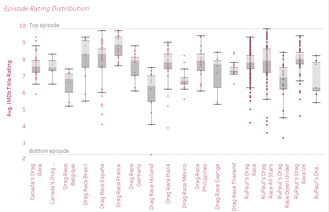
Below I have input a screenshot of a box plot that I made for a dashboard exploring the IMDb ratings of all tv shows within the RuPaul's Drag Race branchise. I will work through how to build this chart below.
This chart requires at least one dimension and one measure, with something to split the view in order to have a variety of data points.
First identify which dimension you want to investigate, bring that pill from the data pane onto columns.
Next identify your measure and bring that pill from the data pane onto rows. At this point you need to decide which form of aggregation you will perform on your measure. In my case each point is an individual episode, and since each episode only has one IMDb rating any measure will work, so for this example I will use the average.
The chart will most likely automatically set to bar chart, change this in the marks card to the left inside the drop down to circle type.
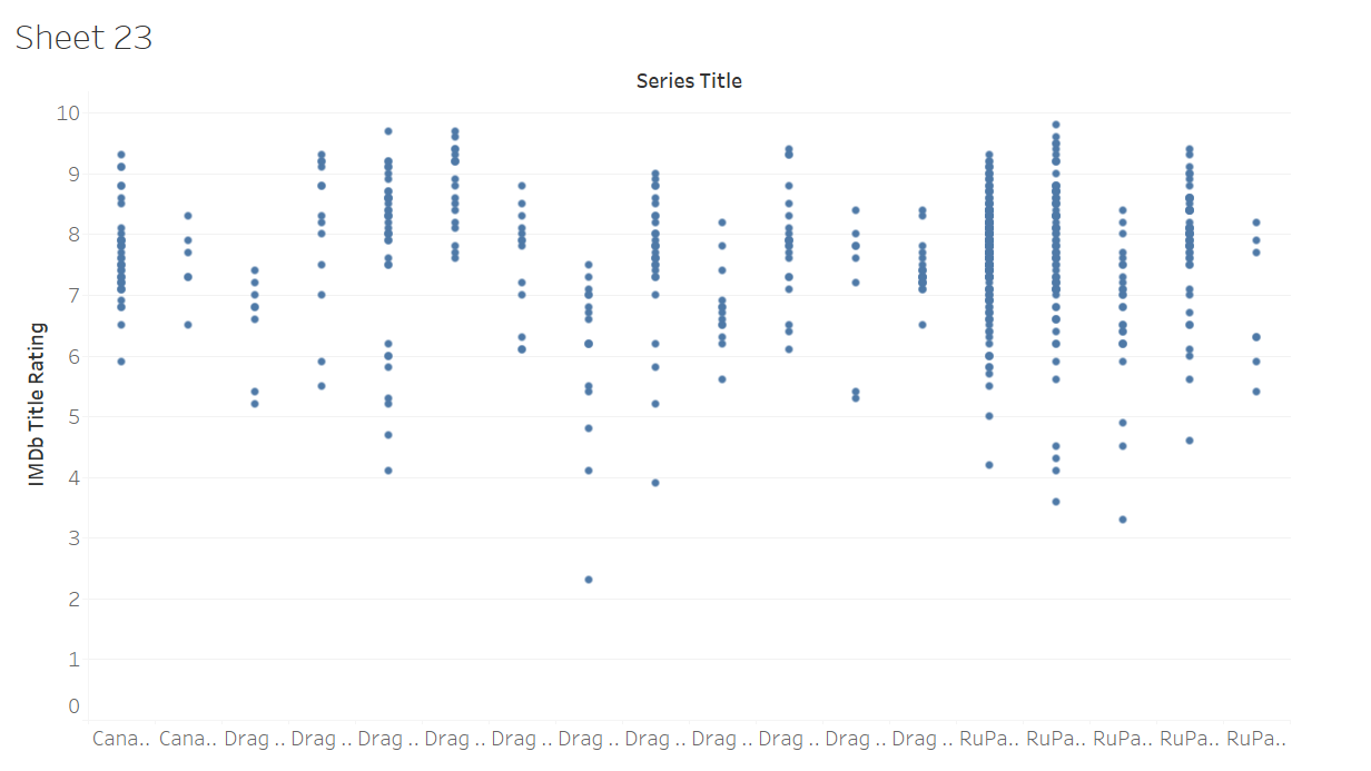
At this point your chart should look something similar to this:
At this point in time we haven't told tableau what to split this apart by, so it is showing one mark for each of the dimension values. In order to split this up I will bring IMDb titleID, as this is unique for each episode, so will give us a single mark for each episode. The circles will probably be automatically set to quite a large size so we can reduce the size by clicking the size icon in the marks card. Now your chart should look similar to the following:
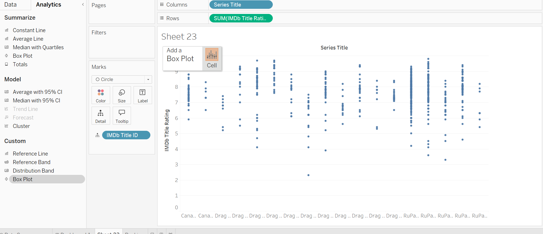
Now we have the basis to introduce the box plots into the view. At the top of the data pane switch to the analytics tab. Box plot should now no longer be greyed out. Drag this and hover it over the chart, a small box should pop up asking at what level you want your box plot to work. In this case there is only the option to do it over the cell, but in other circumstances you may have different options.
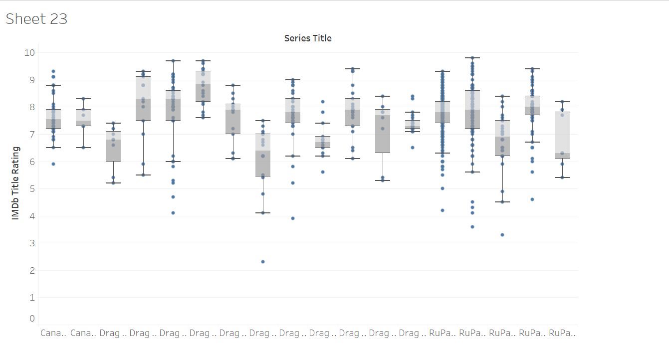
We now have our basic box plot! Now I will go through what formatting decisions I made to get to my final result.
First, right click anywhere on the sheet (not on a mark or box plot), and select format. Here we can switch between tabs in the format pane, to edit background, gridlines, text etc. For this chart I will make the background transparent and remove all grid lines. In general you can do this within the sheet tab, but a common error I encounter is that even with all grid lines switched off in sheet, the grid lines in the rows tab will remain switched on, so we can switch that off too. Later we will be adding reference lines so leave the Ref Lines option as whichever line format you like.
I will also set the text colour to one that aligns with my dashboard colour scheme.
Next, I notice that the axis label for my franchises are for the most part not visible. I can remedy this by rotating the labels, by right clicking on one of the axis labels and choosing rotate label.
Next, as part of my investigation I want to compare franchises where RuPaul is the host of the show, vs those where she is not. To do this I had already created a set that identifies which of the franchises RuPaul hosts, I can then drag this onto colour in the marks card.
Lastly I want my chart to have a reference line showing the highest rated episode and the lowest rated episode. Once again we will go into the analytics pane on the left, this time we will be choosing constant line. Drag this onto your sheet and add it at the table level. This will drop the line at a random constant value. Right click on the reference line and choose edit. Inside the drop down that is set to constant, change it to Maximum, the value drop down should now automatically set to IMDb title rating (or whichever measure you are working with), if not choose that from the drop down. I changed my label to custom and named this Top Episode. Repeat this for the bottom episode, by choosing minimum instead of maximum.
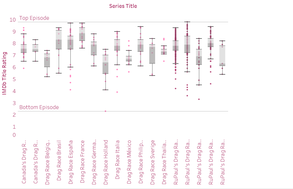
Congratulations! You have built your first box plot!