


Week 2 has now finished, and what a week it has been! An in-depth tutorial on sets, calculated fields and parameters have culminated in a presentation. The task: to improve our final interview visualisations.
Initially, I would like to show you the before version.
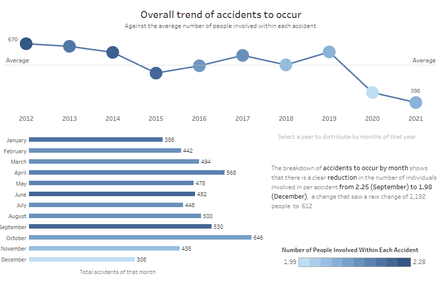
This view demonstrates a line graph describing the total number of accidents to take place in Austin between 2012-2021. This is then broken down into the total number of accidents to take place across each month of those years. While useful, this could be simplified with the use of calculated fields and parameter actions!
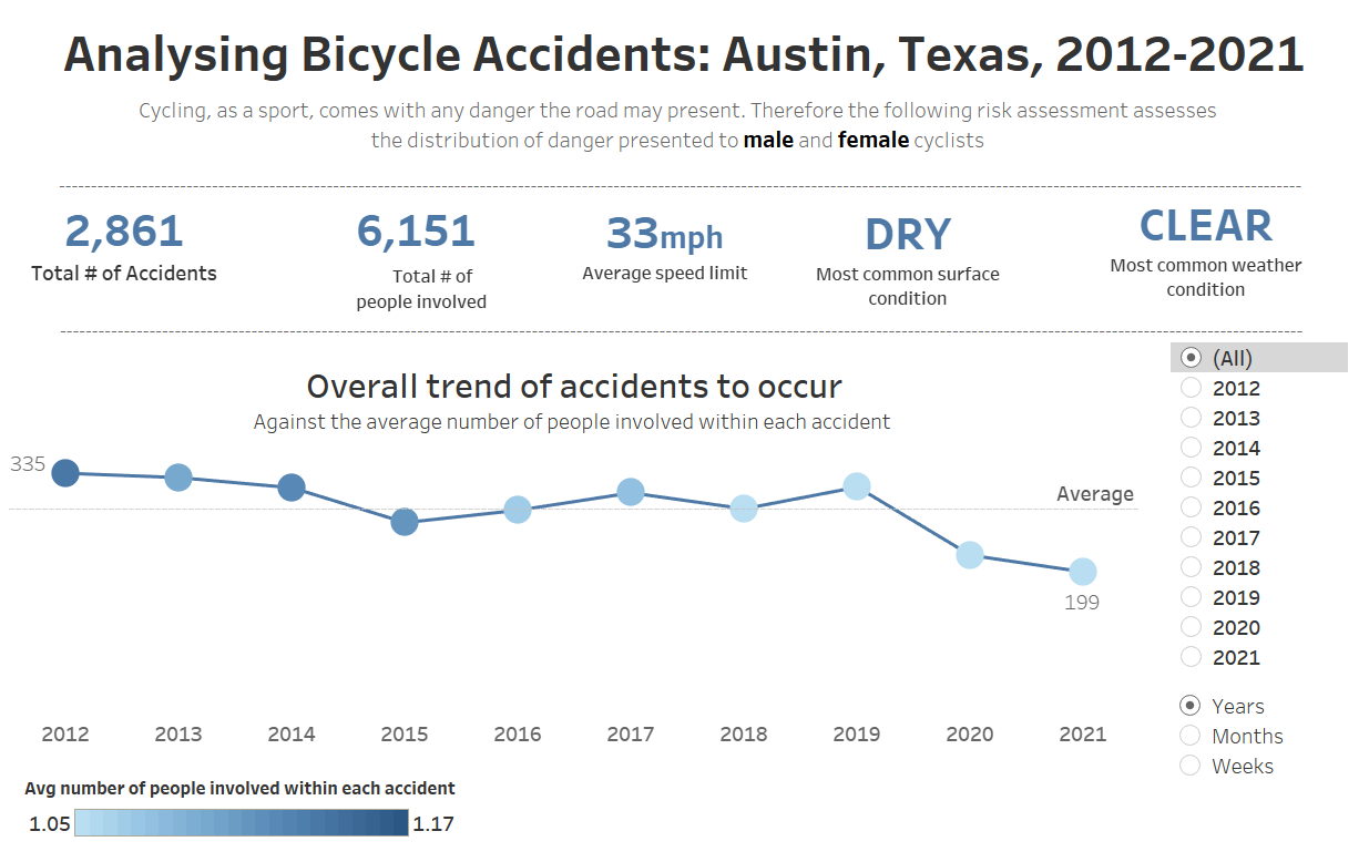
The latest version, I believe, is not only more concise but offers a more interactive format. This enables the user to be able to filter the data by year, month and week as well as the specific months and weeks of a particular year. This provides a more granular version of the data, as well as crucially removing some of the clutter that had previously occupied space on the dashboard.
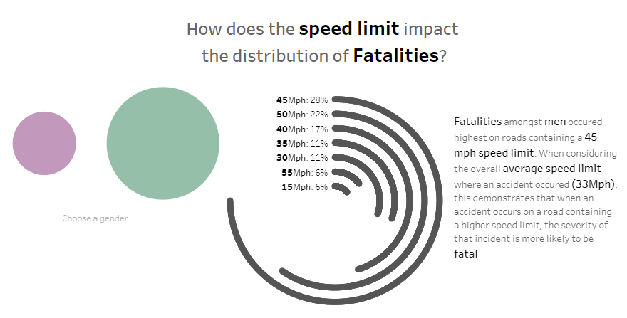
I then had to decide whether to keep the radial chart (breaking down the fatalities per speed limited area) or not. Although this showed a degree of complexity with regards to the type of bar chart I could use, the functionality of this chart is limited due to the lack of proportional representation of the data.
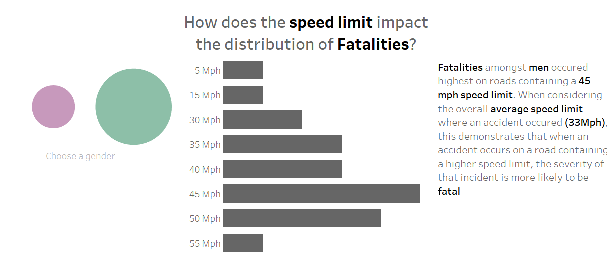
Therefore, the solution for this issue was to replace the radial chart with a regular bar chart. In terms of positives: This is proportionally representative of the data; it is sorted by the speed limit, instead of by the fatalities that occurred; and it is much easier to fix if it were to broke for whatever reason.
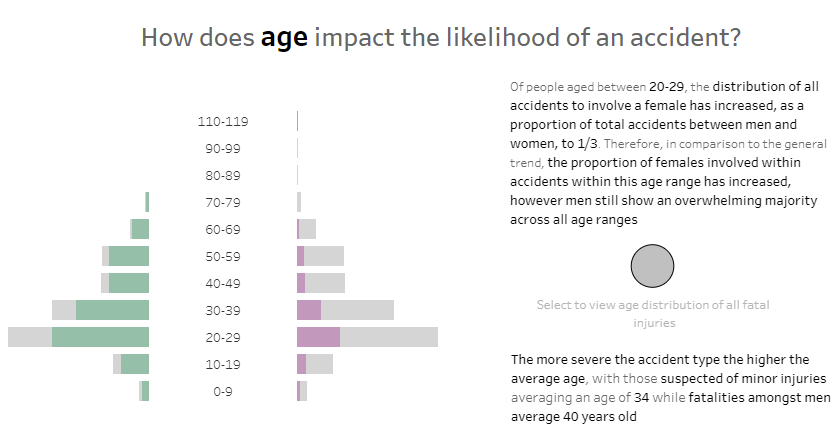
Lastly, as is highlighted in the text, I wanted to display the disparity between the average age for which a fatality to occurred between men and women.
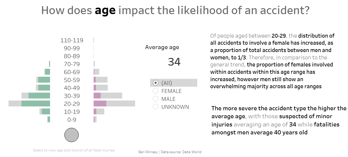
As we can see, I included a BAN highlighting this metric. The benefit of which allows the user to filter the data between men and women against the average age of an accident as well as specifically for fatalities.
Overall, the new view is cleaner, more interactive and, crucially, more analytical based upon the user's preference of data granularity.