


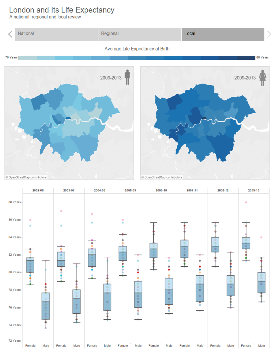
Below is an image of one part of my Data School interview viz.
I was looking to tell the story of the variation of life expectancy between different London Boroughs and also between genders. And one method I thought of doing so was by using a box plot showing changes to these variations over time.
Coach Kreibel, Info Lab founder Tom Brown and Robin Kennedy gave me some feedback about the viz during the interview.
One of the comments made was in regards to the use of colour, and that perhaps I could have used different colours between genders to allow the user better recognition. I explained that whilst I agreed and had actually tried, I could not do so because I could use one colour on the box-plot. With box-plots there is no built in function in Tableau that allows the user to colour by different dimensions as you can in other charts. The colour shelf in these charts represents the data points and not the boxes. Instead you can only format the box-plots, and only change the colour of all those on the chart at the same time.
Andy, Tom and Robin immediately recognised that whilst it wasn’t an obvious, easy change (for an individual with a days worth of Tableau knowledge), it was definitely possible.
This week I finally got round to showing the improvements I made this work to Andy and this blog is how I went about creating my multicolour box plots.
The new viz can be found here on my Tableau Public profile.
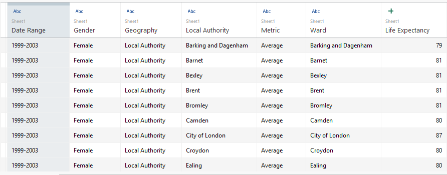
So originally our data was structured in the way outlined below, with ward level detail, gender, date range and of course life expectancy.
Now, whilst you can’t change the colour of box plots on the same chart, you can if they are on separate charts.
LIGHTBULB MOMENT – DUAL AXIS
It took me a while to get to this obvious conclusion, but hey, cut me some slack I was a brand new Tableau user.
So we need two calculated fields, one will have only Male values and one with only female values. With the null values, we can of course simply hide the values.
Below shows the calculation used and the data it provided me with.

Now it is a simple case of creating your dual axis chart, hiding the indicator and changing the colour of the box plots.
(the music was entirely accidental, but given I did not do a voice over on this viz I decided to leave it!)
Questions and comments welcome.
Ben
#VizLikeAnArtist