


One of the learning methods that we use at The Data School is through teaching others. Andy will give us a subject to teach, with little to no detail, and we are asked to produce a session to teach to our group.
Why do we learn in this way? Well at The Information Lab we have a motto, ‘teaching is learning’. The idea being that to teach a subject, you must first master it yourself! Teaching others then reaffirms your knowledge and questions from your peers challenge your mastery of the topic.
Why am I saying this? Well last week Andy challenged us to create a Pereto Chart, he had taught us the content before, we had remade them a number of times before but I simply couldn’t recall the process from my memory.
So, as you may have guessed by my ramblings so far (and by the blog title) I am hoping that blogging on the subject will have a similar affect as teaching. Thus enabling me to produce a Pareto Chart on request.
Ok, first things first, WHAT THE HELL IS A PERETO CHART? This was my first question to Coach Kreibel when he introduced the subject to us.
The principal is simple, it is believed that ‘for many events roughly 80% of the effects come from 20% of the causes’.
They are extremely useful in allowing business to quickly identify areas that need the most attention. They clearly illustrate to the reader which aspects have the greatest accumulative affect on an output.
So how do you make one in Tableau?
For those that wish to follow along, I’m going to be using the ‘Orders’ sheet from the ‘Sample Superstore’ data source that comes with Tableau. If you don’t have this then you can download it here.
Lets pretend we have two questions.
Firstly, what % of states represent 80% of total sales; and secondly, what % of total sales is represented by 20% of states.
A pareto chart will help us easily identify the answers to these questions.
Steps to creating a Pareto Chart:
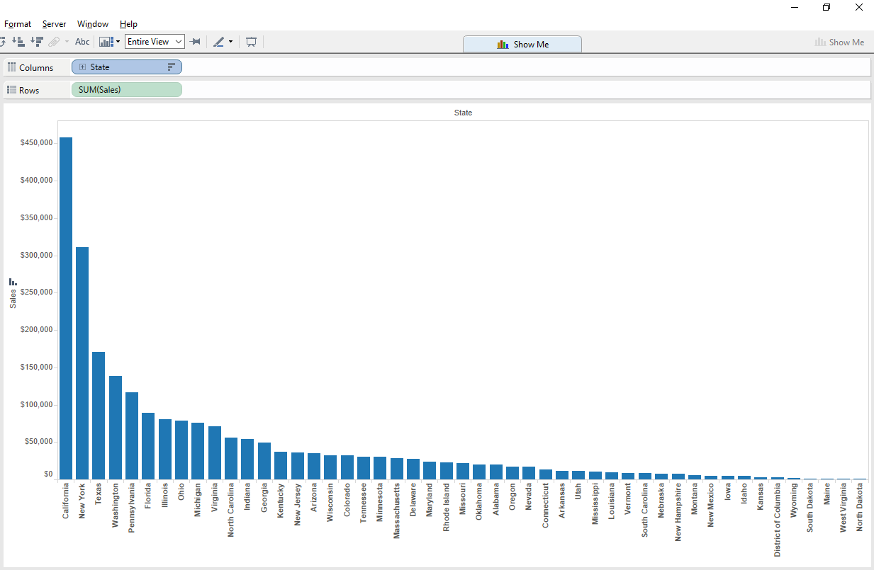
- Drag your dimension (in my case, State) to the columns shelf
- Drag your measure (in my case, Sales) to the rows shelf
- Sort your dimension by total sum of sales, in descending order
- On the tool bar select ‘Entire view’ (squishing everything into your view)
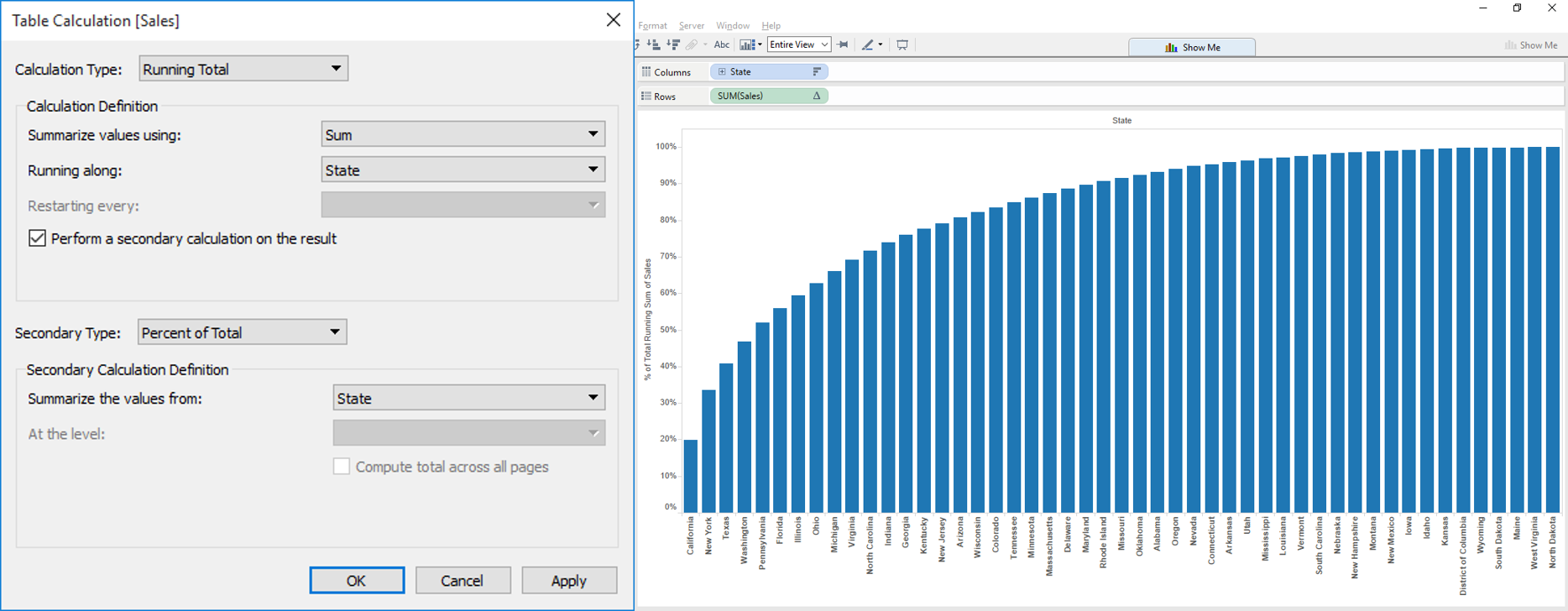
5. Add a table calculation to your measure pill. The table calculation should be configured as per the image below.
a) Calculation type: ‘Running Total’
b) Sumarize values using: ‘Sum’
c) Running along: ‘State’ (or your dimension)
d) Select ‘Perform a secondary calculation on the result’
e) Secondary Type: ‘Percent of Total’
f) Summarize the values from: ‘State’ (or your dimension)
Now at this point we are at a position to answer both those questions with a bit of counting of the number of states. However, what if we don’t want to count this ourselves?
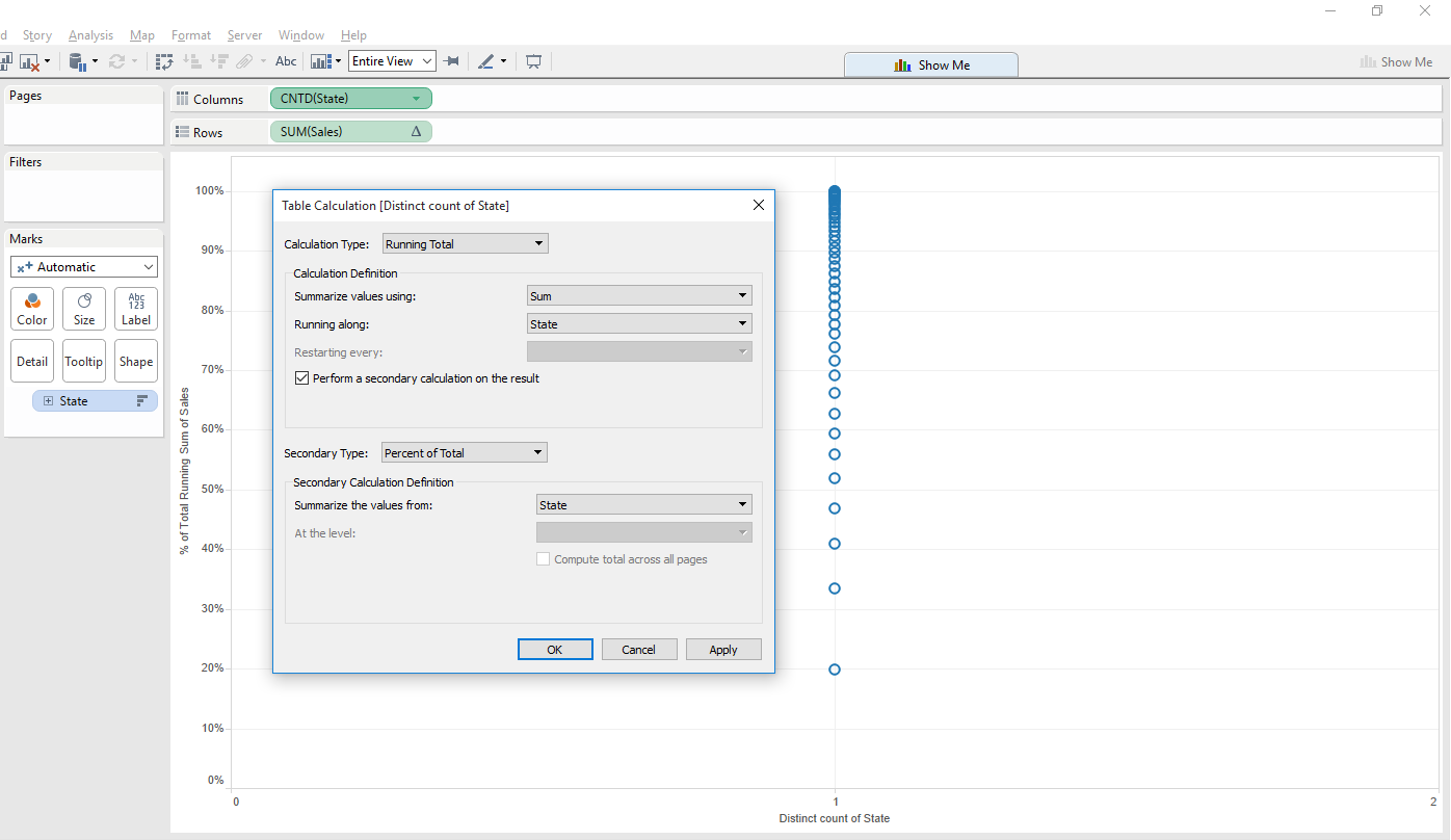
6. Duplicate your sorted dimension pill and place it on the ‘detail shelf’ on the marks card.
7. Change your pill on the ‘columns shelf’ to a count distinct of the dimension (change to a measure and then select count distinct from the drop down).
8. Perform an identical table calculation to the one previous, but now on your count distinct of dimension. The table calculation should be configured as per the image below.
a) Calculation type: ‘Running Total’
b) Sumarize values using: ‘Sum’
c) Running along: ‘State’ (or your dimension)
d) Select ‘Perform a secondary calculation on the result’
e) Secondary Type: ‘Percent of Total’
f) Summarize the values from: ‘State’ (or your dimension)
7. Change the mark type to either bars or area, depending on your preference.
8. On the ‘Analytics Pane’ drag a constant line onto both axis. Set the constant line on the y axis to 0.2 (20%), and the constant line on the x axis to 0.8 (80%).
Your Pareto chart is now complete. In my example I have annotated the points to give me the answers to the questions initially asked.
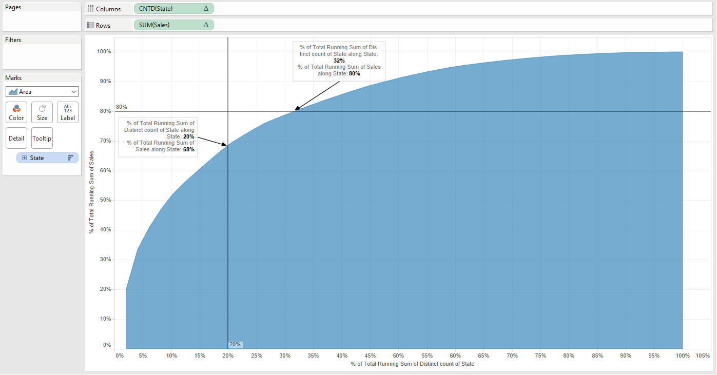
What % of states represent 80% of total sales: 32%
What % of total sales is represented by 20% of states: 68%
In the video demo below I have also added a calculated field which will allows me to identify the answers to my questions through the use of colour.
I hope this guide has been useful! Your feedback is welcome!
Ben