


So this morning I was thinking of what other aspects of tooltips I could blog about. Thinking of the content I had already produced I thought to myself ‘hold on, is it possible to use other chart types in tooltips’… well with some yes, others no. But here are my attempts…
(I would strongly advise that you read the blog from YESTERDAY before reading this as it will help aid your understanding)
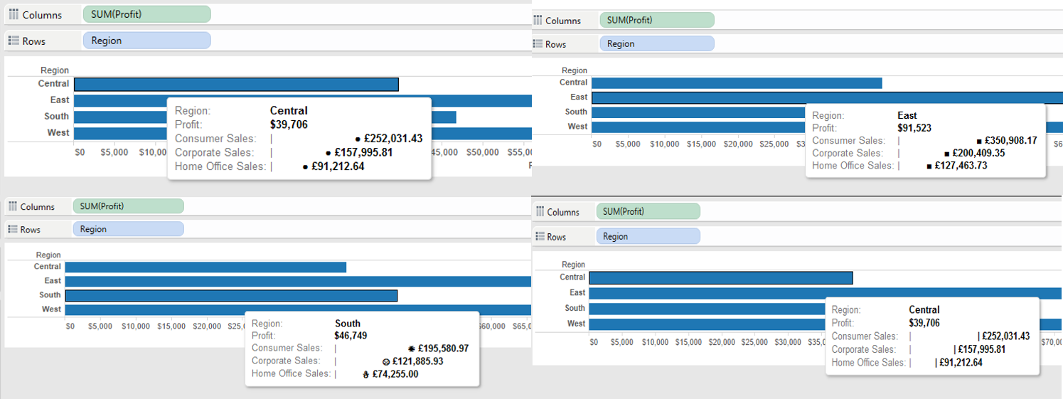
- Circle/square/shape marksLEFT(” “,ROUND((SUM([Dimension Member])/SUM([Measure]))*50)-1)+”●”
So the theory here is that instead of creating a bar by putting in ● within our LEFT function, we can actually just replace this with spaces ” “. We then take 1 value away from the total characters we are pulling from the left side of the string, why? well because we are going to replace this last character with our ● mark.
Now we know this, we can repeat it for square marks, or in fact any shape (providing Tableau recognises it as a character)…
LEFT(” “,ROUND((SUM([Dimension Member])/SUM([Measure]))*50)-1)+”■”
LEFT(” “,ROUND((SUM([Dimension Member])/SUM([M:easure]))*50)-1)+”☀”
- And here’s a lollipop-ish graph…
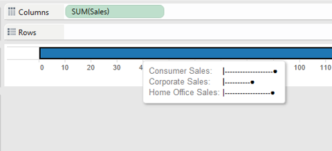
This uses the same method as above, this time replacing the spaces with – …
LEFT(“————————————————–“,round(SUM([Consumer])/SUM([Sales])*50)-1)+”●”
- Ok, so thats good right? Any more…well here’s a ghant chart based on min/max values.
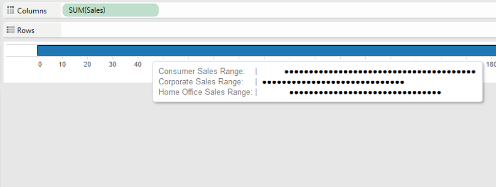
LEFT(” “,round(MIN([Dimension Member])/MAX([Measure])*50))+LEFT(“●●●●●●●●●●●●●●●●●●●●●●●●●●●●●●●●●●●●●●●●●●●●●●●●●●”,round(MAX([Dimension Member])/MAX([Measure])*50)-round(MIN([Dimension Member])/MAX([Measure])*50))
How does this work?
Again like yesterday I will split this into two parts…
Firstly…
LEFT(” “,round(MIN([Dimension Member])/MAX([Measure])*50))
So we are calculating the number of spaces that will be in place before the actual part of the chart you can see will begin.
So if our MIN value is 60, then this will pull 30 blank spaces from the left of this string (If we pretend our MAX value for all dimension members is 100 and remember we are multiplying by 50 in this example not 100, and therefor the value is half)
Secondly….
LEFT(“●●●●●●●●●●●●●●●●●●●●●●●●●●●●●●●●●●●●●●●●●●●●●●●●●●”,round(MAX([Dimension Member])/MAX([Measure])*50)-round(MIN([Dimension Member])/MAX([Measure])*50))
So here we are working out the difference between our MAX and MIN values for the dimension member, then we are taking this number of characters from our string… so if our MAX value was 80 and our MIN value was 60, then the difference is 20 and it will pull 10 ●’s (If we pretend our MAX value for all dimension members is 100 and remember we are multiplying by 50 in this example not 100, and therefor the value is half) from the string.
Now by Adding these two strings together we then get our ghant chart…
| ●●●●●●●●●●●●●●●●●●●●
- What about a line chart? No, definitely not!! I can point you towards fellow DS2 student Anuka Teggarts ‘hover graph’ blog though
- Pie charts? Don’t even get me started on them.
I hope you’ve enjoyed this 5 part blog series, i’m not going to say a complete goodbye to tooltip blogs as i’m sure there will be more from me in the future.
I’d love to here from anyone that has put together any other tooltip charts!
Ben