When working with big geo-coded datasets, points often become cluttered and overlaid when mapped, making it difficult to decipher meaningful spatial patterns that could lead to key insights.
In these scenarios, spatially aggregating data points into surfaces or bins will help tease the signal out of the noise. Meanwhile, in the process, aggregating will take the strain off your processor or server, by obviating the need to plot each individual observation.
This is the exact challenge I faced during my Data School application, where we were assigned the task of analysing Department for Transport road collision data over a 5-year window. With so many data points, finding and conveying interesting spatial patterns proved overwhelming.
Below was my final output. I stripped back the data to the most recent 6-months, and provided the user with the option of filtering by road class and accident severity. Although the filter options provided a means of teasing patterns out of the chaos, re-plotting several thousand data points each time made the process quite cumbersome.
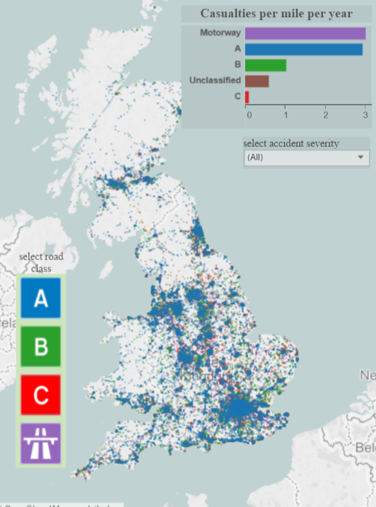
What I needed was some sort of way to extract order from the chaos by aggregating data points.
There are a handful of ways to aggregate spatial data. In this blog couplet I will demonstrate how to execute two of the most popular techniques, using Alteryx + Tableau.
In this particular episode: Grid Maps.
With Grid Maps, the idea is to divide a map into grid squares of uniform size, and bin individual data points into each of these squares. We can then colour-code squares based on the density of points within squares.
Here is my grid-map solution using the 2015 UK collision data:
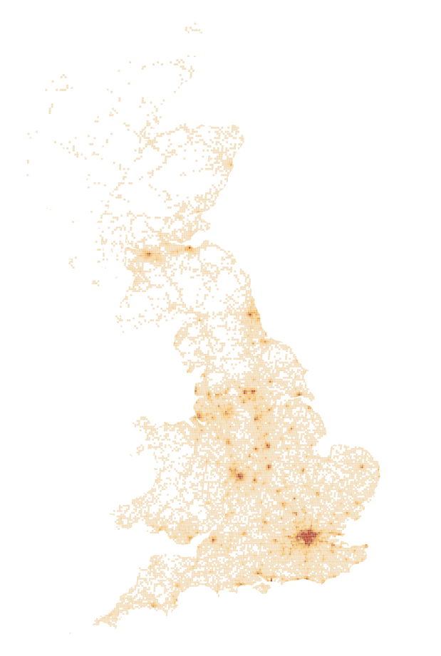
Grid Map of 2015 collision density based on 2 mile grid squares
Using this technique it is now much easier to identify collision hot-spots. They appear as darker blotches of colour (resembling rust spots) on our map – around cities, towns and connecting roads. Meanwhile, paler colours – representing lower collision densities – have effectively mapped out the majority of UK’s road network. Since grid squares containing collision data have mapped out a recognisable shape of the UK, I made a design choice to omit squares without data – resulting in a sleek minimalist effect.
As well as improving legibility, this new map is much quicker to load, and is a lot kinder on the server.
Binning collision incidences into grid squares is a relatively simple task using Alteryx to perform our spatial binning, and Tableau to render this spatial transformation into a map.
In Alteryx
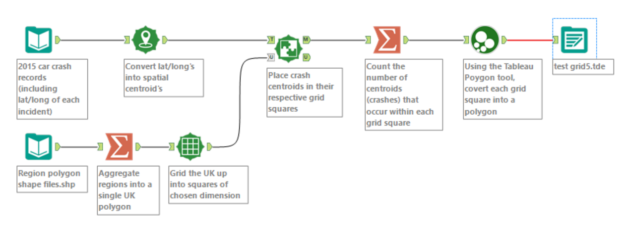
Alteryx workflow I used to transform the data for grid mapping
STEP 1: Firstly, I needed a single shapefile that represented the whole of the UK. On my hard-drive I already had shapefiles representing UK regions. I simply used a Summarise tool to aggregate these into a single polygon.
STEP 2: Then, I used the Make Grid tool to split the UK up into 2mile x 2 mile grid squares.
STEP 3: Using the Spatial Match tool, I placed centroids of collision incidences into the grid squares, and counted the number of collisions occurring within each square using another Summarise tool.
By only bringing the matched spatial records (M anchor) through for summarising (see workflow above), I am only selecting the grid cells which contain data. If I wanted to also plot empty grid cells on the map, I’d simply connect both M and U anchors in the Spatial Match output to the Summarise tool.
STEP 4: Before exporting these data to Tableau, I needed to convert the grid squares (which are currently Spatial Objects)- into sequences of lat/long’s that can be interpreted by Tableau, in order to reconstruct the squares as polygons. I.e. this means breaking each square up into a sequence of four points, and finding the lat/long for each point.
Luckily Craig Bloodworth has written a Macro that will do this for us. It is available to download here.
STEP 5: I exported the transformed data as a Tableau Data Extract
In Tableau
Now the data is fully parsed and transformed, visualizing it in Tableau is a doddle.
STEP 1:
In Tableau, double click the Longitude and Latitude fields in the data pane to bring the base map into the view. Then, from the drop-down menu switch the mark type to Polygon.
STEP 2:
Now, the Tableau Polygon tool has taken our grid square polygons and returned 3 fields, which exist in a hierarchy:
- Polygon ID – a unique ID for each of the grid squares
- Sub-polygon ID – in situations where polygons representing a geographical area are divided into multiple units (e.g. a single postal district that consists of both mainland and island areas), sub-polygon ID names different units within each broader polygon. In the case of grid maps, 1 square = 1 area unit. Therefore, this field is the same as Polygon ID, and not relevant here.
- Point ID – The tells Tableau the sequence of points that need to be connected to re-construct each polygon.
To reconstruct and overlay our grid squares onto the map, we simply need to drag Polygon ID to the Detail Shelf, and Point ID to the Path Shelf.
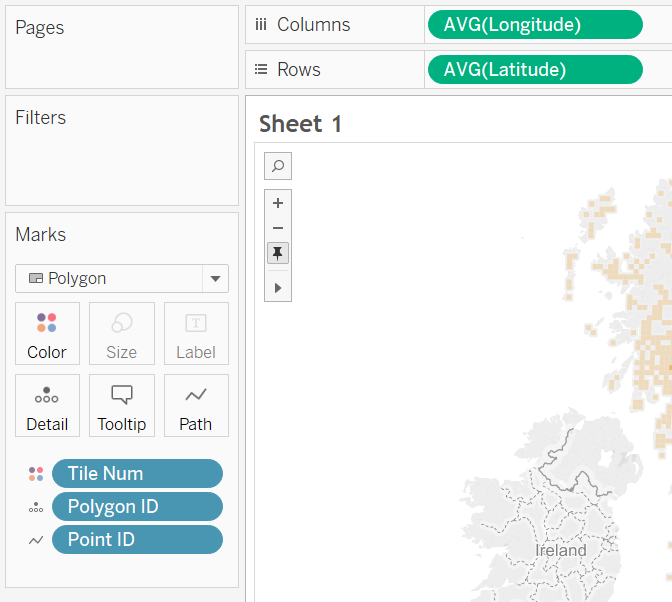
STEP 3: Finally, to colour-code grid squares by density of collisions, we simply drag the ‘Count (of collisions)’ field to the colour shelf.
Colour breaks
Optimising the grid map might require additional alteration of colour settings. I
In the case of the map above I have used a continuous colour scale, and simply reduced the upper threshold value for the most intense colour (from ~400 to 250 collisions). This way more collision hotspots become apparent – not just those in the biggest couple of cities.
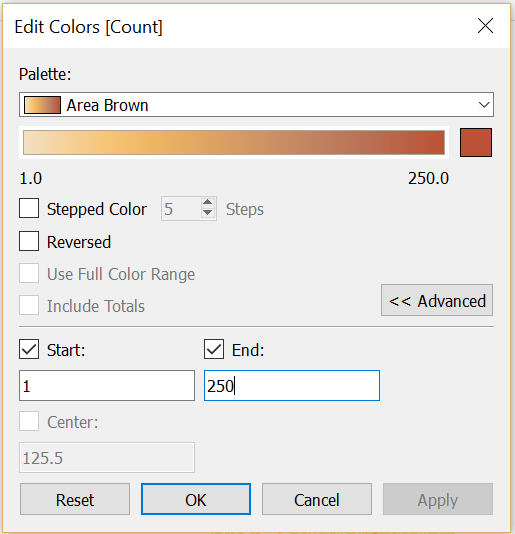
A more systematic method might be the use the Tile tool in Alteryx to split grid squares up into 4/5 groups of equal collision counts. These tiles would then become your colour classes in a sequential colour scheme, with each class containing an equal number of observations.
Anyway…..there are a multitude of ways to find optimal breaks in colour class for mapping. This is a story for another day, and I plan to cover this in a future blog post.
Resoltion
The map above based on 2 mile grid squares offers enough resolution to be able to interpret hotspots within cities and along motorways.
In some instances mapping at such a high granularity may add unwanted noise that does not contribute to meaningful interpretation of the data. In such a case, we would simply increase the grid size to further generalise the patterns.
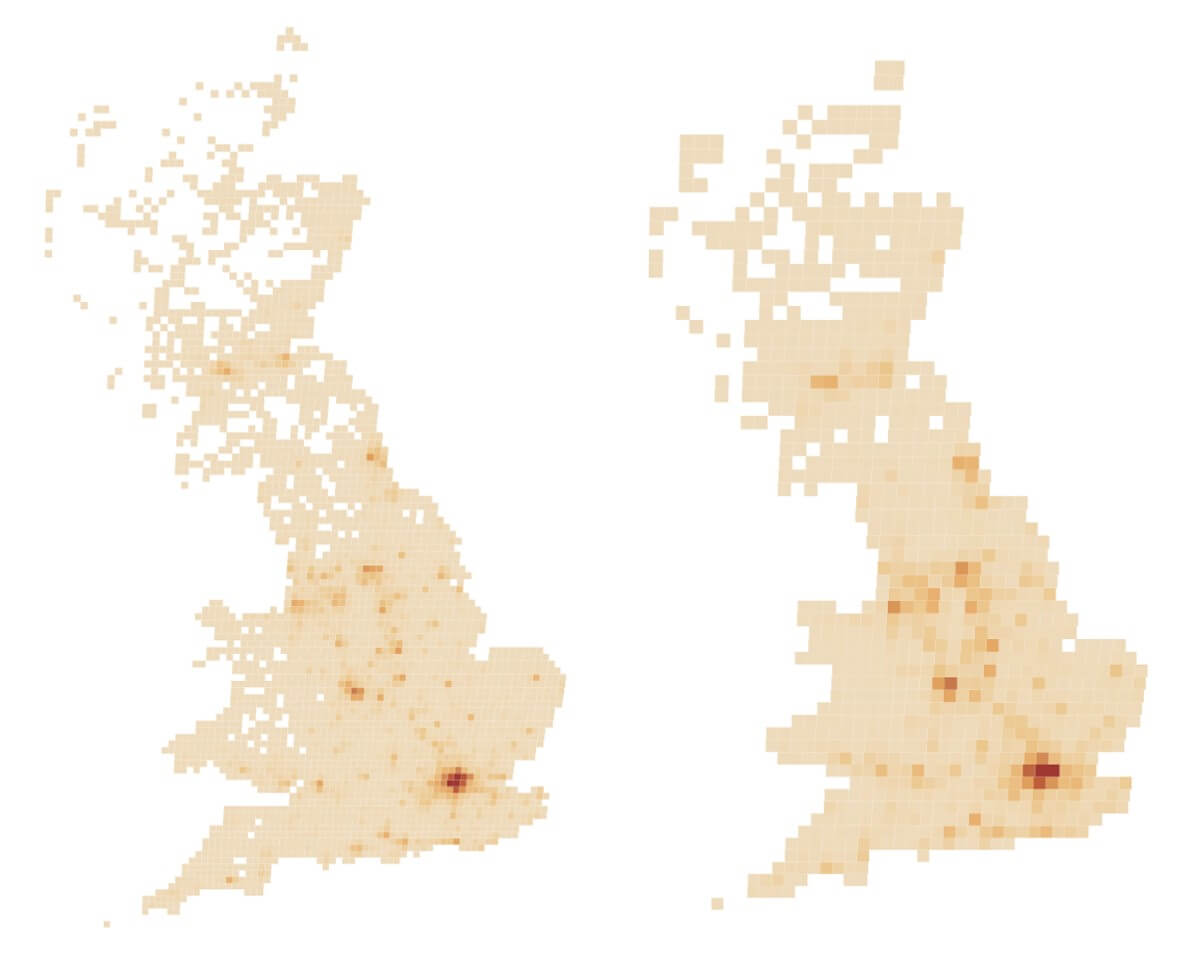
Map with 5 mile grid squares (left) and 10 mile grid squares (right)
Additional tip
Notice how the two maps above have jagged-y edges.
If desired, this can be fixed by ticking an option in the Make Grid tool called ‘Clip to polgyons’.

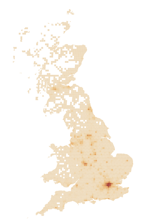
5 mile grid square map with ‘true’ coastline
This simply clips the grid squares along the coastline, to maintain the true shape of the coastline, rather than a pixelated approximation of it.
Part 2 – Heat Maps
