


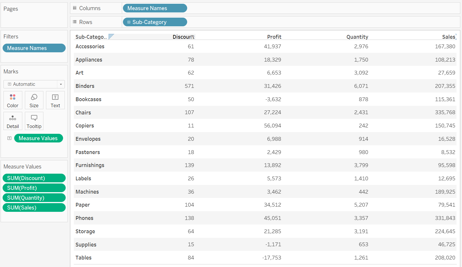
Tableau gives users an option to separate measures, making it easier to format different fields all in the same chart. It is particularly useful for profit/loss tables and when columns in tables need more formatting to keep them separate to view.
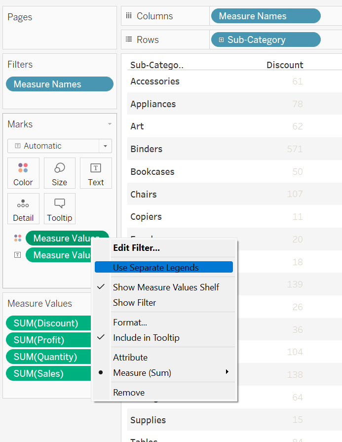
When a chart has multiple values, and the Multiple Values pill has appeared on the chart, Ctrl+dragging this to the marks card on colour, will set all the values as the same colour.
By right clicking the Measure Values on the colour marks and selecting Separate Legends, the individual values in the Measure Values marks card will split into individual legends, by default, appearing on the right hand side.
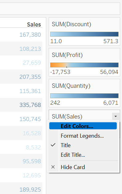
Clicking the drop down will give an option to change the individual colours. The user can also choose their own colours and their own colour divergence to fit with their dashboard design.
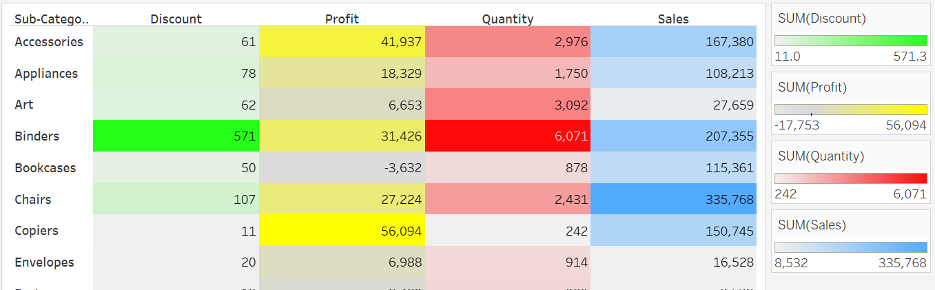
In this particular example, changing the chart to a square chart, will make the effect more clear. Be careful with colouring charts and make sure the best practices are followed to really drive home the effect!
Beau Foletti | DS33