


Our challenge for the last two days of dashboard week is to create a visualisation using IMDB data for the Data + Movies competition run by Tableau.
This is an exciting challenge as it allows us to pair our analytical and creative skills.
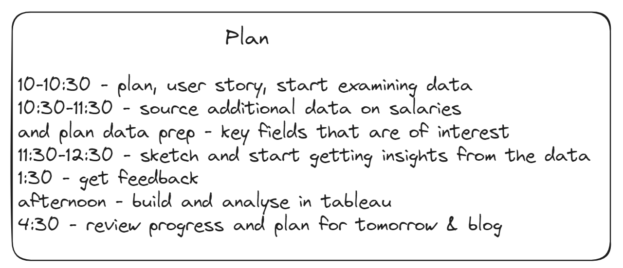
On Thursday, we started on the challenge itself a little later, at 10am, and had to scope out the project and pick our topic in the first half an hour. So my plan for the day was as follows.
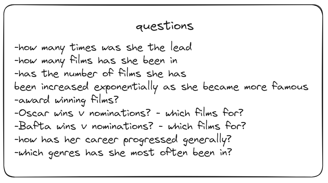
My chosen topic of analysis was the career (through film) of Meryl Streep. As this is a little bit different to usual dashboarding / analysis I am used to, I found it more helpful to start with a list of potential questions rather than a sketch of the visualisations.
By the end of the first day, I completed all of of the data preparation and started trying to answer some of my questions.
Day 2 was largely spent on building the dashboard and on design. I wanted to use the second day as an opportunity to expand on my design skills by using Canva to compliment my tableau work. I found it really difficult to sketch what I wanted the visualisation to look like without trying out different layouts in Tableau, so it ended up being quite an iterative process. Once I had decided on the flow of charts and knew what the size of the dashboard would be, I could spend the remainder of my time in Cava designing the background of the dashboard, which I had to test quite a few times to get the alignment right.
The Result
You can see it for yourself here!
And that is the end of dashboard week, and more importantly, our training. So happy to have reached this milestone at the Information Lab!