Day 2 of dashboard week is all about building templates. The task is to build two templates, one in Tableau, using sample superstore data, and one in Power Bi using HR data.
My plan for the day was as follows:
- 9-9:30 - examine data, brainstorm, look up examples, and start thinking about the blog
- 9:30-10:30 - sketch out plans for both Tableau and Power Bi and get feedback
- 10:30 onwards build templates based off sketches and document along the way
- pre-lunch - review progress
- post-lunch finalise templates and finish blog
The planning
As part of my planning, I worked out what some of the key, basic aims would be for both template dashboards. For the Tableau dashboard, the users I had in mind were looking for a dashboard which gives them a monthly breakdown of sales and profit performance overall for the executive team and can be filtered to a specific state so that 'state managers' could see sales and profit only relevant to them. For the power BI dashboard, the aim and purpose of the dashboard was for the HR department to see the number of new hires at the end of the month, alongside their demographics. It also allows HR to filter to a specific department and drill-through to their overall demographic statistics.
The sketches
I spent the morning sketching the dashboards based on the user I had in mind for my template.
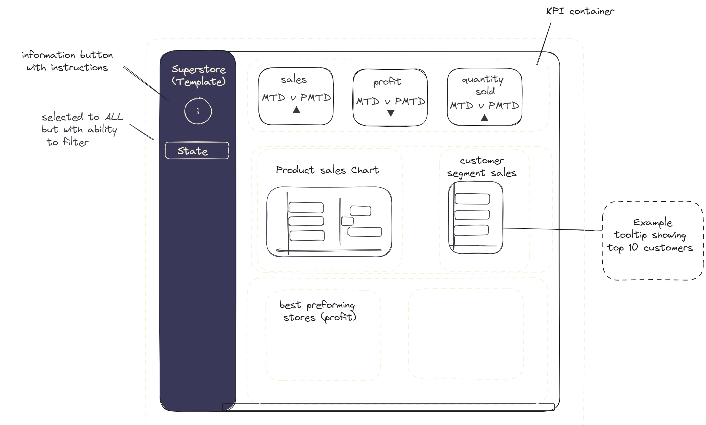
This was my Tableau sketch.

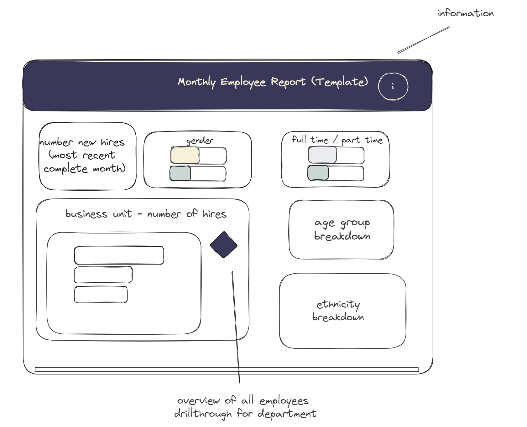
And this was my Power Bi sketch

I tried to keep the colour scheme consistent across both templates.
As I began building the templates, a few of my chosen 'example' metrics changed, but the format stayed largely the same.
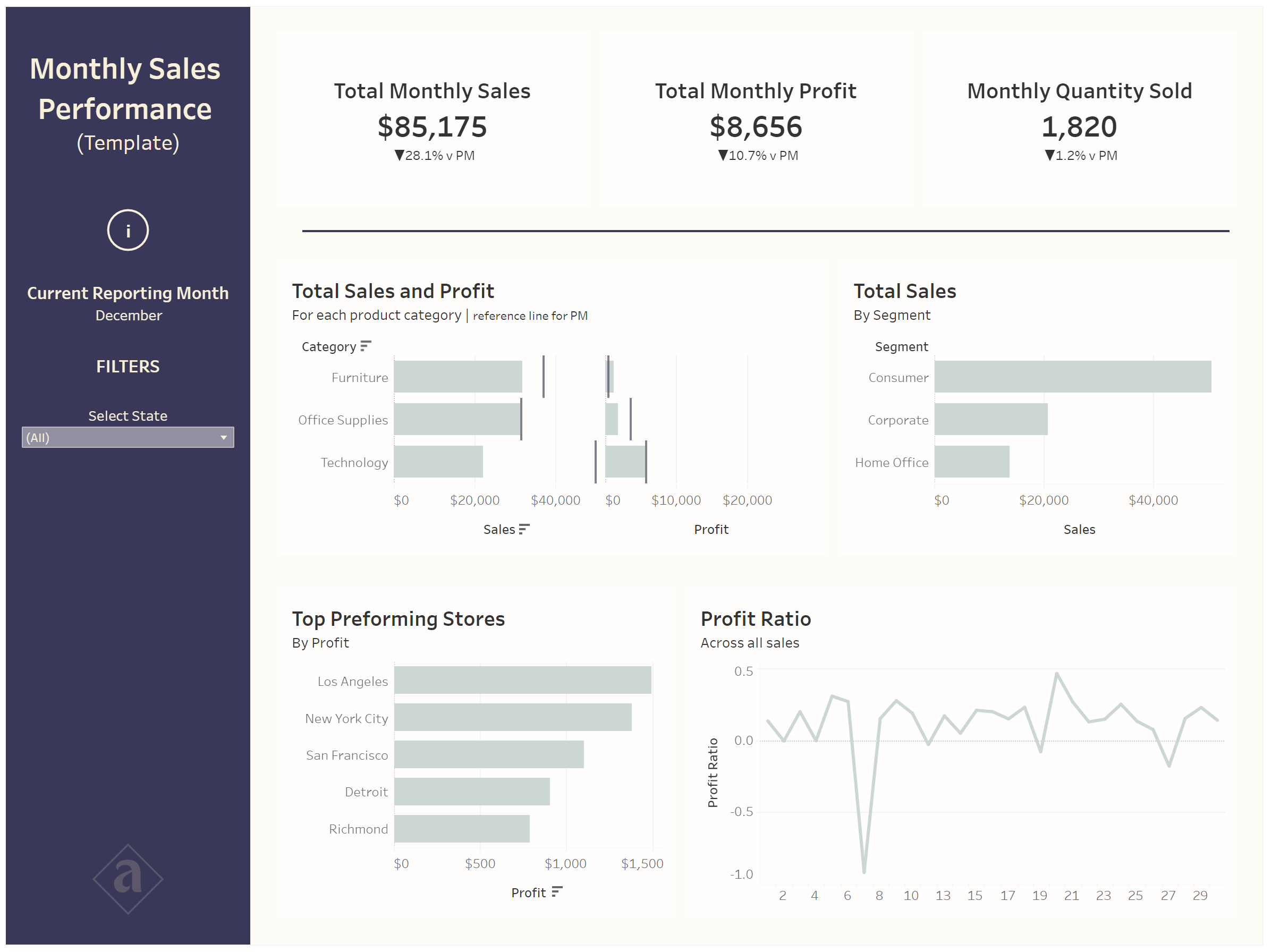
Tableau outcome

Power BI outcome
Reflections
I find creating templates quite fun and interesting, however, it is difficult to know where the line stops between creating useful sample charts and going too far (by adding calculations) as the sample charts may not actually be used by the user.
Bring on day 3!
