


Dashboard week has begun!
The theme for the first day is accessibility. We started the day with two hours of teaching on accessibility for different audiences. Following this, we each received a task with different accessibility requirements. The scope of my task was to create a dashboard pitch for public sector procurement, specifically for the Department of Health, using Covid-19 Data. The aim was to make the dashboard accessible to as many people as possible, adhering to the Web Accessibility Guidelines.
As we had four hours for this task, I only created a rough plan, without timing breakdowns. It was as follows:
- Look up examples of the UK Gov Website / Government reporting on coronavirus
- Look up a summary of web accessibility guidelines
- Sketch the dashboard with some labelling of key design choices
- Examine the data
- Build the dashboard
I spent an hour on the first four bullet points, with the remainder of my time spent in Tableau building the charts and formatting the dashboard.
Below is my plan. As you can see it is not very detailed as the main aim of it was to have a layout to follow and an idea for each chart.
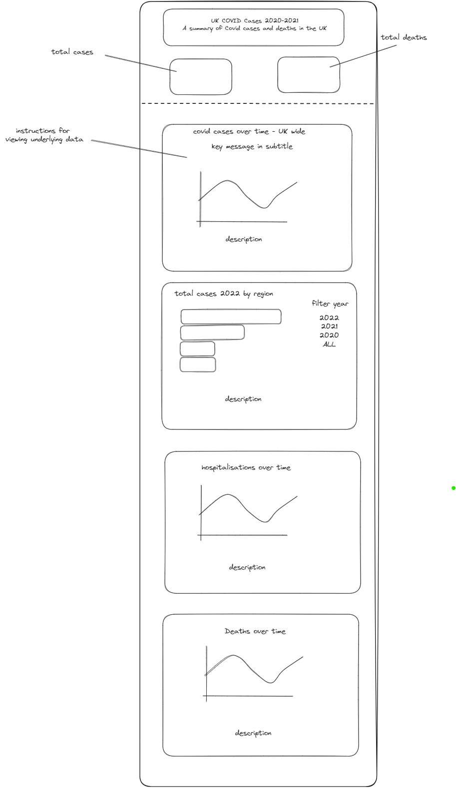
Even though the plan was not very detailed, it helped keep me focused to the task, and my final dashboard had a very similar layout.
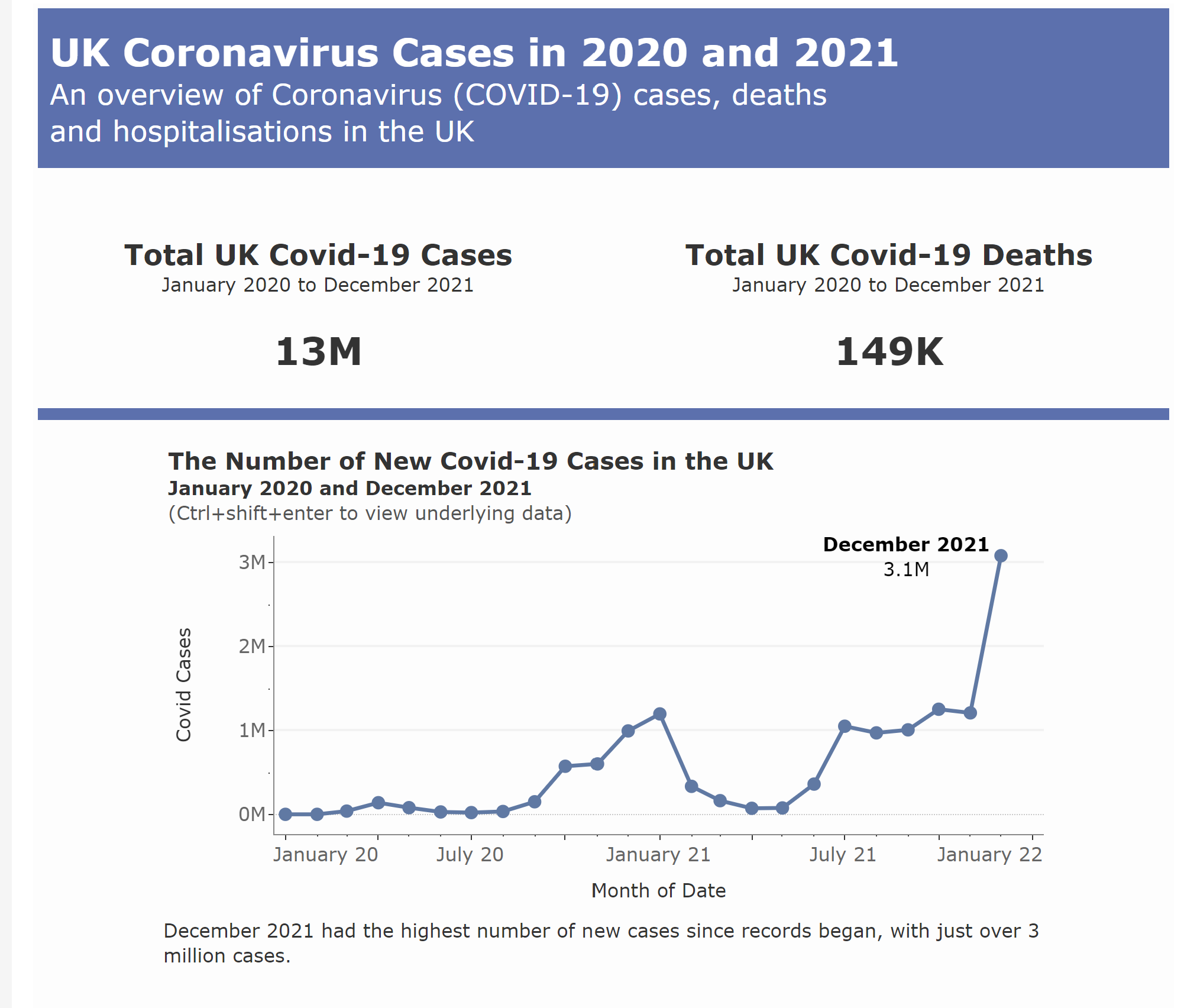
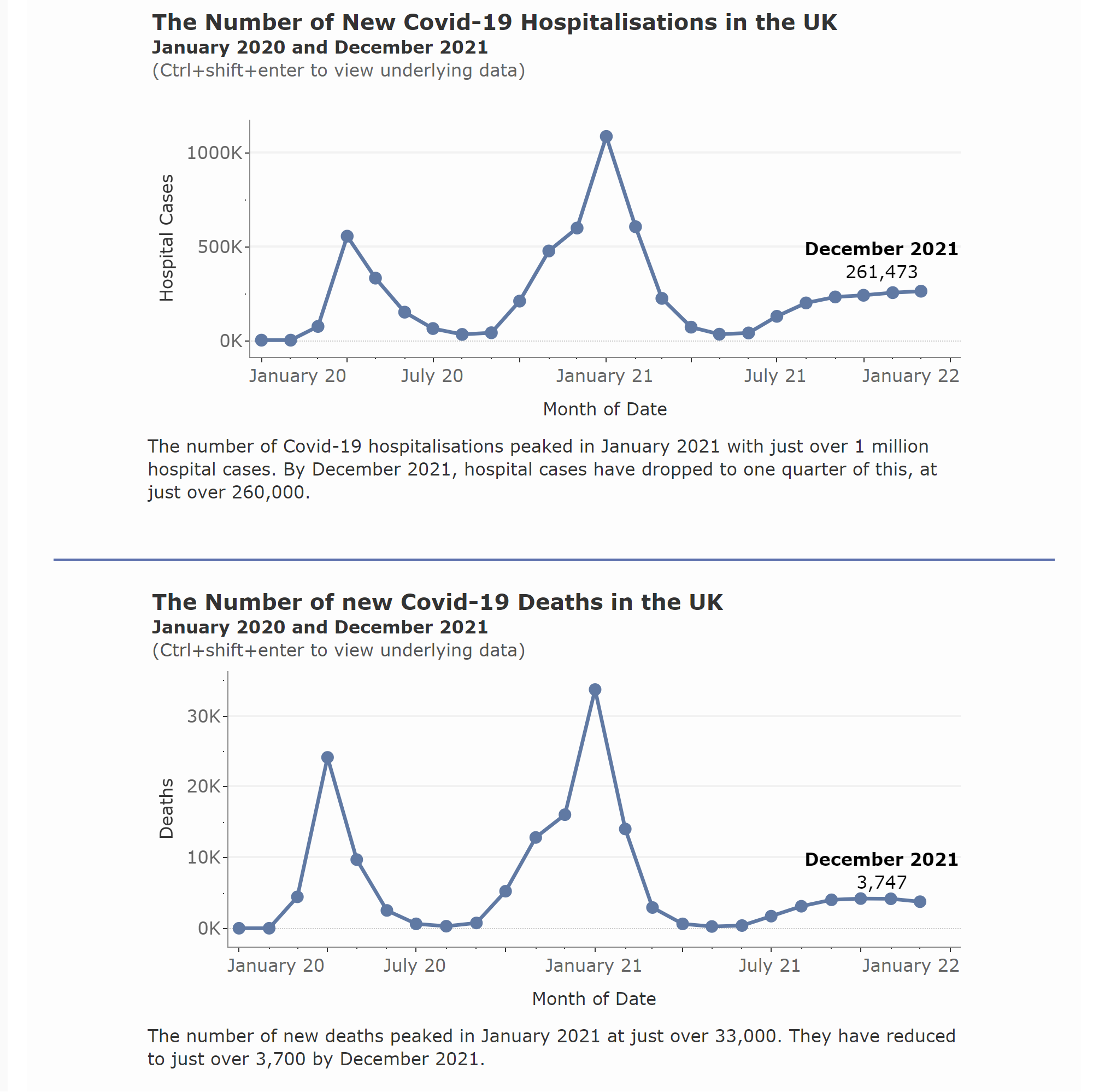
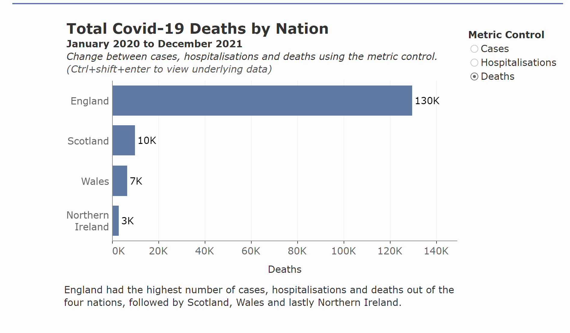
Some of the key things I considered when making this dashboard were:
- Font size minimum of 12 for all text (including the axes labels)
- Limited use of colour (primarily sticking to the colours on the UK Gov Website of white, black and blue)
- Using off-white and off-black shades throughout to reduce contract, whilst also checking contrast between the blue and white title to ensure it had high contrast.
- Using circle marks on the line charts to make it clear to the user where the individual data points are.
- Labelling of the most recent data point to provide quick insights on the current status.
- Bold titles, subtitles to give additional context and captions providing additional information.
- Alternative Text on the BANs (additional alt text would have also been added to the charts if time allowed)
There were many additional things I wanted to consider and/or missed. However, I think the end result has been a good starting point and taster of the considerations you need to make when working to make your content more accessible.
One of the key reflections from this challenge was just how overwhelming the website accessibility guidelines can be, as they go into very specific detail on every element. This made it difficult to know whether I was going far enough with any adjustments I was making. However, I found looking at good practice examples really helpful and this made the process less overwhelming than reading through pages of guidance during this time pressured task.
Let's see what day 2 has in store!