A pretty common usage of parameters is changing the size and colours of bars or lines. You can then take it one step further and change the label based on a hover.
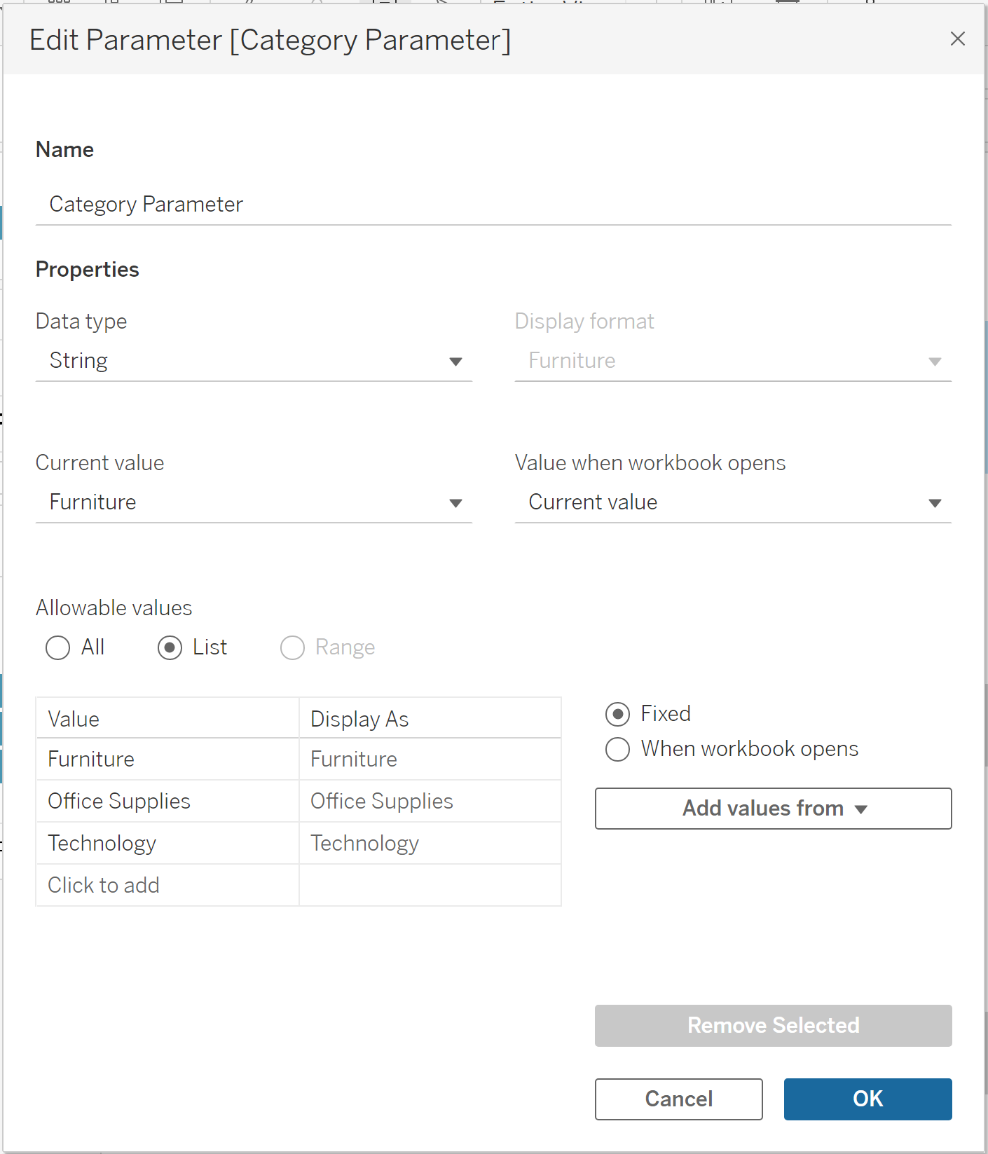
First we need to make the Parameter. The example I'm giving here is based on the Sample - Superstore data and I'm looking at Categories. Click the dropdown arrow in the data pane and select Create Parameter. I'm going to label this "Category Parameter", select string as the data type, select list and then add values from the Category field.
In order to change the bar colour and size, we need to create a calculated field that returns a Boolean value. For this demo, I'll keep it simple and type the following:
Highlighted Bar Colour / Size:
[Category] = [Category Parameter]
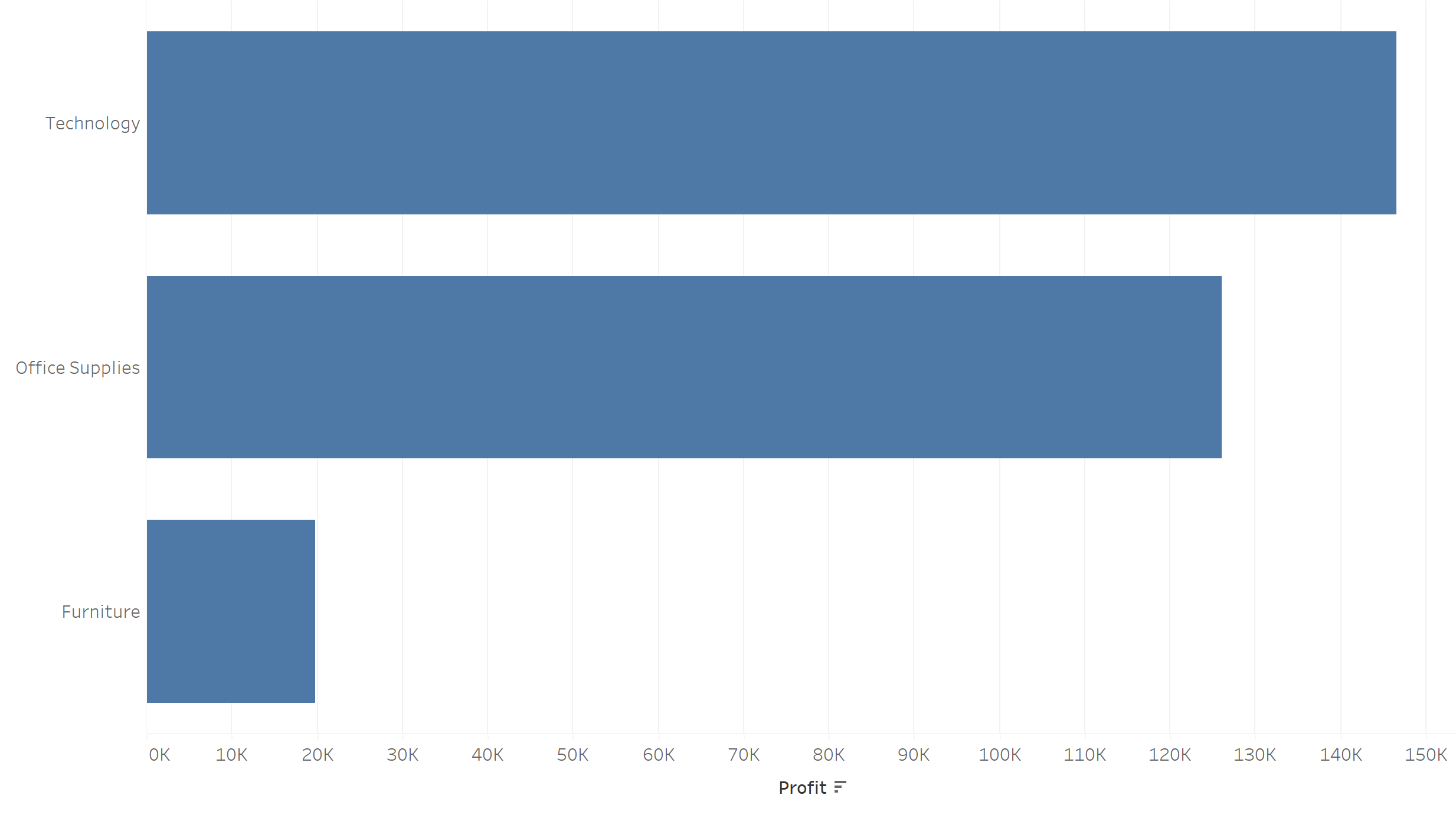
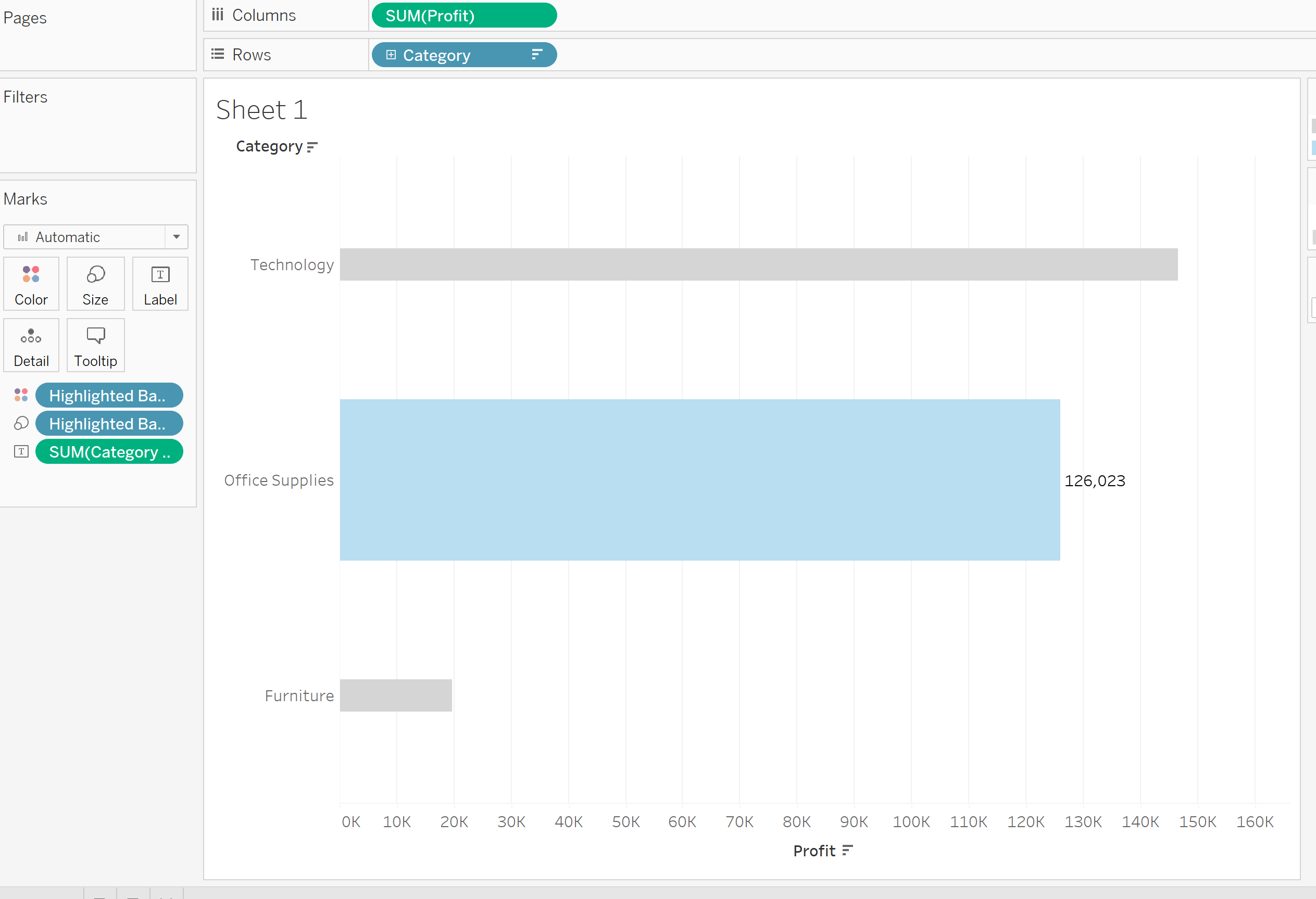
Next, drag your metric to columns (here I'm choosing Profit) and Category to rows. I like to click the little sorting button to arrange the Categories in descending order of profit and set to entire view. You should end up with a bar chart that looks like this.
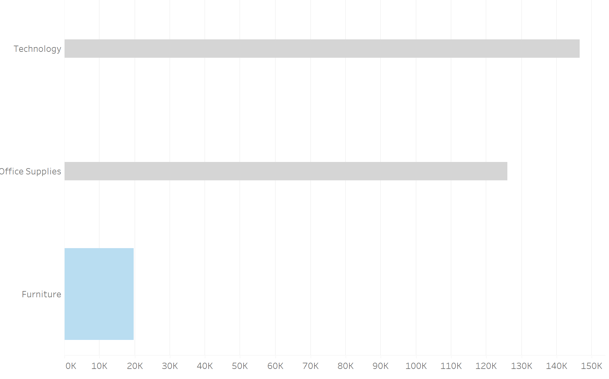
Go ahead and drag your Highlighted Bar Colour / Size field to colour and size on the marks card. Change the colour and sizing options however you like, I'm going for grey and blue. You should end up with something like the below.
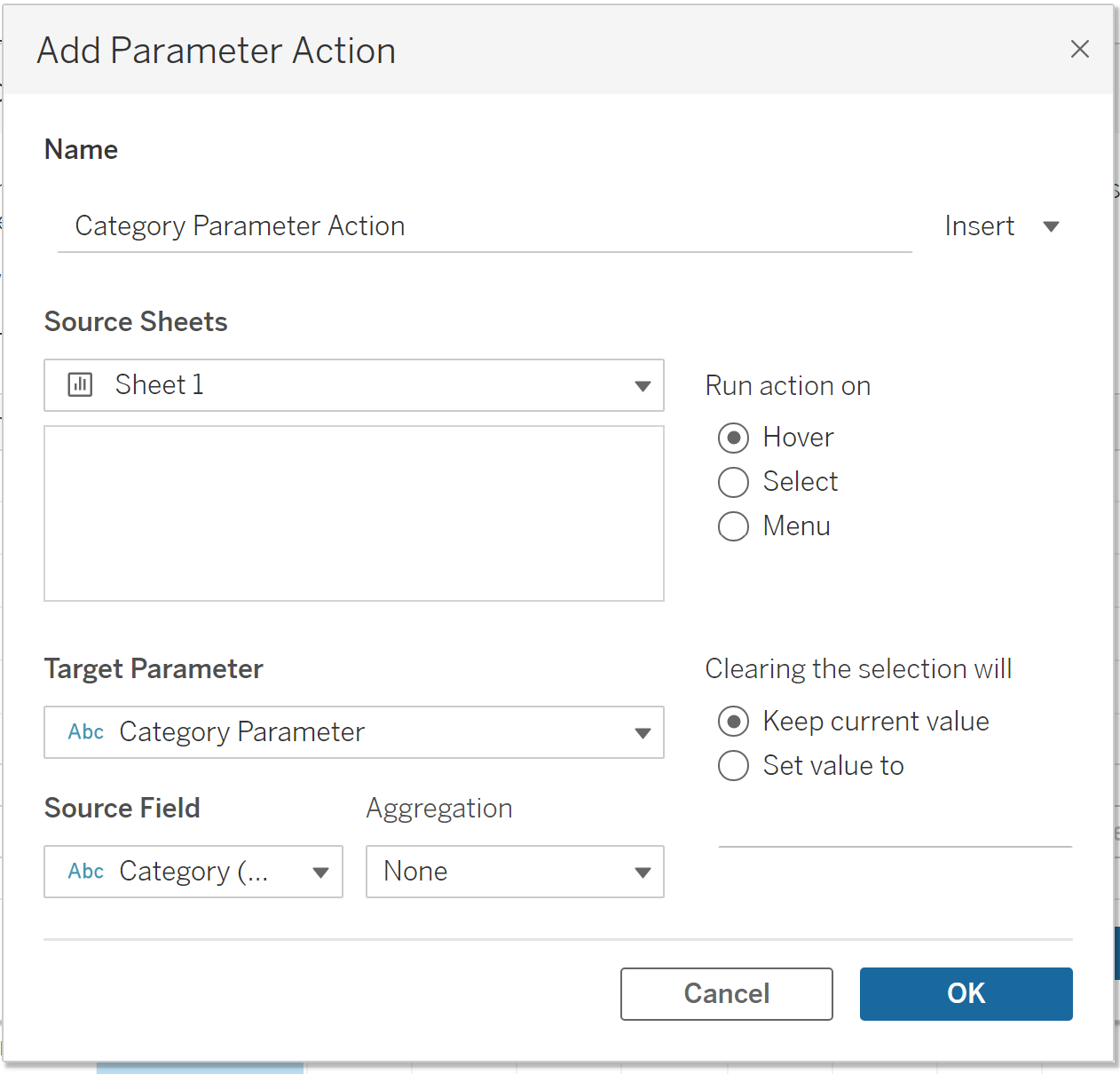
Next, click Worksheet -> Actions -> Add Action -> Change Parameter. I'll give the action the name Category Parameter Action. Make sure your current worksheet is selected, choose Category Parameter as the Target Parameter and Category as the Source Field. Underneath Run action on, I'm going to select hover - although this depends on your preference.
Now, when you hover over your categories in the view, the size and colour should change accordingly.
If we want to go one step further, we can add a label that also changes with this parameter. We've already made our parameter so we can skip straight to creating the calculated field. Type in the following:
Category Label:
if [Category] = [Category Parameter]
then [Profit]
else NULL
end
Drag this field onto the label in the marks card. Since we've already created the parameter action, we're all done! You should end up with something like the below.
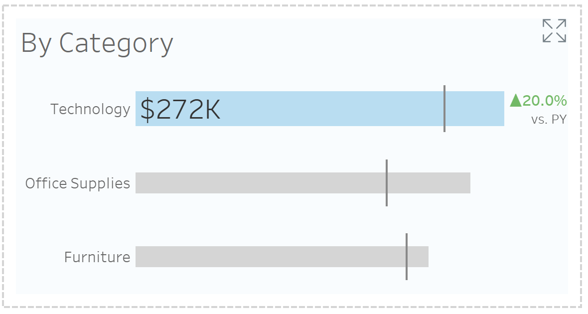
I encourage you to go further and experiment with this. I chose to have my bars represent the current year and bring in a dual axis to have a Gantt bar represent the previous year. Some time spent formatting later, and here is my final result. (Note my metric here is Sales).