


In the second week of Dashboard Week, we received a dataset representing notable people across various historical periods.
https://medialab.github.io/bhht-datascape/#authors
Because the dataset contained around 2 million data points, it was clear from the start that we had to focus on a small subset. A recent event that stuck with me was an attack on Muslim life in England
(https://www.bbc.com/news/articles/cx2x9j1en29o).
Based on this, and the fact that we have a dataset featuring notable people, I wanted to challenge some of the narratives that might be circulating. I decided to shed more light on Muslim life, with the Islamic Golden Age serving as a prime example.
To bring the data and the user story together, I looked for inspiration on how to implement this and stumbled upon a visualization by Kimly Scott.
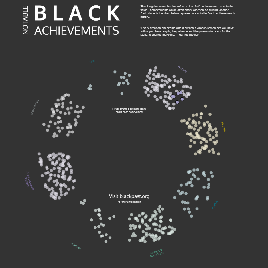
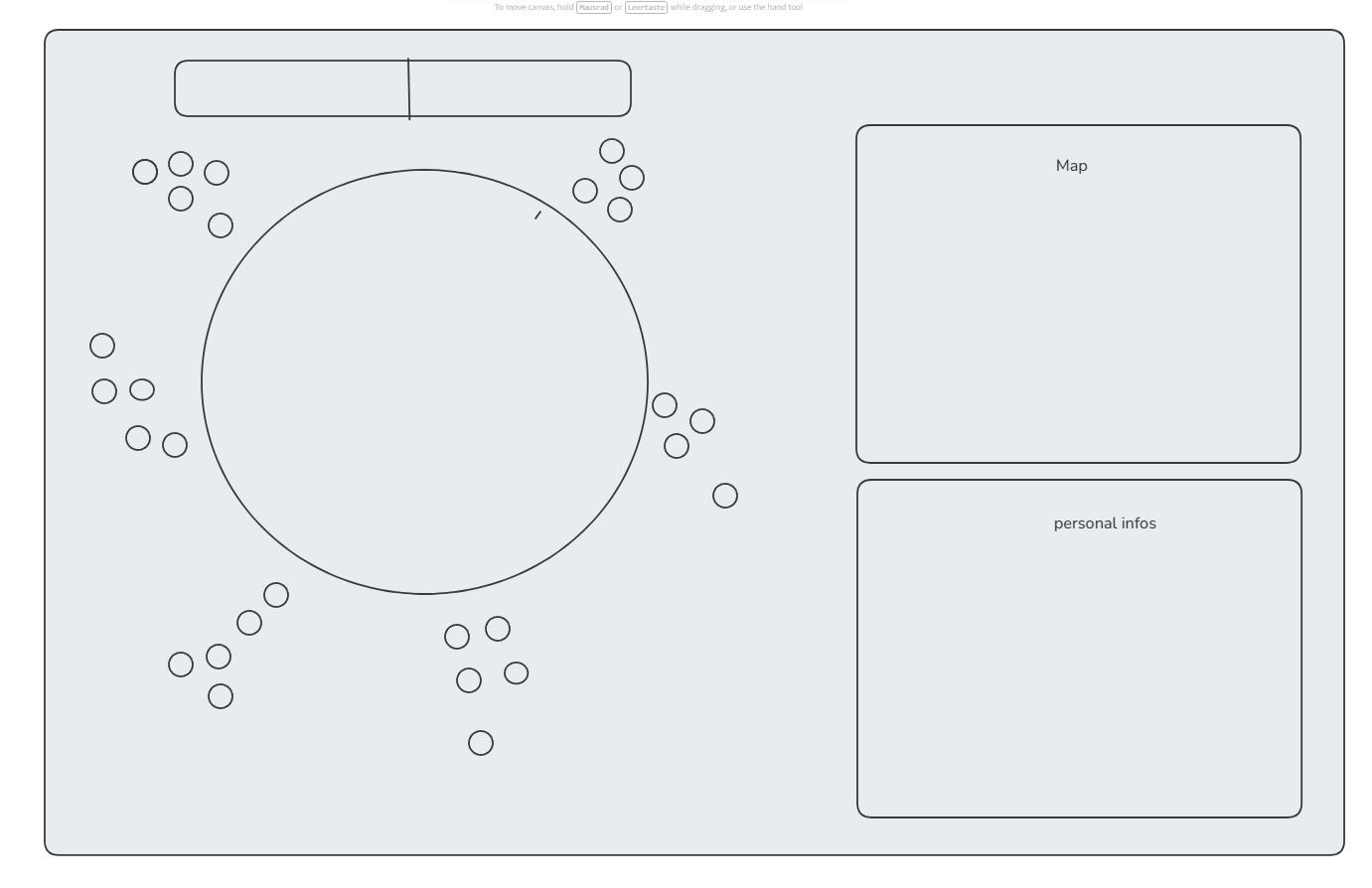
Consequently, I want to display the Top X most-viewed personalities of the Islamic Golden Age across various categories. To support this, I will include a map and additional information about the selected personality.
While the vision was set, the question remained: how do I extract the right personalities from a dataset of around 2 million entries? The answer? Filters. A lot of filters…
- Time Period Check (approx. 600 – 1350 AD, including a buffer for the era)
- Topic = "Discovery/Science"
- Historical Kinship Prefixes
- Every Arabic Article & Its Assimilations (Sun Letters)
- Word Roots & Theological Proper Names (including virtue prefixes)
- Female Scholarly Icons
- Scholarly Titles of Honor
- Expanded Latinized Chronicle Names (the interface between West and East)
The result is a list of 542 personalities, grouped into 7 overarching fields.
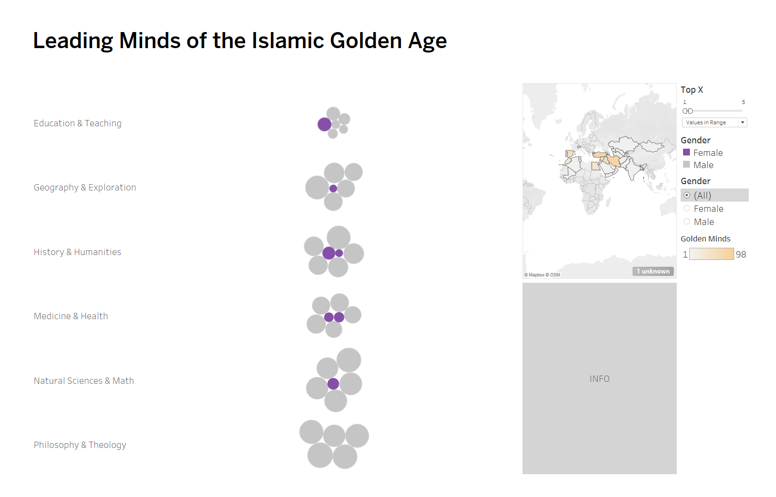
Next Steps: Correctly arranging the data points as shown in Kimly Scott's visualization. Additionally, it would make more sense to use Latitude and Longitude for the map instead of regions, since borders shifted significantly over such a long period of time.