This week, I participated in Makeover Monday 2024 - Week 11, where we explored housing vacancy rates across various U.S. metropolitan areas. The dataset was sourced from LendingTree’s study on vacant homes, highlighting the percentage of empty properties across different cities. The original visualization provided an overview of housing occupancy rates, featuring a map that highlighted vacancy rates by MSA (Metropolitan Statistical Area).
Data Profiling
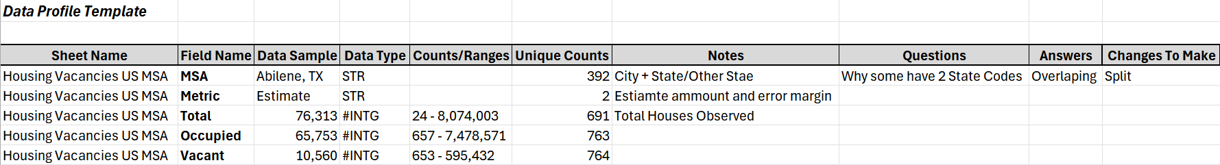
Before diving into visualization, I conducted data profiling to understand the structure, quality, and distribution of the dataset. This step was essential in identifying key attributes such as total houses observed, occupied and vacant properties, and unique counts across MSAs. The profiling results (see image below) provided a clear foundation for my analysis.
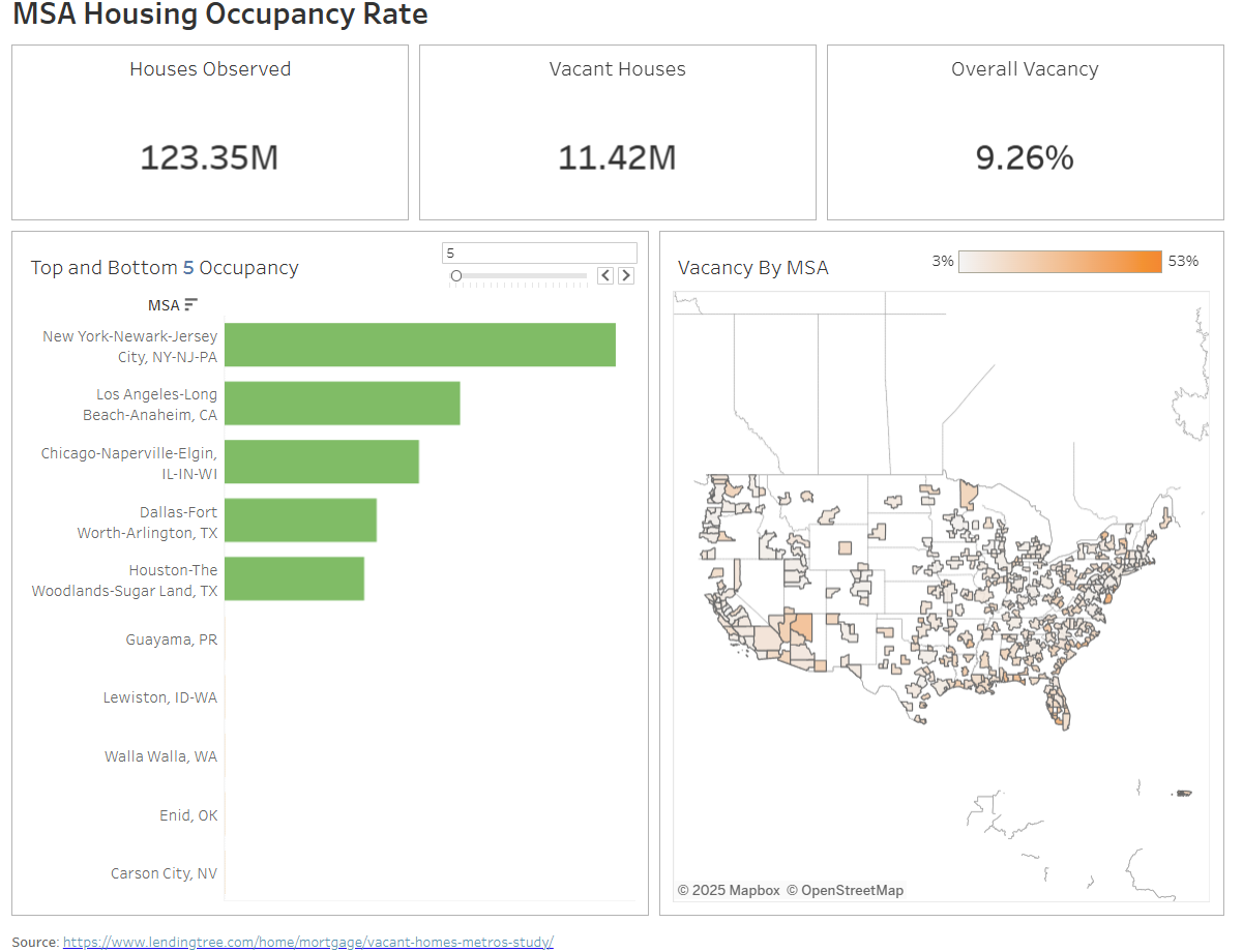
Initial Makeover Monday Visualization
The original Makeover Monday visualization primarily included a map displaying the highest vacancy rates by MSA. While this was insightful, I saw an opportunity to enhance the visualization by adding more comparative elements.
Enhancing the Visualization: My Plan
To build on the initial map, I focused on improving comparisons and KPIs:
- Coloring the map by percentage of vacancy rather than absolute counts for better proportional insights.
- Adding a top parameter filter to compare MSAs by total vacancies, showing both the highest and lowest vacancy regions in a more interactive way.
- Providing key summary metrics like total houses observed, vacant houses, and overall vacancy rate at a glance.
Final Visualization
My enhanced dashboard now allows users to compare housing vacancy trends more effectively, providing both high-level KPIs and deeper insights into specific MSAs.