This week, I finally had the chance to get hands-on with Alteryx, and I’m excited to share my first experience using the tool! Having worked with Tableau Prep and Power Query before, I was curious to see how Alteryx compared in terms of usability and functionality.
First Impressions
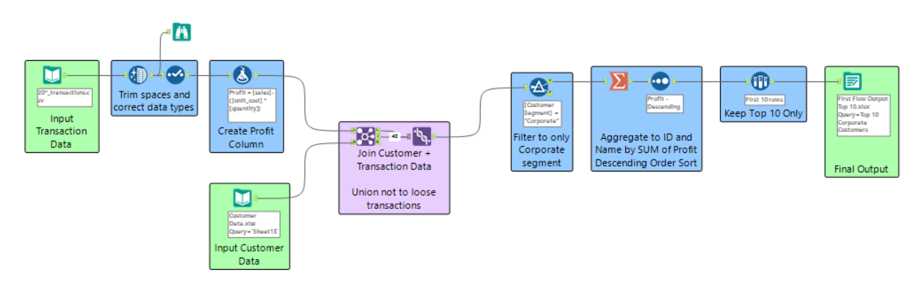
Right away, what stood out to me was Alteryx’s visual workflow approach. The drag-and-drop interface makes it easy to construct complex data transformations in a structured and readable manner. I found it particularly useful for tracking each step, which helped me understand the full data pipeline at a glance.
For my first flow, I built a corporate customer profitability analysis by:
Cleaning transaction data and calculating profit
Joining customer data without losing transactions
Filtering for corporate customers
Aggregating and sorting the top 10 by total profit
Outputting the final dataset
How I Documented My Workflow
Good documentation is key when working with complex data workflows, so I made sure to keep my flow clear and organised using:
Containers & Colour Coding – I grouped similar steps (e.g., cleaning, joins, filtering) in containers and assigned different colours for quick identification. This made it easier to follow the logic and distinguish between sections at a glance.
Annotations – I added brief descriptions within key steps so that I (or anyone else) could quickly understand what each part of the flow was doing.
By taking these steps, my workflow remains readable, scalable, and easy to troubleshoot—something I’ve learned is essential when working with data preparation tools.