Dashboards are powerful tools for data visualization, but they need to be designed thoughtfully to ensure clarity and usability. I recently undertook a quick clean-up project to refine a dashboard, and I want to share my reflections and key design principles that contributed to a more visually appealing and easy-to-follow interface.
Key Elements of a Well-Designed Dashboard
1. Color Palette: Less is More
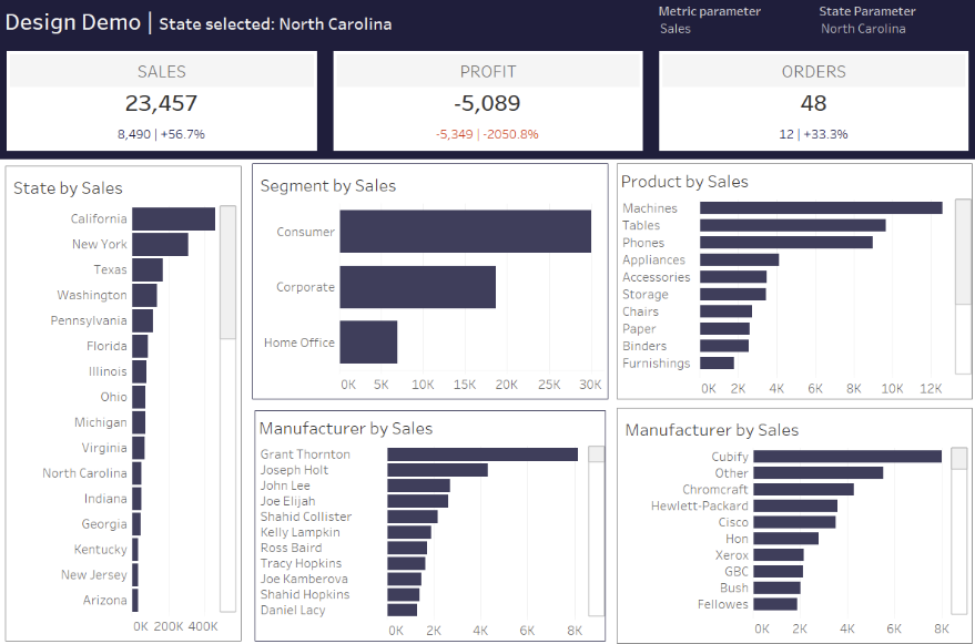
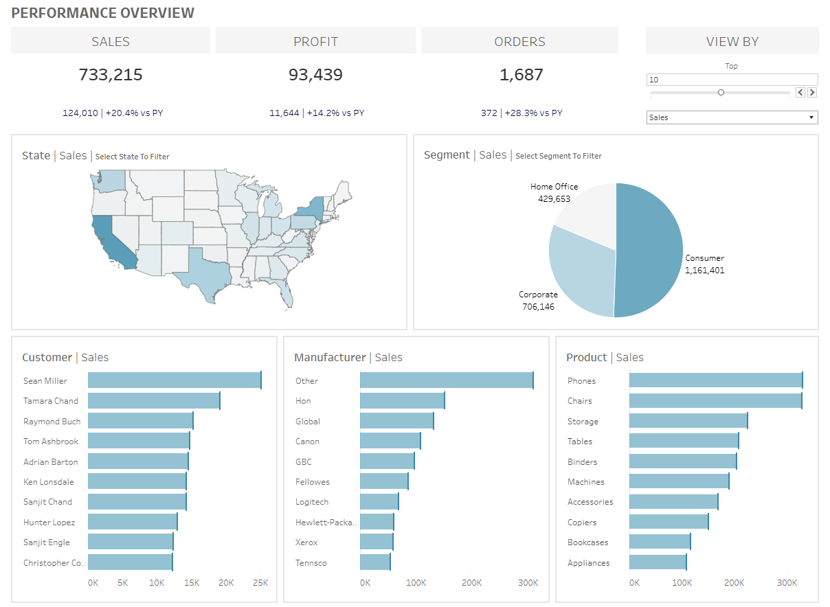
One of the first things I addressed was the color scheme. The original dashboard had a dark, high-contrast theme that could be visually overwhelming. I refined it to a more subtle and professional look, using light blue shades as the dominant color. Keeping the palette to a maximum of four colors ensures consistency and avoids distractions.
2. Font Consistency Matters
A clean and professional dashboard maintains uniform typography. I standardized the fonts to improve readability, ensuring that headers, labels, and values followed a structured hierarchy. This simple change makes the dashboard feel cohesive and easy to digest.
3. The Power of Padding
Padding is often overlooked but makes a huge difference in readability and visual organization. I set an inner padding of 10 pixels to allow each element to breathe. This avoids overcrowding while maintaining a structured layout.
4. Effective Titles & Labels
A well-designed dashboard should guide the user naturally. I ensured that each chart and KPI had clear, concise titles. This eliminates any guesswork and allows users to quickly understand what they are looking at.
5. Interactivity: Keep It Simple
While interactivity is important, too much of it can be overwhelming—especially for users who are not tech-savvy. I streamlined the filters and interaction points to make them intuitive and useful rather than excessive.
6. Clear KPIs for Quick Insights
Key Performance Indicators (KPIs) should be immediately visible and easy to interpret. This ensures users get crucial insights at a glance.
7. The Z-Pattern Layout Approach
Users naturally follow a Z or reverse Z pattern when scanning a screen. I repositioned charts and KPIs in a way that aligns with this natural eye movement. This structure enhances usability and ensures the most important elements are seen first.
Final Thoughts
By applying these principles, the final dashboard is more polished, easier to navigate, and visually appealing. The transition from the original cluttered design to a clean and structured interface demonstrates how small tweaks in color, spacing, and layout can dramatically improve usability.
If you’re designing a dashboard, remember: less is more. Keep it clean, intuitive, and focused on delivering insights effectively.