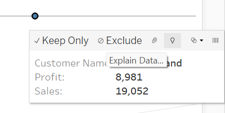
Tableau is an excellent tool for an individual to be able to visualise their data and draw up rapid conclusions, especially when working with large datasets; but what happens when you have an absurd value that does not correlate with the rest of the dataset? Tableau has a tool called 'Explain Data..' that helps you understand the underlying characteristics behind some figures and why certain figures buck the trend of the data.

The screenshot above shows a customers whose figures seem to be abnormal in regard to the rest of the dataset. By selecting the dot related to that customer and clicking the lightbulb (Explain Data) you are able to gather further information.

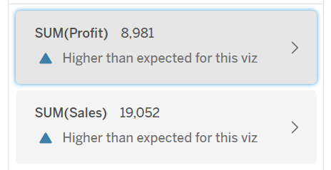
Within this table, you are able to delve into the nooks and crannies of your data. When you click a section, e.g. sum(profit) or sum(sales), Tableau provides you with more information from the distribution of said information in relation to the entire dataset and even contributing measures that has caused the figures shown to be what it is.
