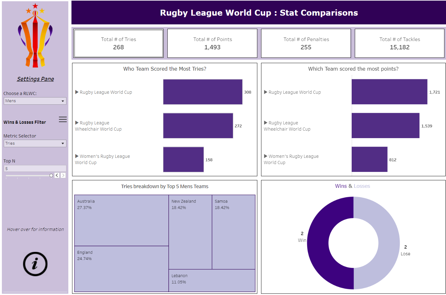
Last Day... We were tasked with creating a dashboard on a specific question that our cohort Lorna provided. The full list of questions are here. The question I chose to create a dashboard on was: How do the teams within the World Cup compare to each other?
The dashboard I created was relatively exploratory, allowing an individual to pick some metrics which I deemed to be important in Rugby to compare against other teams. the metrics chosen were: Tries, Points, Penalties & Tackles. The user is able to compare between the different world cups (Mens, Womens & Wheelchair) whilst also being allowed to delve into each specific World Cup & see the breakdown of certain metrics for the teams involved. Interactivity allowed for the user to see the top N (1 to 5) team in a certain World Cup based on a the metrics mentioned before. For example if a user wanted to see the top 5 wheelchair teams broken down by tries or points, they are able to do so within the dashboard.
I chose to include an information button as the interactivity of the dashboard was not quite as intuitive as i wanted and a user might get lost trying to navigate through.
Below is a screenshot of the dashboard.