


We all start the data school by trying to produce the best dasboard possible on a given data set. With no prior experience, you try to learn as much as possible about tableau -in what seems like the shortest week of your life- trying to cram everything you have learnt into one dashboard.
In my application I included lots of graphs, i tried to cover as many points as i could and finally filled it with as much text explaining my detailed findings! But why wasnt it the best?
Below is my first dashboard, Im going to breaks down what mistakes i made and what changes i made in order to improve.
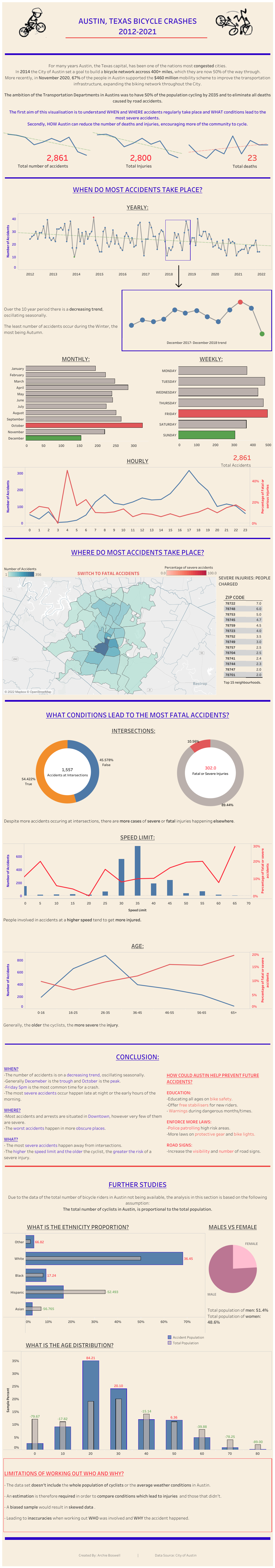
If you've managed to scroll far enough to get to this paragraph then im sure you can agree, its long. Very long. Ensuring the length is appropriate is something i originally overlooked and there are some othet notable corrections that should be made:
- COLOUR: Reduce harshness of colours and match the axis to the lines. Use colour blind friendly colours. Change background to allow the information to stand out more.
- TEXT: Reduce the amount of text so it is more engaging and easier to read.
- GRAPHS: Ensure that time is always on the X axis and reduce the number of graphs where possible.
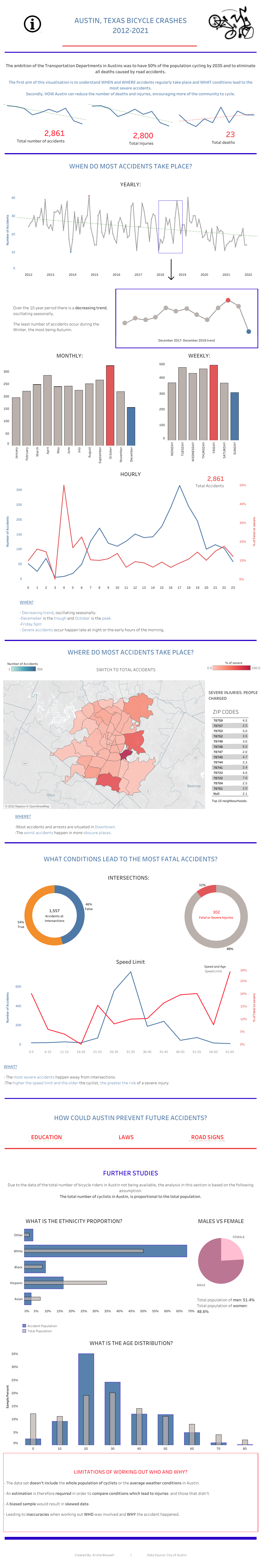
By changing the colours of the text and the background it is easier on the eye and makes important information stand out. I also used the power of tooltips to reduce the amount of visible text making the viz clearer and more engaging. Finally, i reduced the number of graphs by using parameters to change the field on the axis.
Im sure you can see how the changes are improvements however, there is still work to be done. Something that i failed to consider the first time was my 'User Story'. Who is this visualisation for? What do they want to do? What information do they need in order to achieve this? I concluded that this viz was for an Austin official who needed to know WHEN most accidents occur, WHERE they happen and WHAT conditions lead to the most severe accidents. In order to enforce necessary precautions to reduce the number of accidents and deaths. Any extra information could overcomplicate the viz, clouding the purpose of what trying to be achieved.
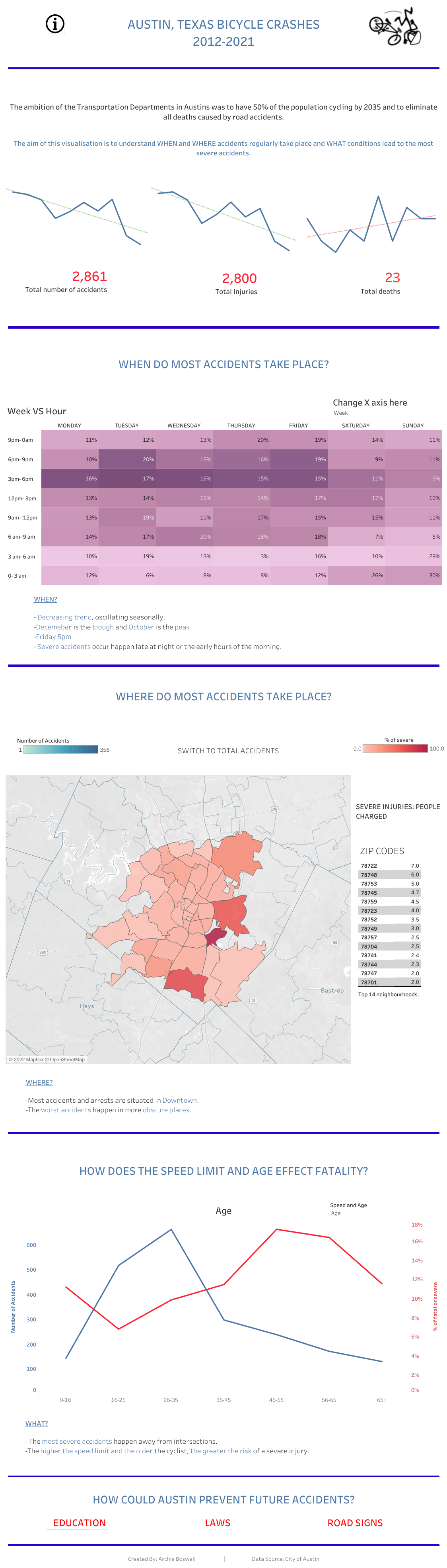
After focussing on what information my user needs, the visualisation has been made very concise. The only text outside of the introduction is a short conclusion after each section, highlighting the most important points. I have reduced the number of graphs where possible and have removed sections completely which i didnt think answered the desired questions for my user.
Im sure you would agree there is still a long way there until my visualisation is important, however its definitely an improvement.
KEY ADVICE: Dont be afraid to let some sections go, even if it has taken you a while to complete. Sometimes less is more!