


After looking outside on a cold winters morning I was certain that I wasn't going to enjoy a single moment of apricity; so I thought it would be appropriate to learn how to make one of those ' sun looking charts'. More commonly known, and properly known, as a radial bar chart.
A radial bar chart is a variation to a bar chart which shows the the proportion of different categories and sub-categories in the shape of a circle. It is not the best way of representing your data as it can be hard to make comparisons, however they sure do look good.
To start with, you need to unionise your data set then make a calculated field which gives the necessary table value as one and the other tables as zero. This will become more clear later on in the blog.
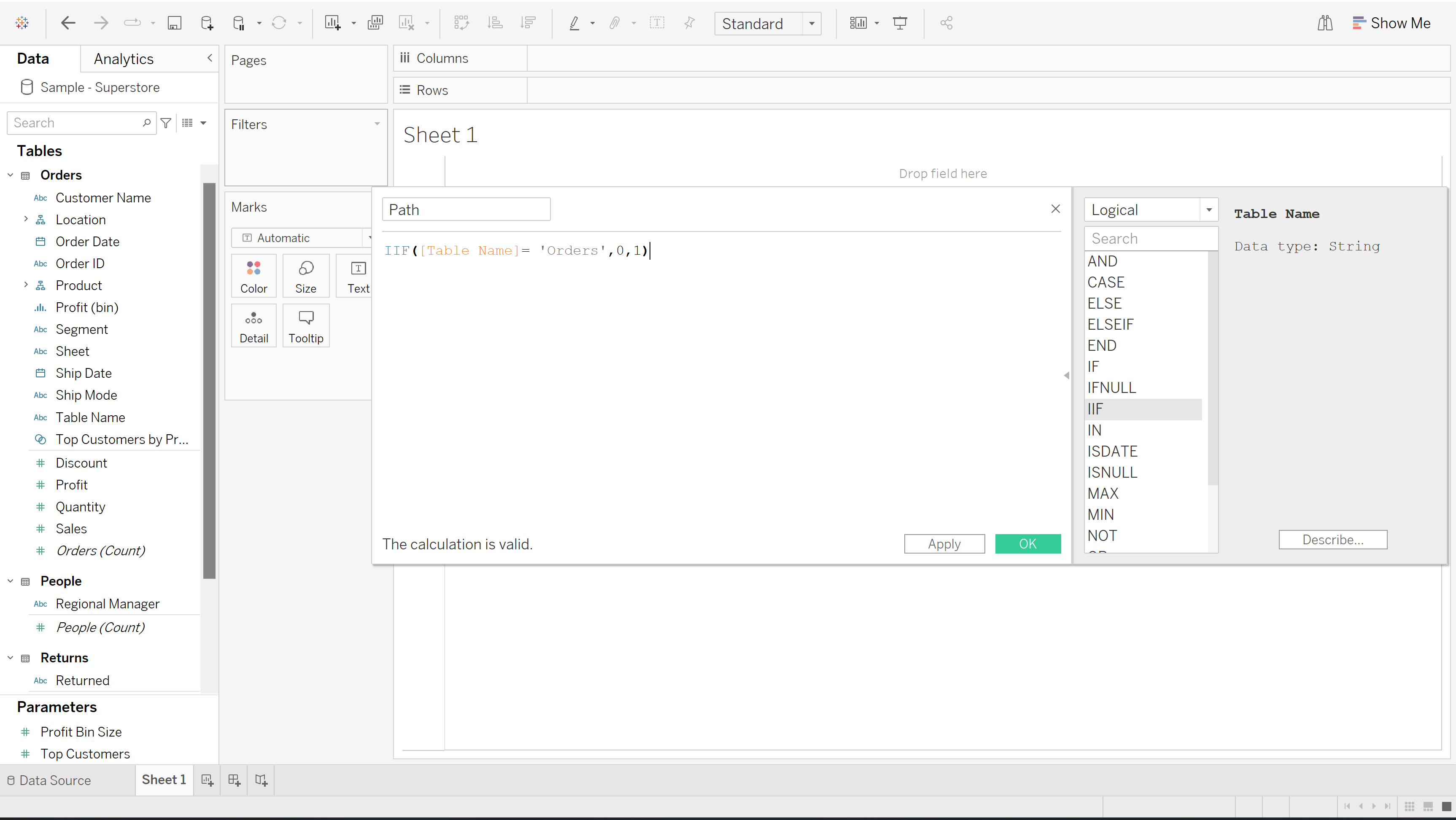
Following that, we need to create two parameters which determine the size of the circle. I decided to call these 'inner' and 'outer' which take values of 0.5 and 1 respectively. They can be changed at a later date to modify how your visualisation looks.
A calculated field needs to be made which assigns a sequencial number to each row and then divides it by the total number of rows in the calculation, finally multiplying it by pi allows us to transform the data structure into a circle.
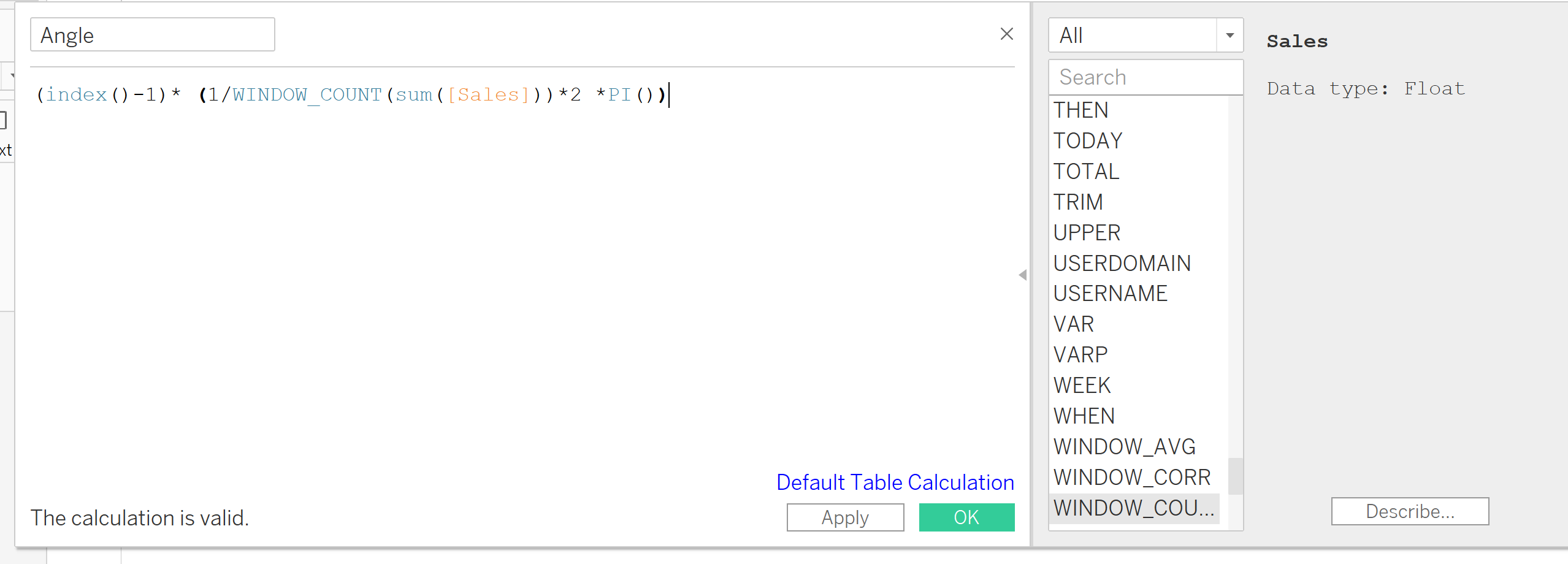
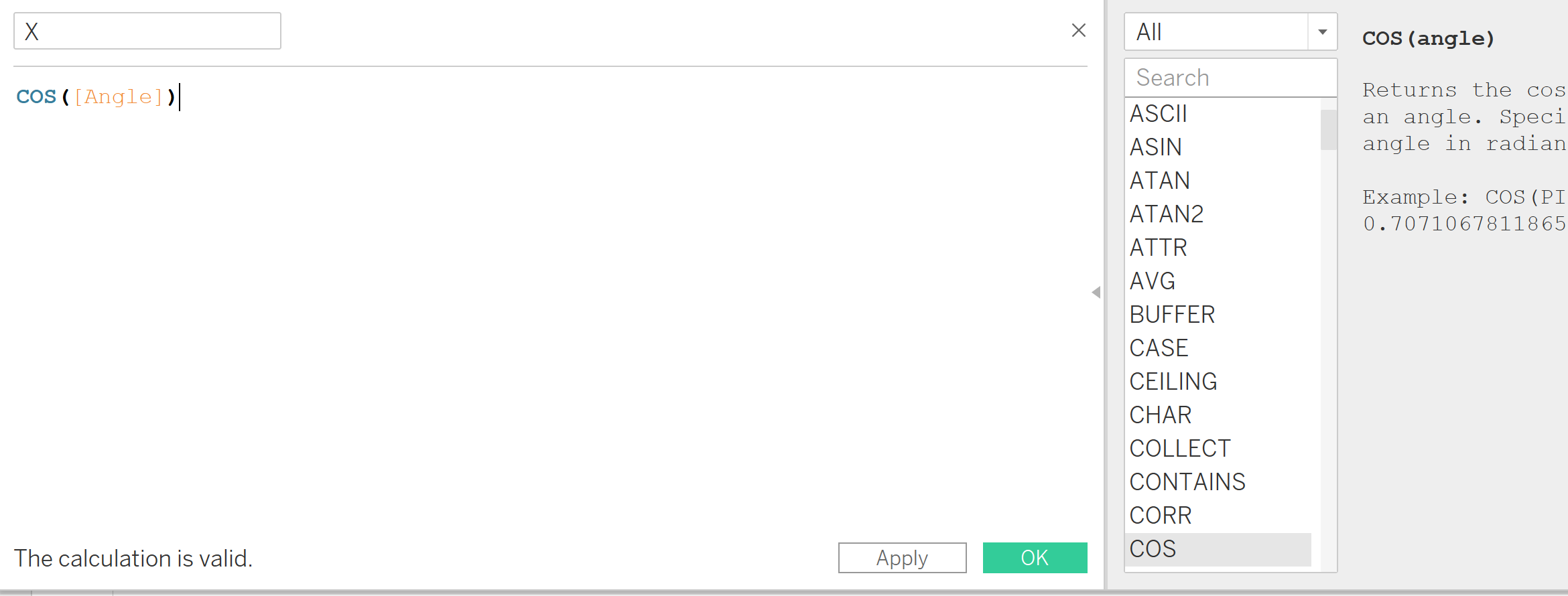
We then make another two calculated fields called X and Y which find the cosine and sin of the angle field that has just been created. Below is the example of the X field.
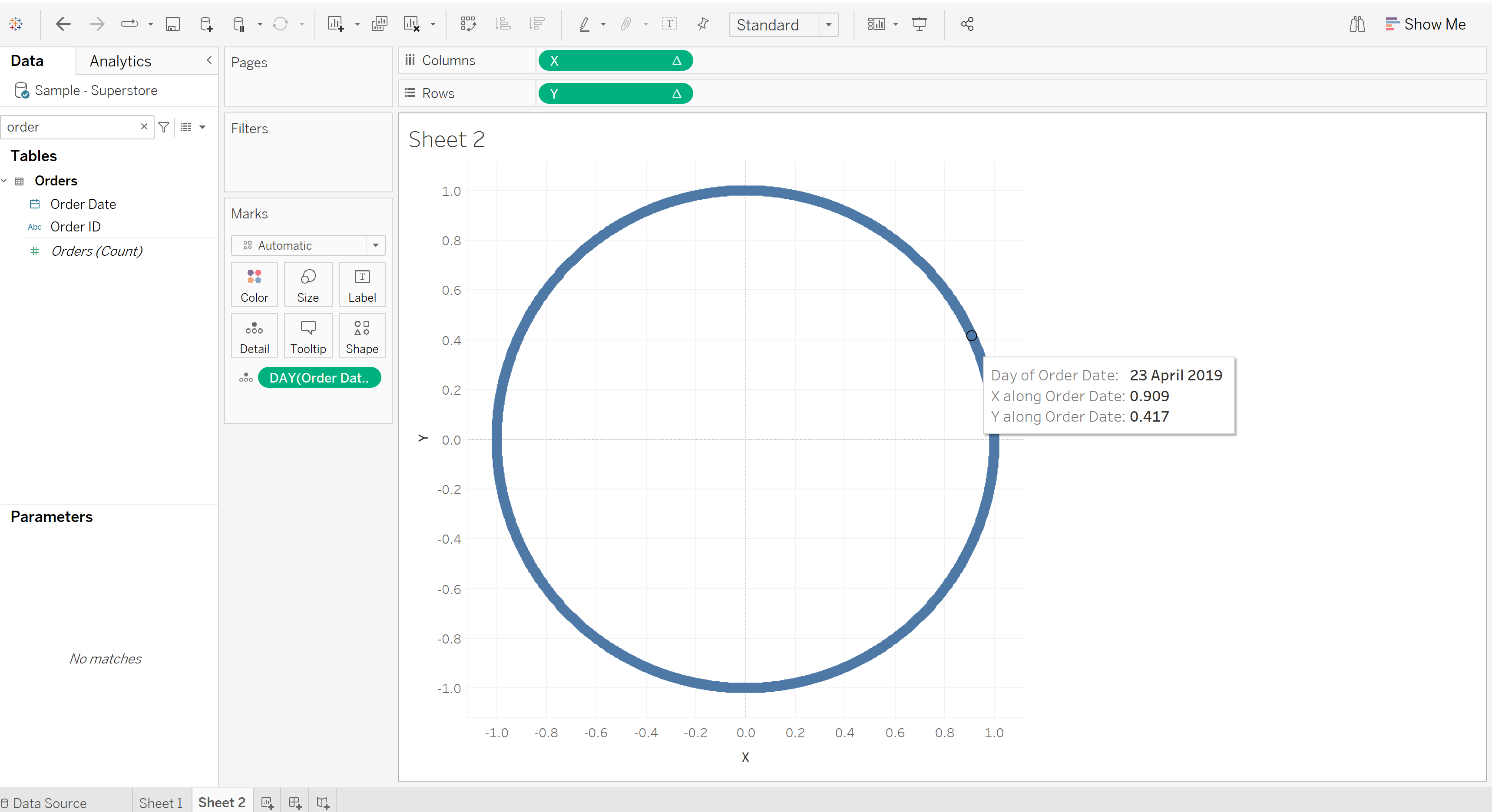
After this step, we need to bring the following measure names onto the view and ensure that the date field is discrete and measured by days. We also need to make sure that the X, Y and angle fields are computed using the 'Order Date'. This will give a new value for each row in the angle column, increasing in small increments depending on the number of rows in the data set.
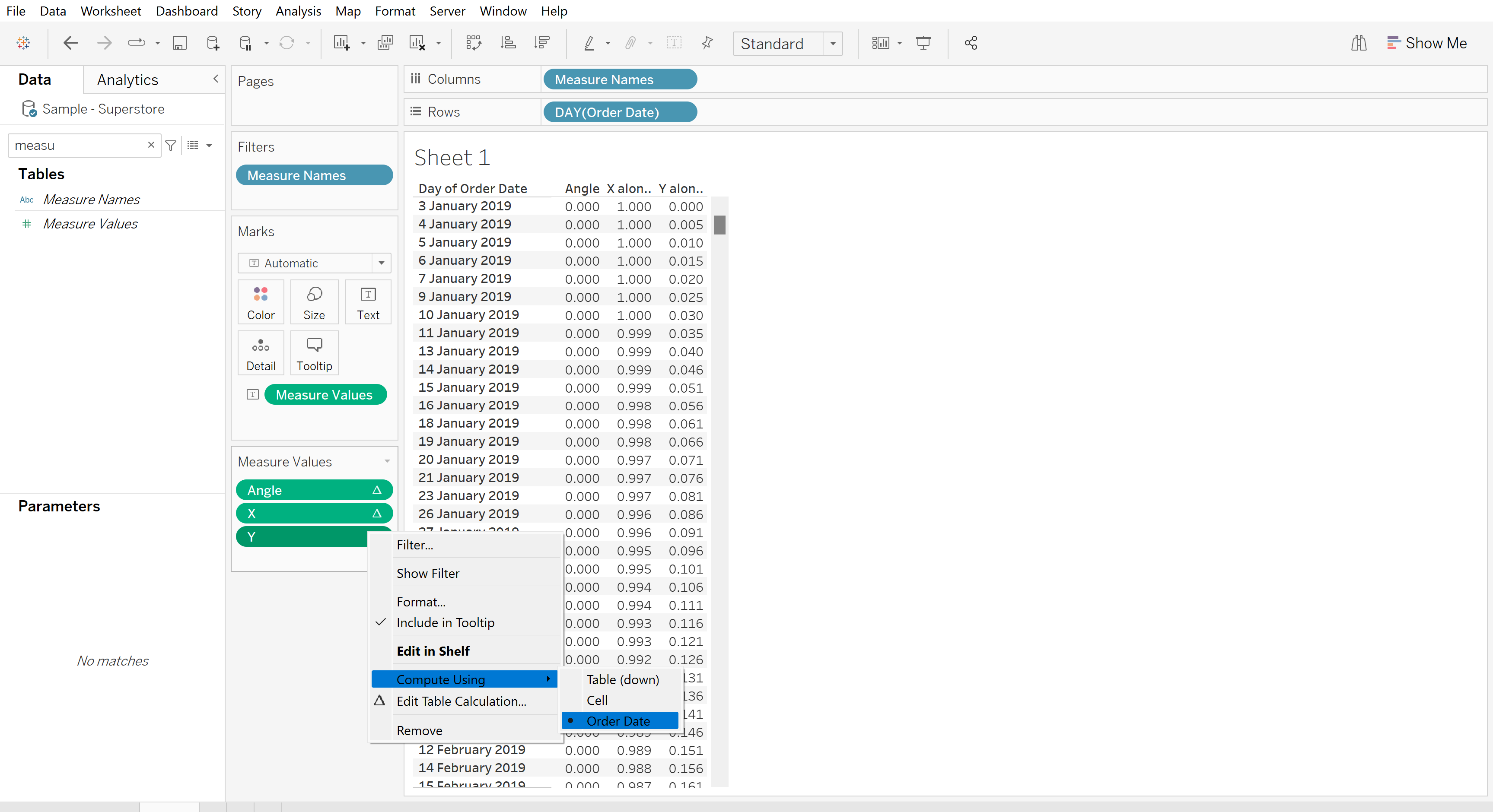
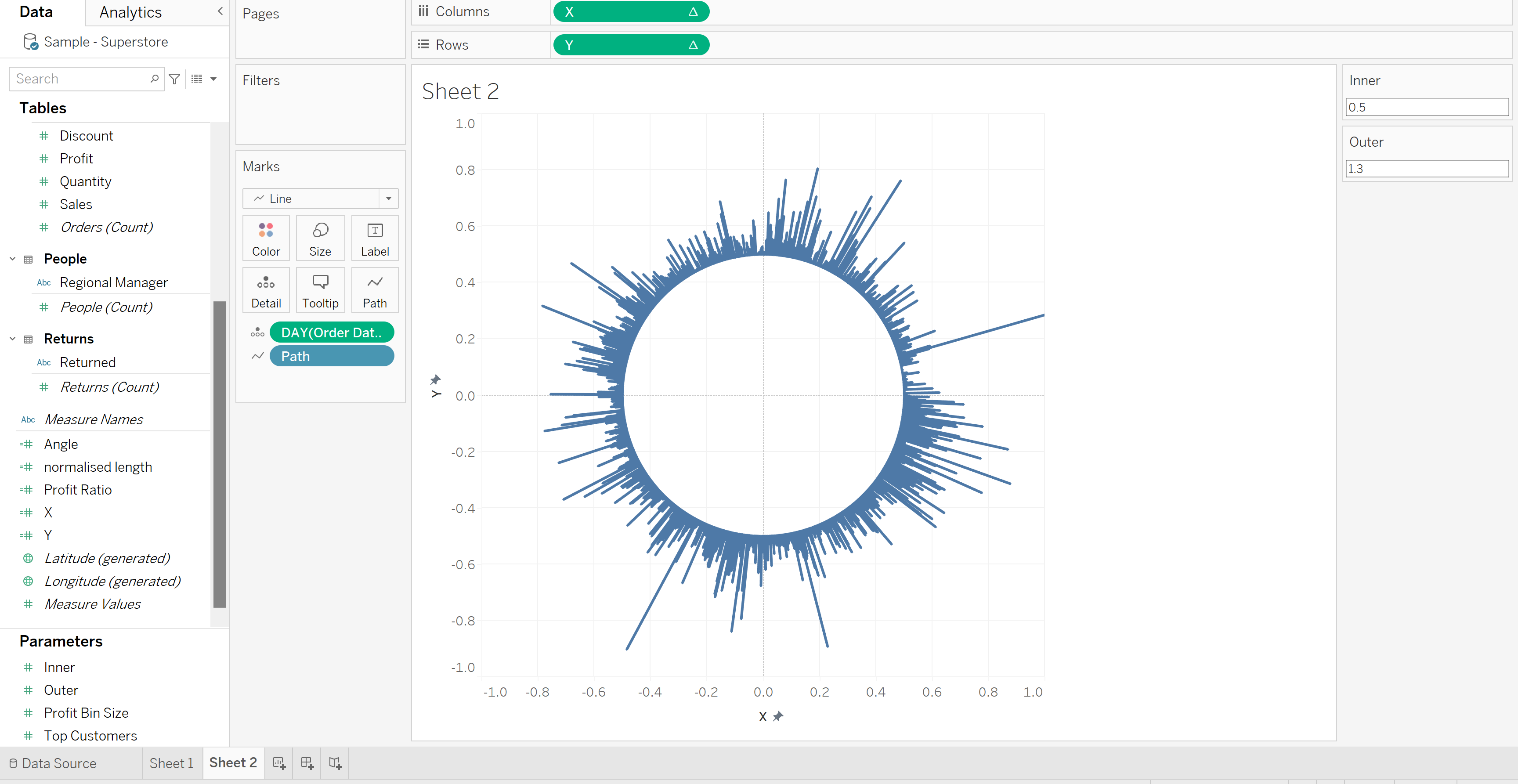
Opening a new sheet allows us to visualise what the table is representing, drag the X and Y fields to rows and columns, and the continuous order date in days onto detail. Each time you use table calculations you need to remember to specify how they are being computed! So remember, right click on the X and Y fields and select: compute using 'Order date'.
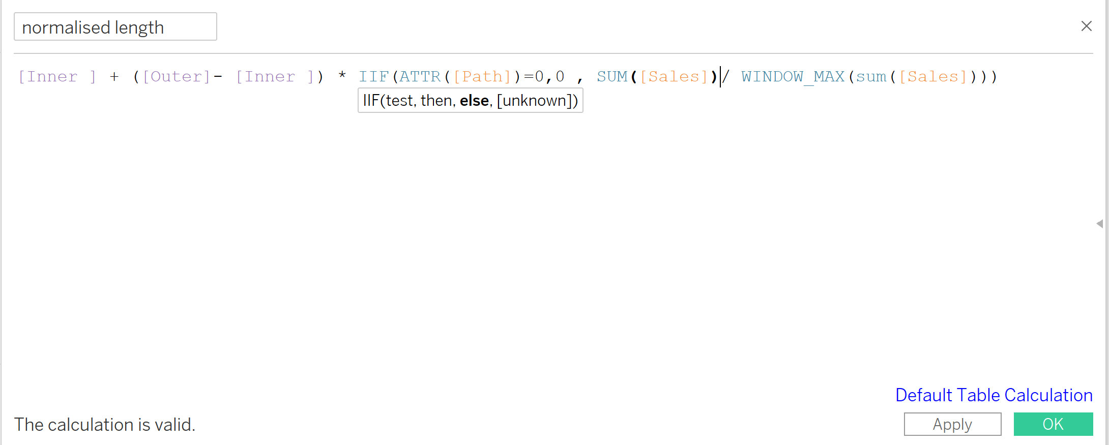
After this, we need to make another calculated field which 'normalises the length', representing the size of the inner and outer circle determined by the values that we put in the parameter.
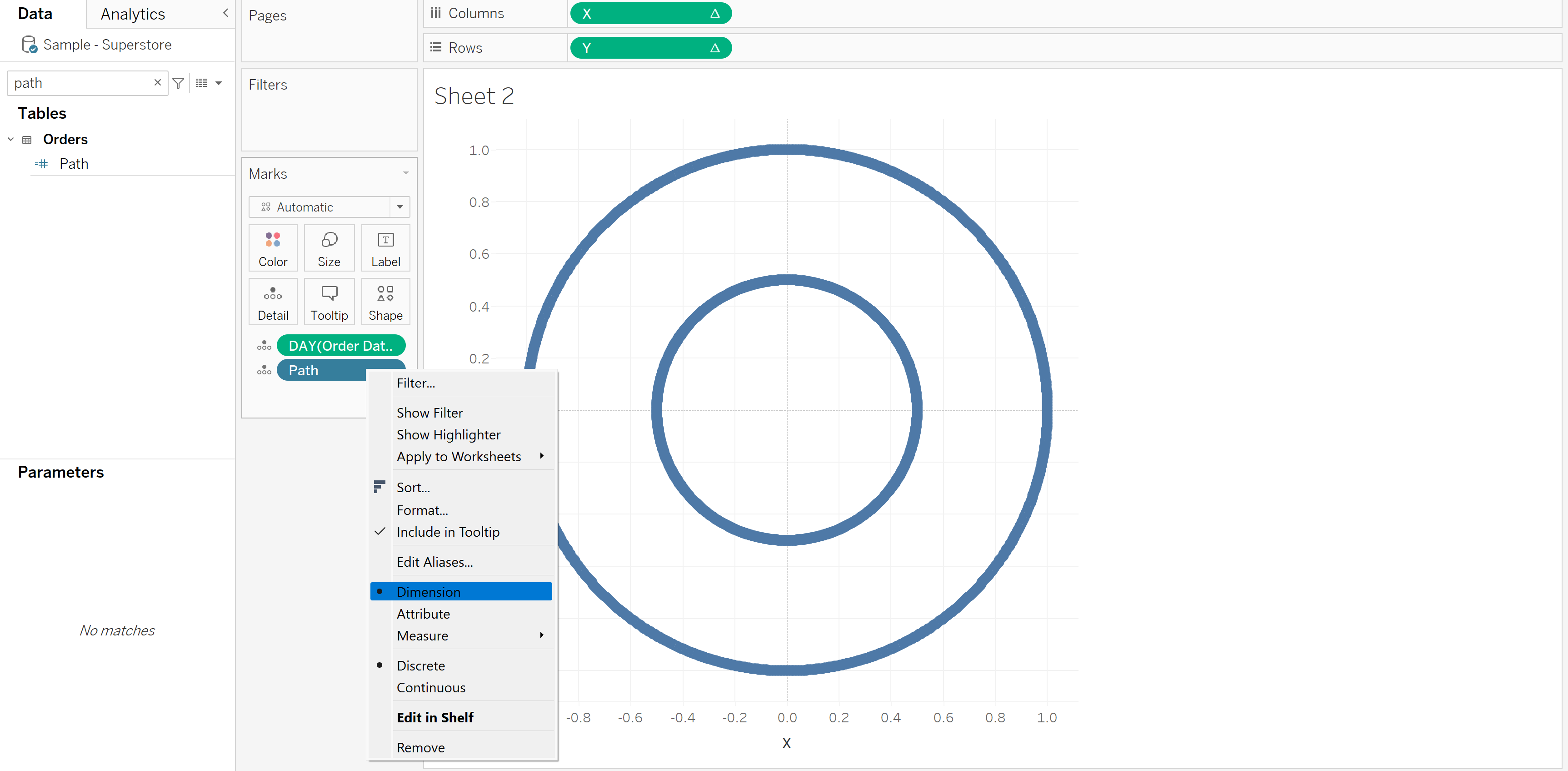
We then need to modify the X and Y fields by multiplying them by the normalised length calculated field. After converting the path field to a dimension, drag it onto detail on the marlks card and it gives us what looks like a doughnut chart- but dont worry, we haven't done all of this work just to get a visualisation like this!
This is the reason why we unionised the data set in the first place, one of the tables is represented on the inner circle, and the other on the outer.
We just need to convert the marks type of line, move the 'path' field onto path.
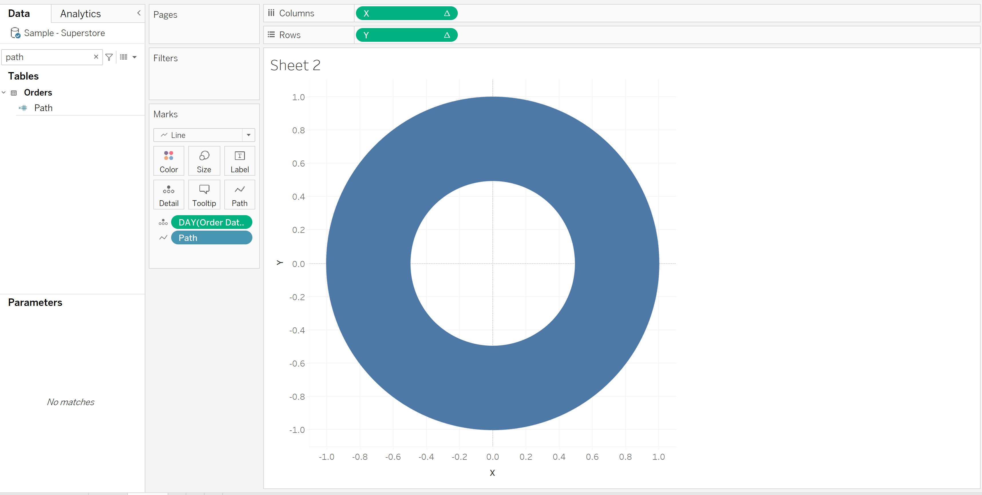
Now were cooking, this bad boy really looks like a doughnut chart now!
But why doesn't it look like a radial bar chart? What could we have forgotton to do? Yet again, we need to change how the X and Y table calculations are computed!
You can change the axis ranges depending on the length of your lines, just keep in mind if they're not the same then it would no longer be a circle. Also, changing the parameters will impact the size of the inner circle and lines going from it.
After dragging category to colour and removing any grid lines or axis, you can produce a wonderful looking chart.
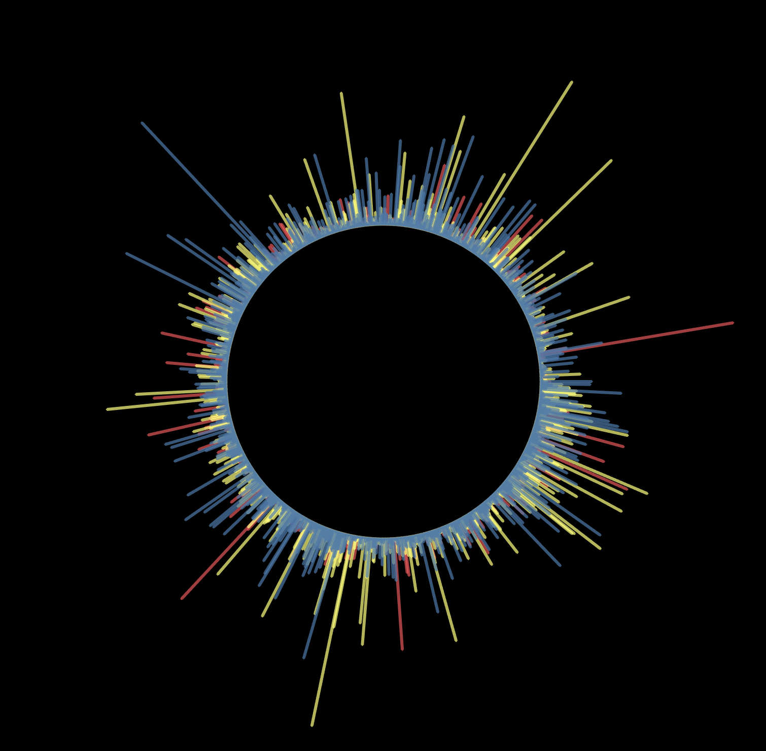
I chose a black background gives a very powerful chart!