Waffle chart give an alternative way of representing a proportion unlike pi charts where angles are used waffle charts are split into a grid making it easier to visualise progression.
The first step is to make a template in excel that represents each percentage as a coordinates in a 10 by 10 grid.
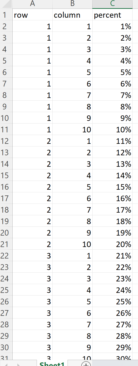
Open this excel sheet in tableau public and convert the rows and columns into discrete fields and then drag them on to the necessary section. Format the 'percent' field and then drag it onto the text option on the marks card.
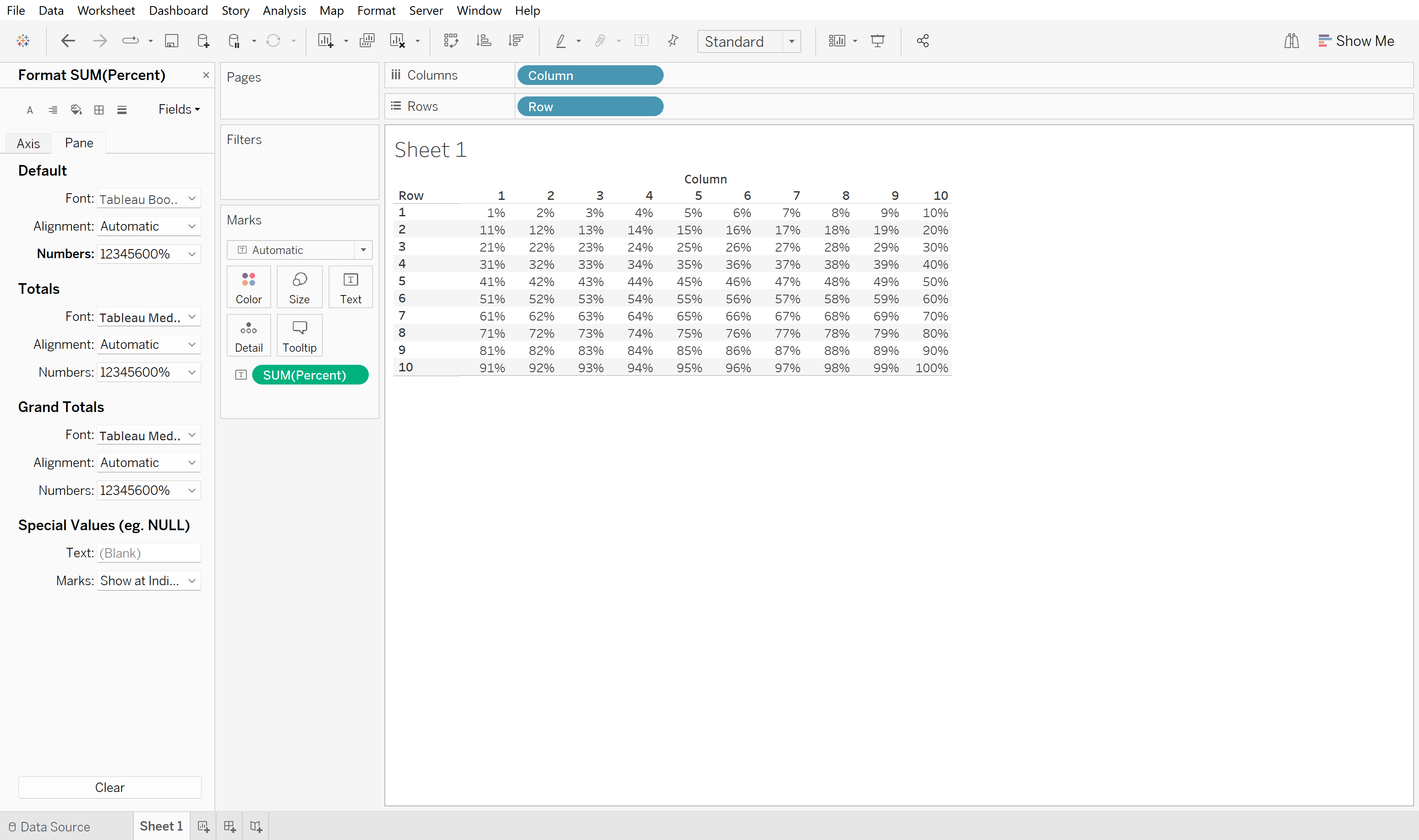
Once the template is up and ready, connect the desired data set to Tableau, in this example I will be using the superstore sales data to visualise the profit ratio.
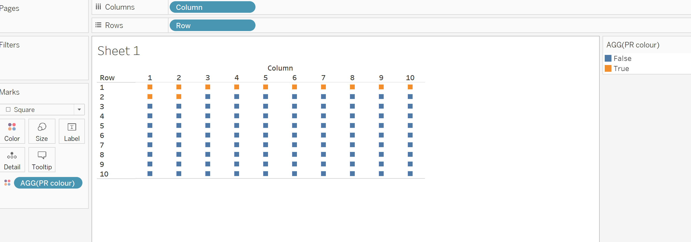
We need to tell Tableau how the two data sources relate to one another. To do this we make a calculated field with a boolean output, if the profit ratio is greater or equal to the percetage from the template sheet then the output is true.

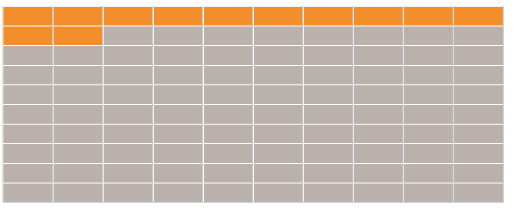
By dragging this calculated field onto the the colour marks we can see that 12 out of 100 of the marks are true which means the profit ratio value is 12 %.
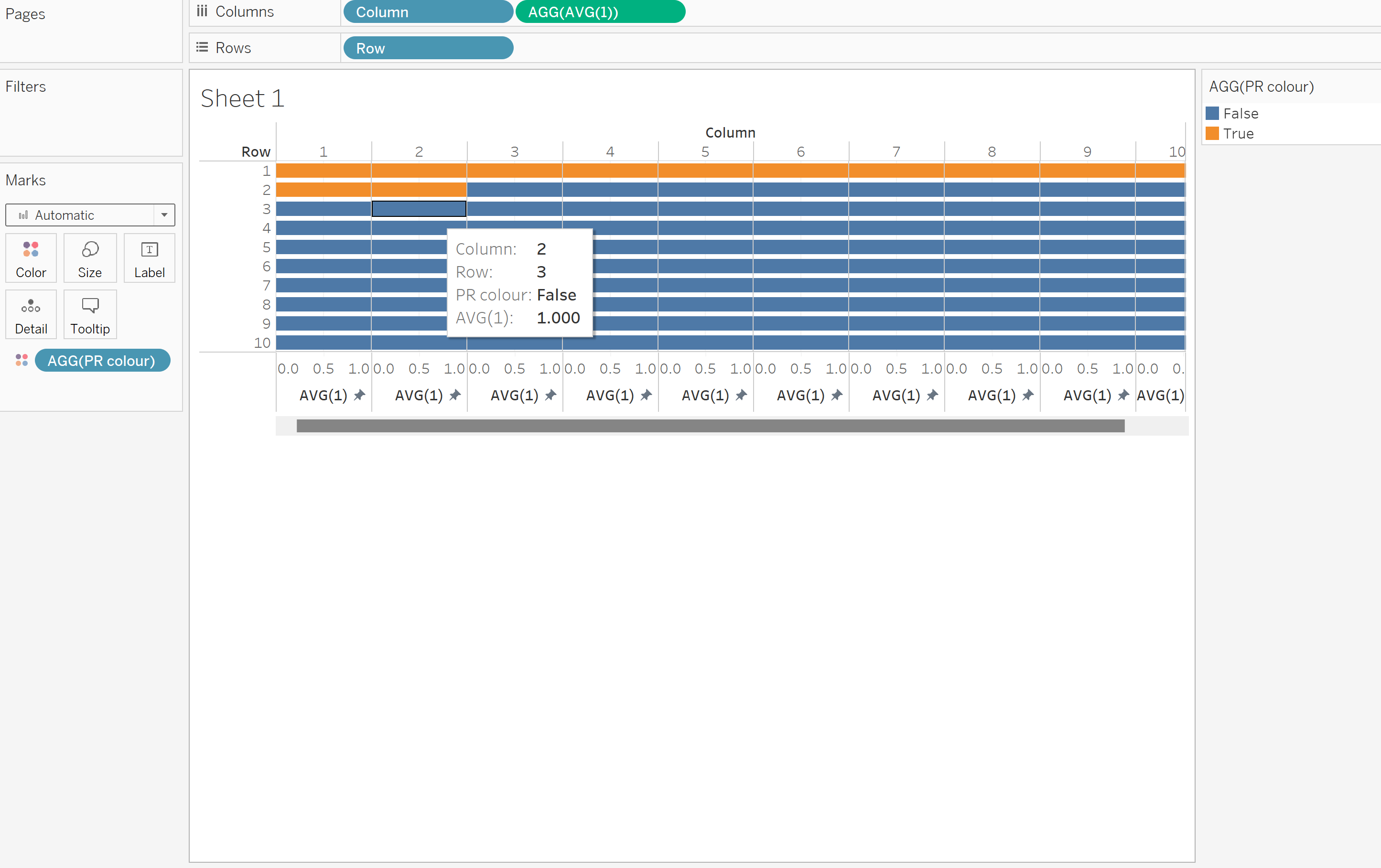
In order to make more solid blocks of colour change the type to automatic and add a new field on the column section, just typing AVG(1) is sufficient. Think about what colours you want to use and add white borders to make each cell more prominant.
Removing all the headers and maximising the size of of the cell gives a much tidier finish. Further adjustments can be made to give more information.
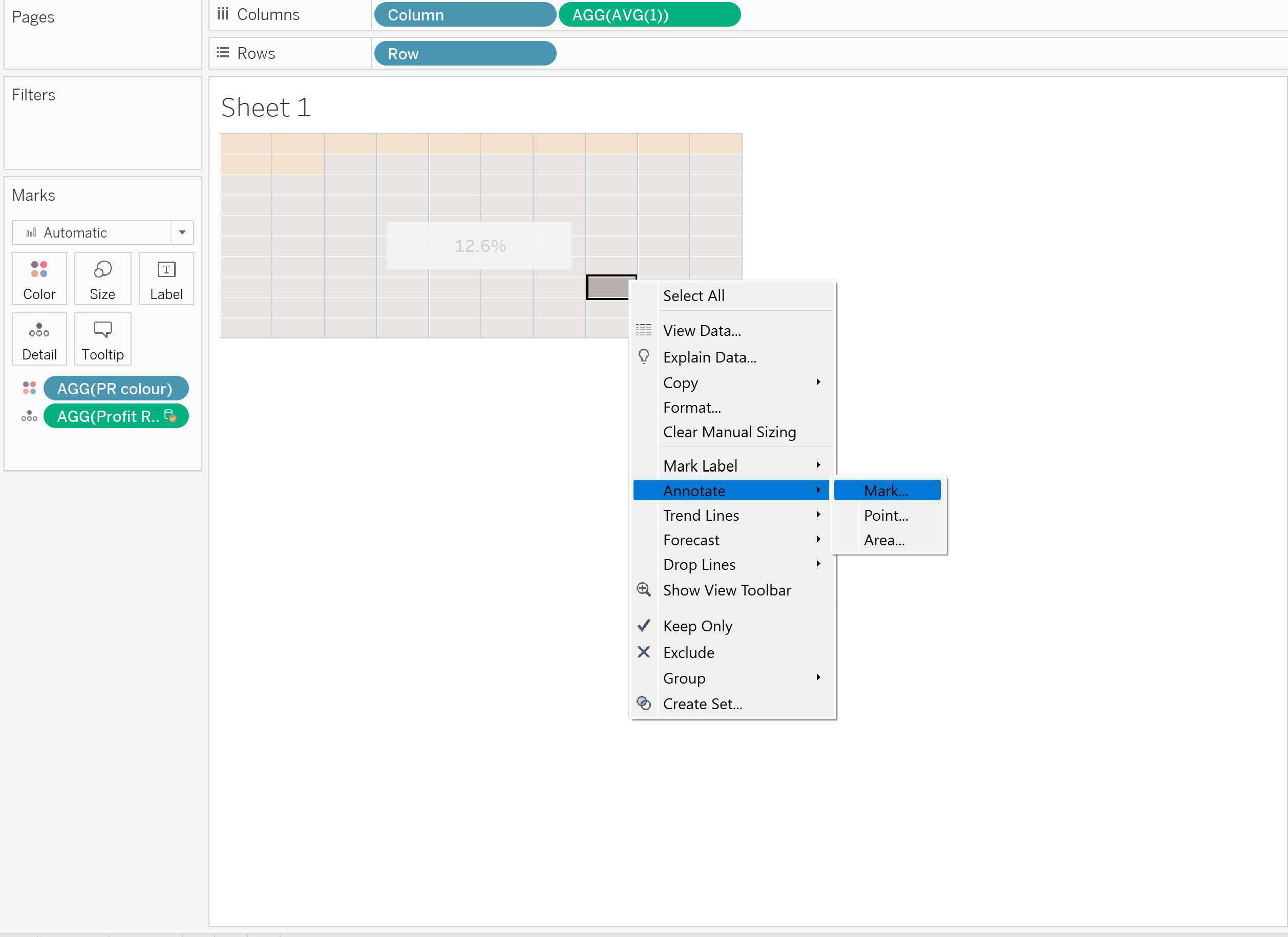
After removing all tooltips and including the profit ratio as a percentage right click on one the cells and click 'mark', this will highlight the percentage of profit ratio in the centre. Think about the colour change to emphasise the most important information.
After some formatting we have the final chart:
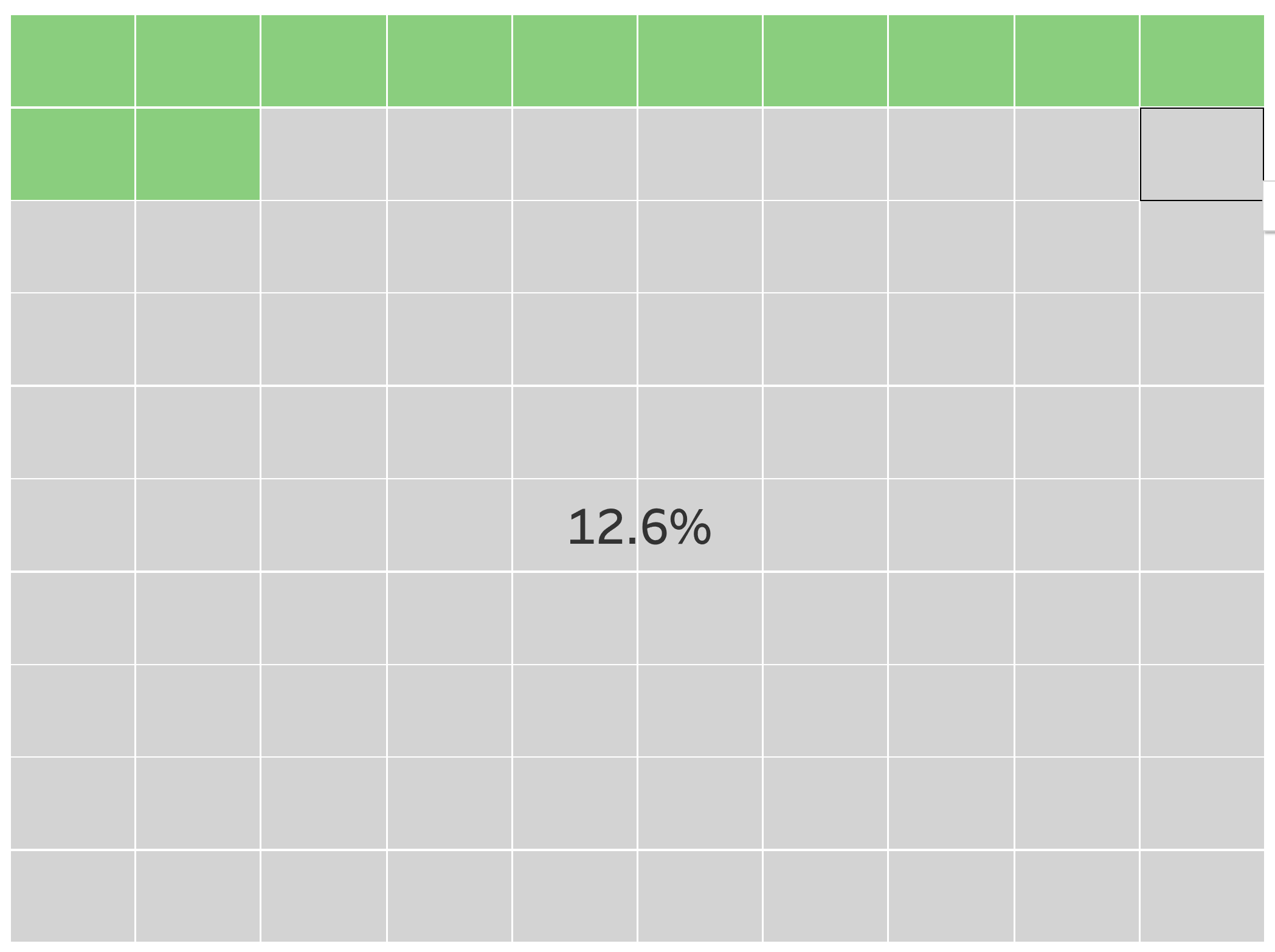
Filters can be added to drill down further, analysing the profit ratio of individual regions e.t.c.
