


So, dashboard week has officially began, a period of time that you only hear people talk about when you first join the data school. One that feels like it is an age away. After 8 projects and 17 weeks of training its sneaks up on you quicker than you think. Bring it on.
Today was all about how to make dashboards more accessible, which is ensuring that as many people as possible can use, understand, and have access to our visualisations.
There are 3 main types of accessibility:
Accessible Design
- Widely used in other fields
- Focused on accommodating different disabilities
- Is an attribute of design
- Can be measured against guidelines
Inclusive Design
- Relatively new
- Originates with technology
- Method of practice
- Focuses on broader scope of human difference
Universal Design
- Originates in architecture
- Aims for a single design which can be used by the most people, without the need for adaptation
- Emphasises an end state/solution
My project today focussed on using a speech narrator to help people understand my dashboard who are visually impaired. It is very important to know what screen reader picks up to know what to include in the final viz.
Screen Readers:
Cannot read:
- Anything within the chart area (including tables)
- Tooltips
- Headers
- Axis labels or titles
Can read:
- Sheet titles
- Sheet captions
- Legend titles and text
- Filter title and text
It is essential to put all the key information in titles, any important information from charts can be explained in the captions.
Below is the original dashboard that needed to be retro-fitted:
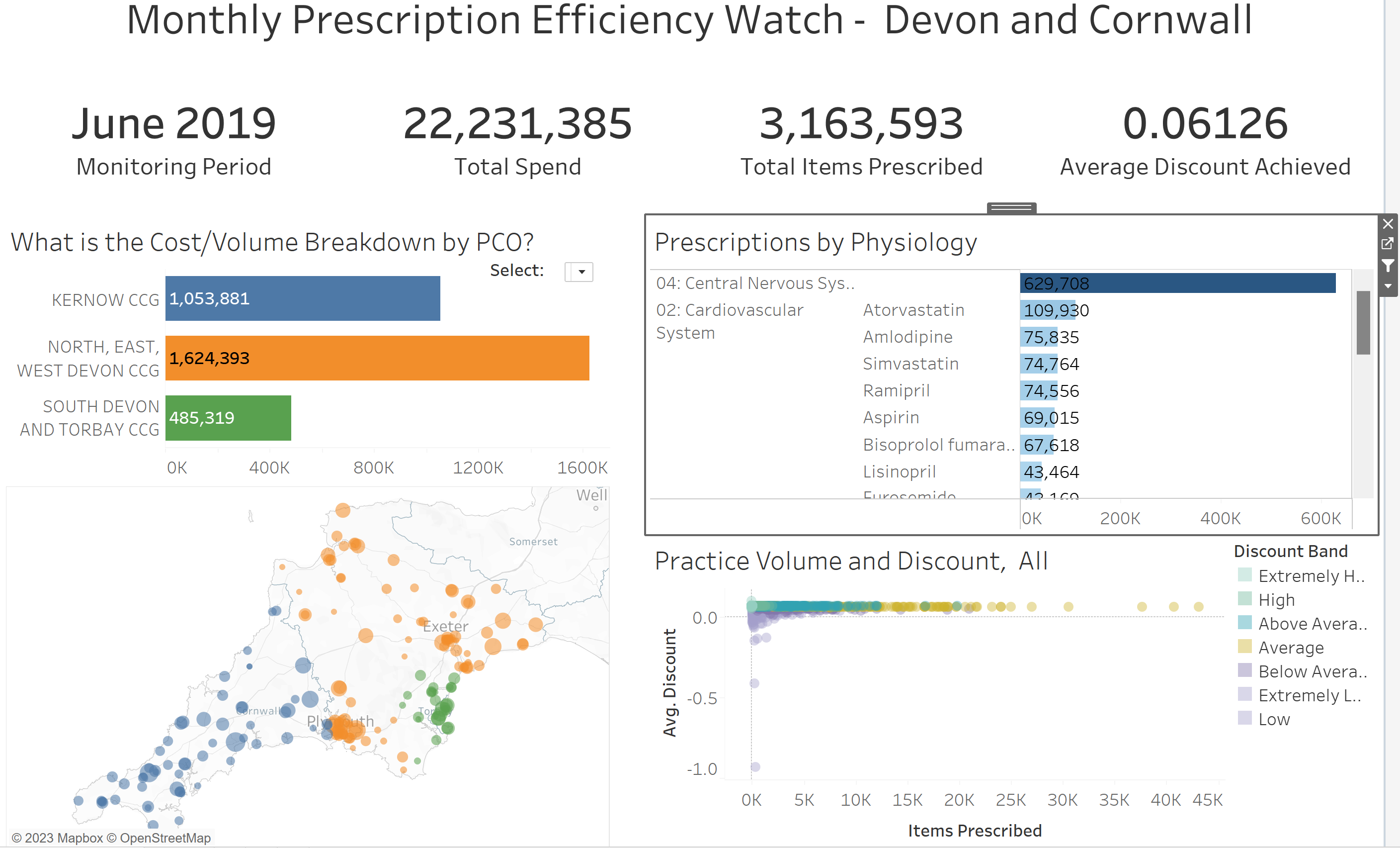
Areas of Improvement:
- The KPI headers should be first so listener knows what the number is refferred too
- Include key facts in the titles
- Inlcude captions
- Remove any interactivity and present as KPIs
- The more aggregated the information the easier to interpret for a visually impaired person
The dashboard below includes the modifications:
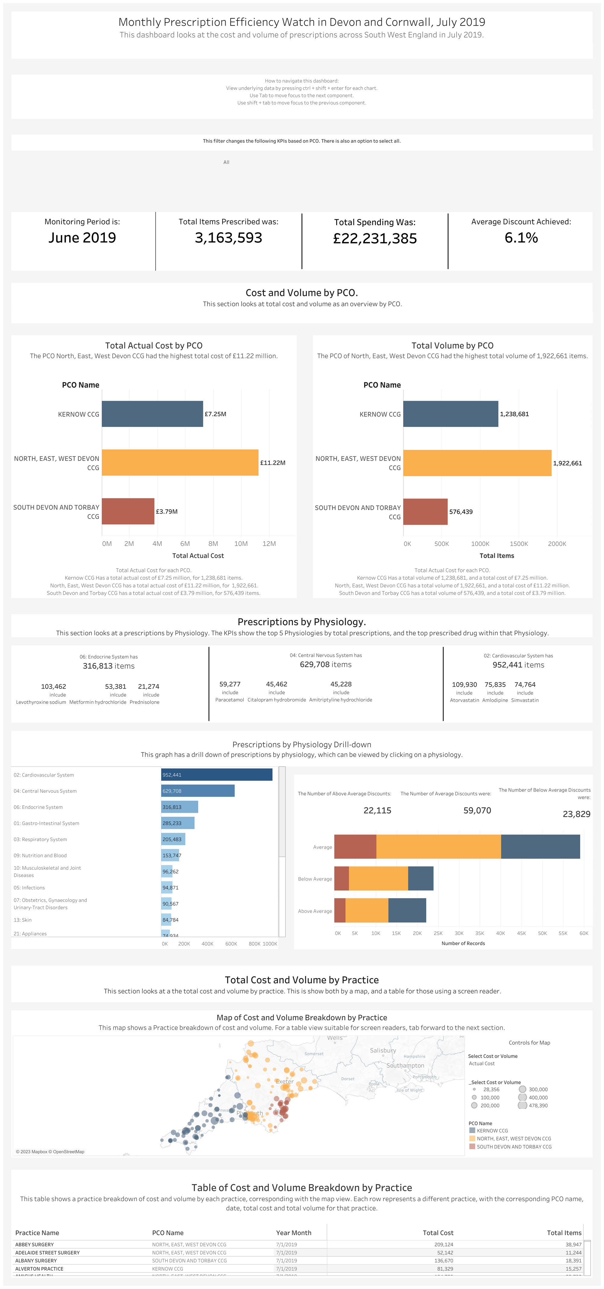
Navigations at the start dashboard is very important to instruct the people using how to use.