


The final day of dashboard week means the final day of training at the data school, wow, how time flies when your brain is being crammed with information.
Today we got the choice of whether we wanted to make a C-level dashboard or an analytic dashboard on a kickstart data set found on kaggle. I thought that because i have more experience on the analytics side i wanted to test my skills by making an overview dashboard.
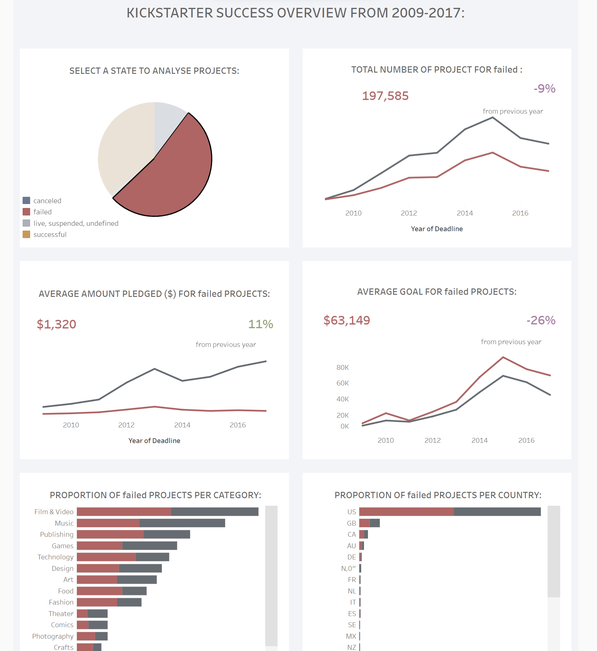
I started off by researching what makes a good C-suite dashboard and I found that the speed at which you can extract information and the clarity of charts is essential. From this information i concluded that it was important the charts were concise and minimal.
I then went through the data and thought about key information a manager would be looking for and the key fields that I needed in order to present this information. I found the most important comparison that needed to be made was to compare what makes a project successful compared to the unsuccessful ones. As a result i thougth that using this as the main filter for the rest of the dahboard.
I then worked out what graphs i wasnted to allow this chart to compare which were as follows:
I found myself wanting to add a deeper dive into specific categories for example however i needed to remind myself that this dashboard was used for an overview, rather than a deep dive- a very useful skill to learn!
What a week.