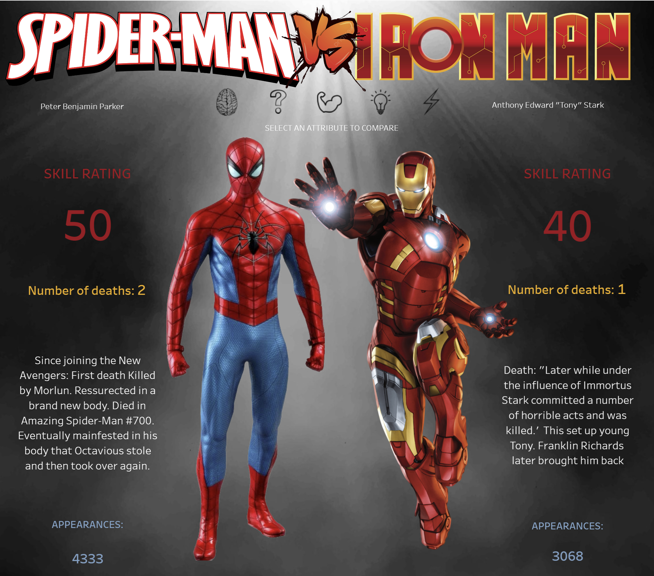
Today was so fun! We were able to use our creativity to produce a popping infograph on Marvel characters. The data consisted of how many times each character had died and if so, were they brought back to life?
When i was making my plan i thought it would be really interesting to be able to compare two of the biggest super heros. However after looking at the given data set, i realised that this would not be possible; so i went digging around to find some fun stats on Iron Man and Spider Man. The two coolest superheros in my opinion.
I started off with sketching what i wanted my infograph to look like and i invisioned the viz to be split in half, with each of the characters either side. Above the images i wanted to include icons which would change the stats shown allowing you to directly compare the chosen attribute. After making all the KPIs, i went onto the internet to find the necessary images that i wanted to use for my buttons. Learning dynamic zone visibility made connecting the buttons with the necessary sheet a lot easier- so that got done fairly quickly.
Next up was to create the background- which took a whole lot longer than expected. I wanted a smokey mysterious background that would make the bright colours pop off the screen. A great tip to make sure the image that you saved will fit perfectly on your dashboard is to modify the dimensions in Figma.
I then needed to bring everything together- i must admit i did use floating sheets- which got drilled out of us for the last four weeks- but it gave me much more flexibility when creating my dashboard. Here it is: