Dashboard Week
WEDNESDAY
This time Andy has decided to harness DS2’s collective brain power for his own ends by having us go through copious amounts of his worryingly meticulous exercise data from the popular app Runkeeper. What have we learnt? That these apps commonly record their data very annoyingly as a separate gpx file (new file type!) for every single tiny part of your journey resulting in thousands for every run! This was certainly a task in alteryx and choosing what to focus on in this sea of data proved to be even more difficult.
Alas, due to the impending deadline (the end of the day), I decided to simplify my idea from being the greatest viz on quantified self anyone has ever seen to something more realistic (a common theme I’ve found). The simplification was to focus on finding out Andy’s best runs of all time, filtered first by distance then by pace. I used the workflow below (with Andy’s help!) to find the top 10:
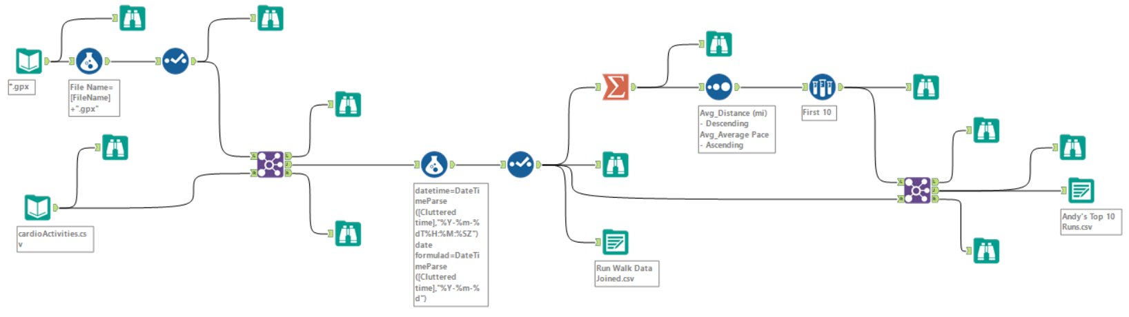
Where the summarize tool is is where the process to find the top 10 actually begins. The first half was simply to join the gpx run data with Andy’s personal exercise data (weight fluctuation etc) and to clean it up a bit. The summarize tool was used to group by file name and create average distance and pace columns for every file name (i.e. run as each run had the same file name which essentially combines all the tiny run parts into one – gotta love the summarize tool). The columns are filtered by distance then pace and the top 10 were selected using the sample tool.
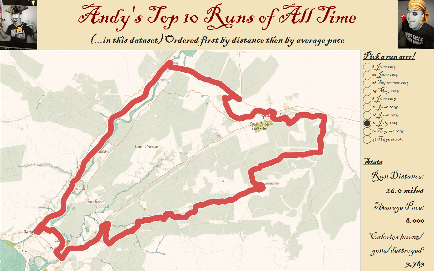
I decided to visually represent Andy’s best runs with a map. Now, I had been waiting for an occasion just like this to finally use my favourite map from mapbox, the Pirate Map! Then I thought, why not continue the theme throughout the viz? Hence why I created these highly flattering images of Andy below using the app iArrPirateFree.


To create the map, double click latitude and longitude, change to a line map and put datetime on line. Remember to right click datetime and change to ‘Exact Date’ and the rest is formatting. To see how to use a map from Mapbox in Tableau, read my next blog on Mapbox 🙂 Overall I’m happy with my viz, I really enjoyed the chance to make a light-hearted and playful viz and think the pirate theme works really well and methinks I’ll use it again in the future 😉
As always, thank you for reading!
Anuka