


At the Data Journalism UK conference, Chris Love and I, showed journalists how Tableau can make data visualisation easy. Here’s a quick recap of the data we used and the demo viz Chris created. Then I’ll share what did with the data.
The Data

We took some open data from the BBC Data Unit on the number and location of blue plaques located in the UK.
Some of the fields could do with a bit of data clean up – I have chosen to ignore the ‘Roles’ data, which describes what the subject of the plaques role within society was. I thought it was one of the most interesting parts of the data but the data is very messy. I wanted to keep this post quick and focused on visualisation instead of data prep, so we’ll skip over that for now.
Chris’ Demo
After introducing everyone to Tableau Public Chris walked through how to create some of the main chart types and put together this quick dashboard as an example. Then it time to get people playing with the data!
One of the really great things about Tableau is how easy it is to look at different dimensions and measures, see what chart types work and which don’t. You can really explore your data and things like duplicate tab and an endless undo button (possibly my most used feature of Tableau) are a god send.
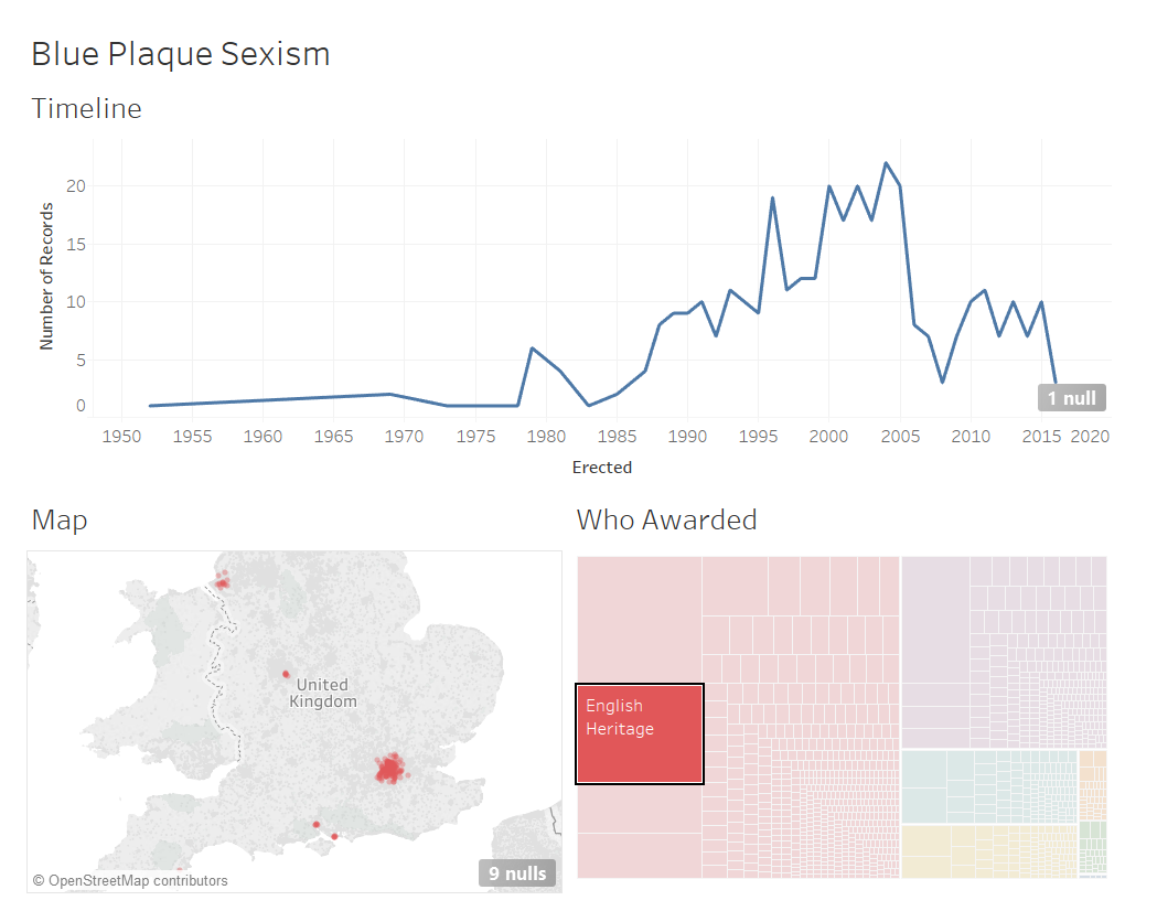
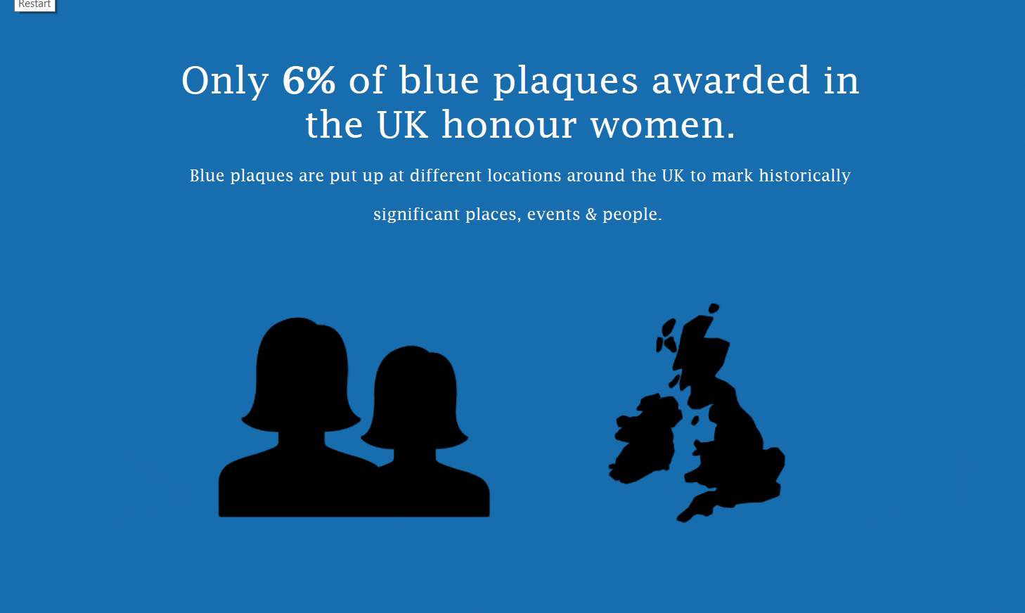
A story lead that participants at the Data Journalism UK session picked up on was the lack of female subjects in the data. Given my interest in gender issues I thought this was an interesting angle. And I’ve rolled with that idea in my own visualisation of the data.
My Dashboard Design
And here’s the results of my data exploration.
If anyone from the session would like to share their version, then please do! You can paste link in the comments or give me a shout on Twitter. I would love to see what you guys have created!