


Here’s how used calculated fields in my lollipop control chart to highlight the variation in height and wingspan. To catch up on how I built the chart using data for the Data School Iron Viz competition check out part 1 of this series.
Click the image to see the interactive version on Tableau public, where you can also download the workbook and the data.
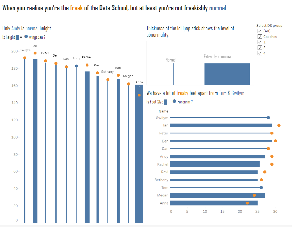
Change the size of the lollipop sticks
I wanted to show the variation in from the norm in the thickness of the lollipop sticks. So to do these I needed to calculate the difference between height and wingspan for each member of the Data School. As I want to use the result of this calculation to size the height bars I need to create a new calculated field.
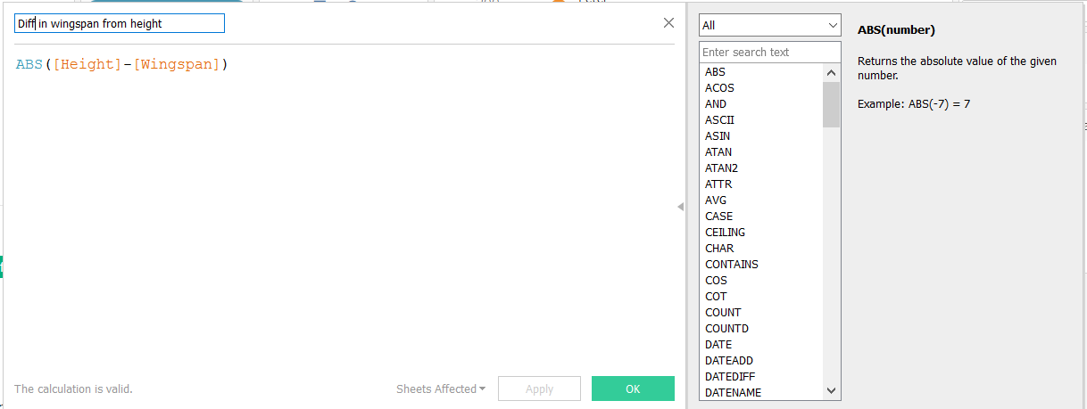
I took the height value away form the wingspan value to work out the difference
The absolute value is used as I am not interested in whether the difference comes form height exceeding wingspan or the other way around. I simply want to know the difference between two. And the absolute function will ensure that I do not get negative numbers.
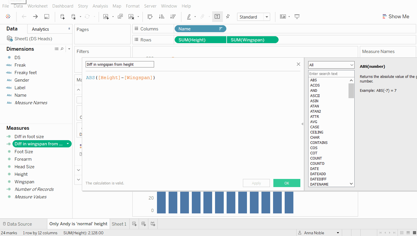
Once the the difference measure has been created we can drag it to the size shelf on our bar chart.
Colour by normal and freaky
Okay so even though we have built in this variation into the thickness of the lines it’s not always easy to tell when a persons height is perfectly aligned with their wingspan as the circles sit on top of the bars. And the difference could be small enough to make the lollipop stick look thin and ‘normal’. So decided I would add a further calculated field which would give a different colour to the circles in the scatter plot i.e. the wingspan values when the normal condition is fulfilled compared with when it is not and the person is ‘freaky’.
So here’s calculated field number 2:
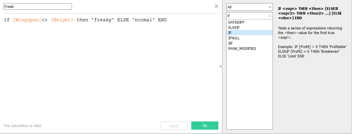
Here I’ve used an IF statement which says: if the value of wingspan is not equal to height then class it as freaky. But if the two values are equal to each other then class the individual as normal.
Then when I drag that onto the colour shelf for the wingspan measure only the Andy’s lollipop will turn blue. Everyone else will have a blue lollipop stick and an orange lollipop.
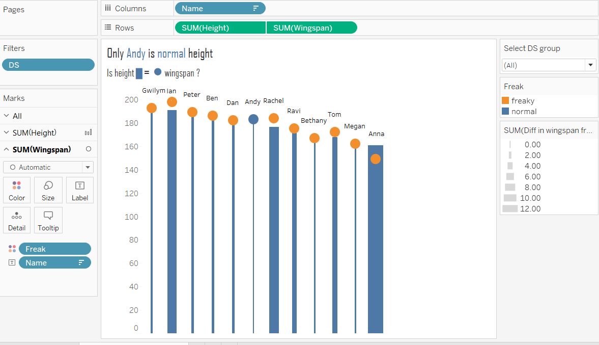
Then we just need to clean things up a by taking out the axis title height. And add names back onto labels and voila. There you have a lollipop chart that shows just how abnormal the data school is.
As you can see creating new calculated fields using logic and basic calculations can be useful for adding extra visual elements to your data viz. What could you use them for?