


Carl Allchin introduced DS4 to control charts last week. And I got inspired to take the idea of highlighting those that are on target vs outliers into my Data School Ironviz of our body part measurements. But with a slight twist.
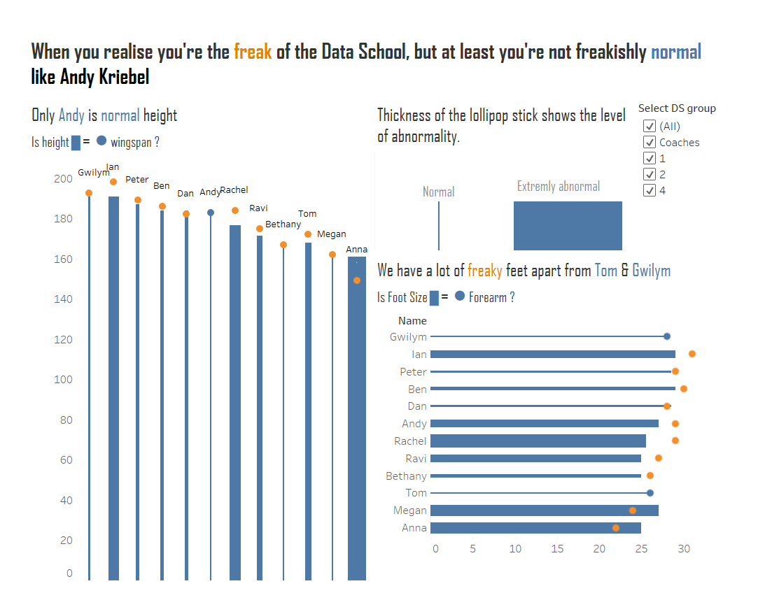
This was the result. I used a perfectly formed lollipop to show the norm – and used colour and size to highlight abnormality. Click the image for the interactive version.
And this is how I created it:
Defining normal
We took measurements of height, wingspan, foot size and forearm length at the Data School to see whether we met the hypothesis that your height should be equal to your wingspan and your foot size equal to your forearm length.
So normal would be when both are equal. Each of these equalised comparisons are represented by a ‘normal’ or standard looking lollipop – with a fine line which has a circle sitting directly on top of it.
Defining freaky
So the ‘freaks’ would be those people who’s measurements did not meet this criteria. And this would be shown visually in the make up of the lollipops.
Here to is useful to look at how I have built one of the charts in Tableau. So let’s take the height vs wingspan data as an example.
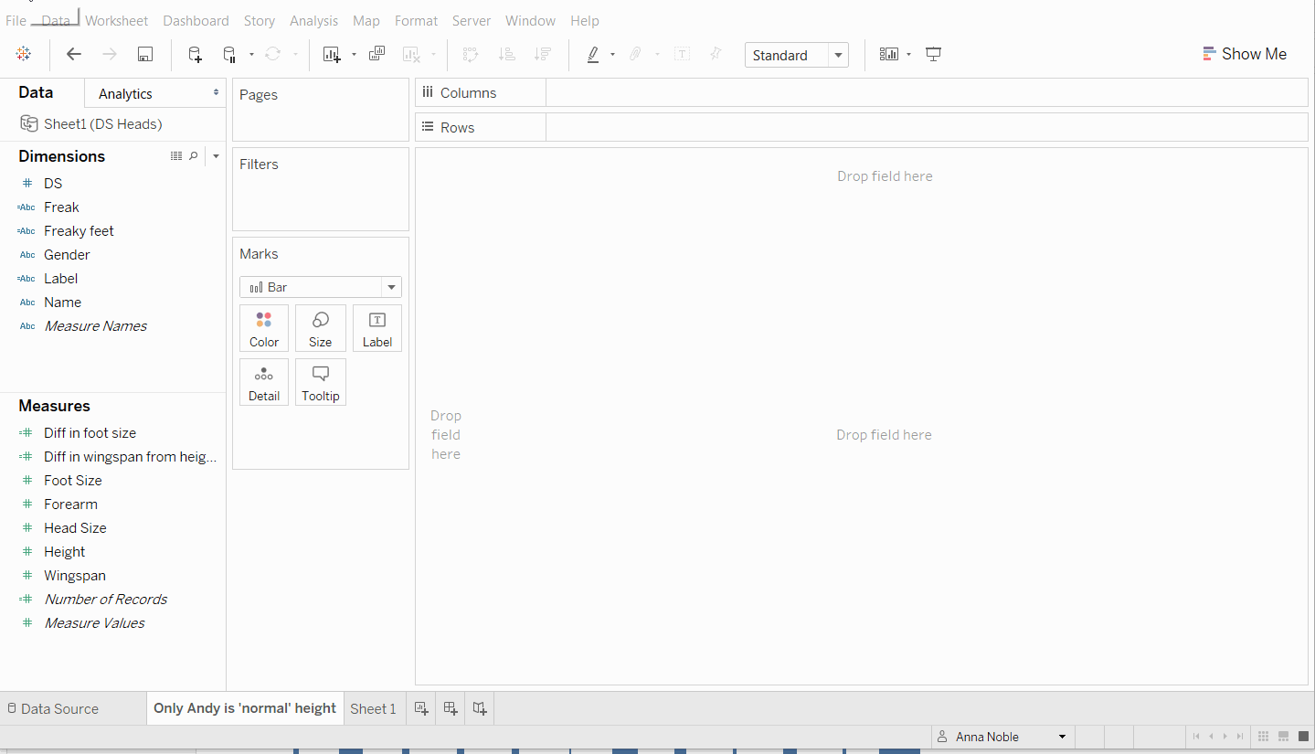
I am using a dual axis chart with the height for each member of the data school shown in the form of a bar chart and wingspan as a scatter plot laid on top of the bars.
Things to look out for
- Can’t see the circles on top?
- In the tool bar at the top go to Analysis > Stacked Marks>On
- Make sure you synchronise your axis when you make a dual axis chart
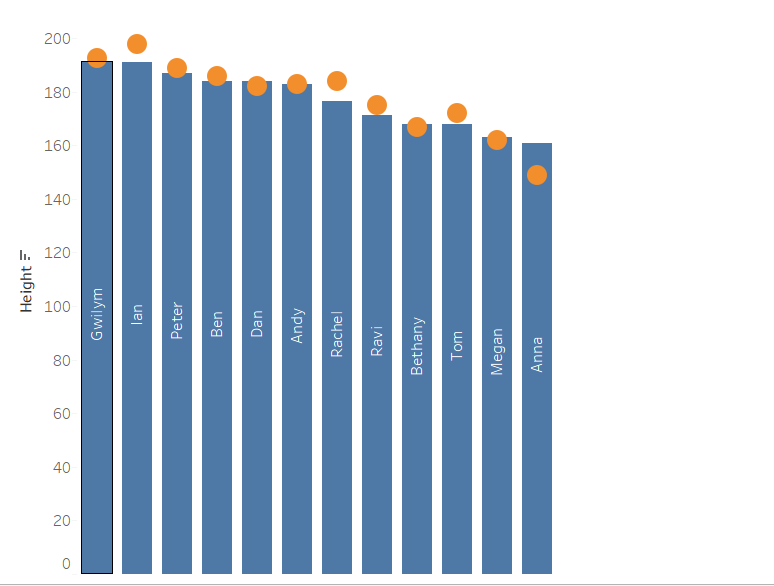
I’ve put name on the labels and now we can see that Gwilym and Ian are the tallest while I am the shortest. Andy has a wingspan perfectly equal to his height as the middle of the wingspan circle aligns exactly with the top of the height bar. Where as Ian and my self show the two extremes. Ian has arms that are much longer than his body, where as I have arms that are much shorter than the length of my body.
Next I got thinking about how I could make this variation, the difference from the norm more visually accentuated and used some calculated fields to add colour and size as visual cues for this. Check out part 2 to find out how.