


We gently move into hump day and keep rolling along through Dashboard Week. So far, I’ve been super impressed with the team. In case you’re wondering why we do dashboard week, it’s basically to get them working quickly. Essentially they’re learning a new language every day. This is great practice for being a consultant. You might be in one department or one company one day and a different company or department another day. They all have their own language and you have to be able to make sense of the data very quickly.
For day 3, the team is tasked with visualising public transport data. Ideally I’d like to learn about ridership patterns. I have 8 cities for them to choose from. I’m 99% sure each of these cities has a public API to pull data from. If not, I’ll let them nominate another city, as long as it’s not London or New York.
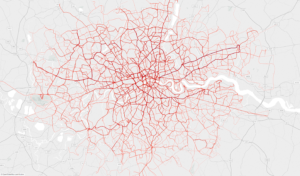
London bus map courtesy Mark Bulling on Tableau Public
They’ll get their assigned city by picking a number out of a cup. Here are the options:
- Atlanta
- Switzerland
- San Francisco
- Madrid
- Paris
- Berlin
- Philadelphia
- Chicago
That’s it! Easy peasy!