


DS20 has had a pretty tough start to their time at The Data School. They joined during lockdown and have had to do ALL of their training over Zoom. It’s draining and we can see it in them. On top of that, because there was no overlap with DS19, they haven’t had the opportunity to see and be inspired by the group older than them.
So this week, their focus is going to be solely on dashboard design, specifically KPI dashboards. I want each of them to develop their own style. They should still ensure they done good analysis, design, insights, etc., but in the end, they need to have a great design, something they can take with them to a client, something to be proud of on their Tableau Public profile.
The basic idea for Dashboard Week is that the team is given a data source, they prep the data, they do analysis, create a visualization, and write a blog post.
Here are the rules that are common across each day:
- They SHOULD work independently. They’ll be on Zoom all day with each other, so if they get stuck, it’s ok to ask for help (as it always is).
- Everything MUST be done by 3:30pm.
- Presentations will be at 3:30pm each day.
- While I would highly recommend they blog about their process, given that they are presenting at 3:30 each day, this is now optional.
Some additional tips:
- You can’t be a perfectionist. Don’t panic. It’ll be ok.
- It’s about learning something new and finishing a project in one day.
- Think of it like one of your Friday projects or a Makeover Monday, just repeating every day.
- The focus is on design, to improve and develop your design skills.
It’s inevitable that they will use all of the time allocated. I’m pretty convinced that I gave them until lunchtime, they would get fairly close to where they will be at 3:30pm; it’s about time management and blocking out distractions.
For day 1, the team will be visualizing data about Major League Baseball pitch locations. The data comes from Baseball Savant. I used this data myself when Tableau 2018.3 came out with density heatmaps. Read more about it here.
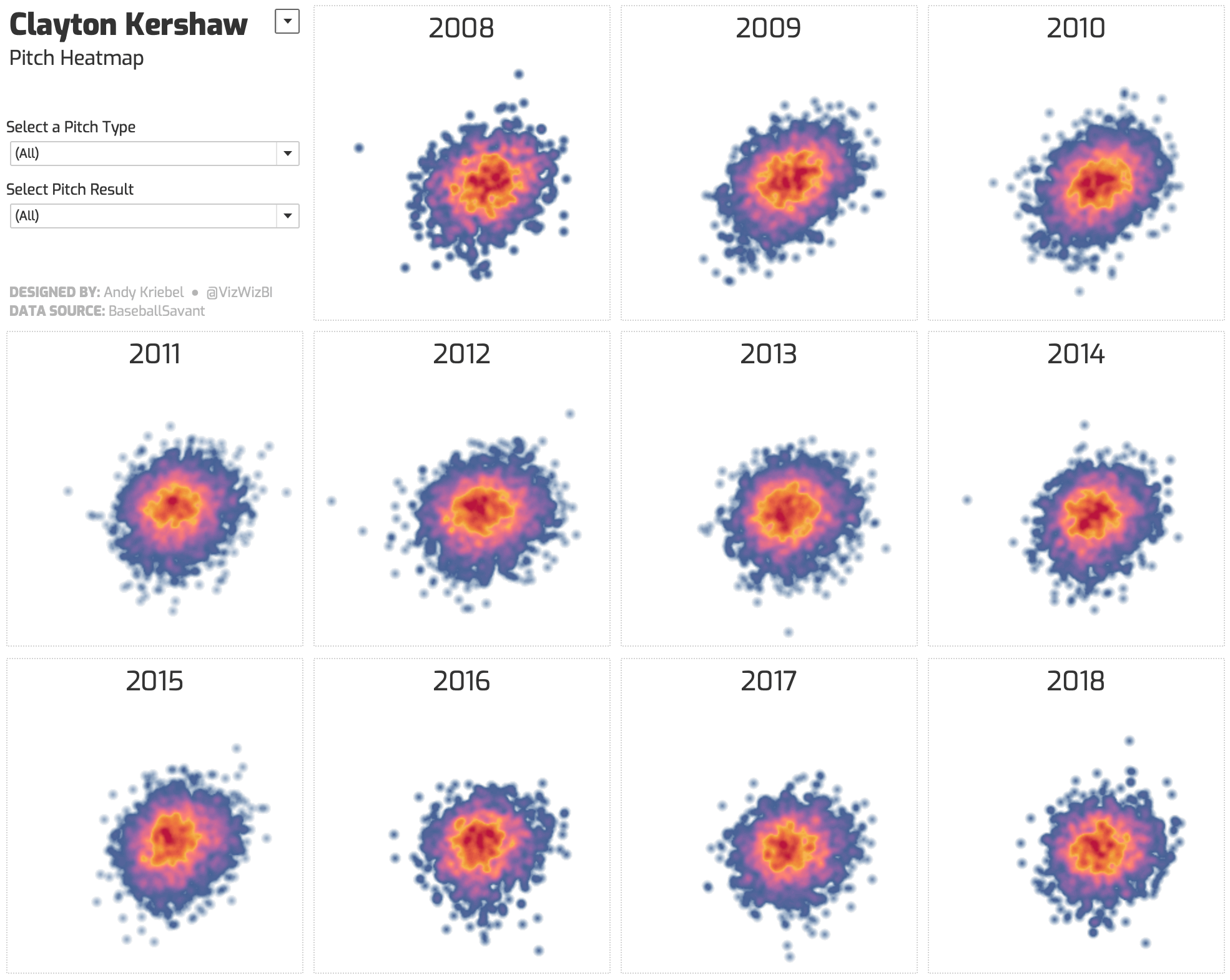
If I were them, I wouldn’t use ALL of the data. I only used two pitchers in the example above. I also did not create an KPIs; DS20 has to.
TIPS:
- Think about the questions you’d like to answer first. Basically work backwards, from the dashboard to the data.
- Once it comes to looking at the data investigate the data by asking: when, where, what, how, then why. I’ve found this to be a super effective process, but they are welcome to use whatever technique works for them.
- If their original question cannot be answered with that data available, they won’t have wasted much time and can start again.
Remember, this isn’t rocket science. You need to create a good design that is a KPI dashboard. If there are no KPIs, then don’t worry, I’ll let you know.
Good luck team!