Tracking the rate of your customers’ orders so that you can react if a customer appears to be dropping off
A few weeks ago I built a rudimentary customer drop off tracker for a client project and I thought I’d share the technique.
It relies on finding the average time between orders for a specific customer, and calculating whether more time has passed since their most recent order, than that average time frame.
The use of an average here is why I call it rudimentary; it takes no account of trends in a customers buying pattern (if they are buying a lot more recently than they were to begin with) or of seasonality in a customers purchasing history (whether a customer buys in sprees and then drops off for a while only to return later for another spree).
The main cause for this is down to the way Tableau brings in the data, the data does not have a rigid order for the data, hence it becomes difficult to do calculations which order the data and keep it in that fixed order. I can build a table and do a table calculation on it, but once I move it around to build a chart, a lot of what I have built ceases to work in the same way. Hence why I settled on a simple average for this model.
So let’s begin by walking through its construction; I’m using the superstore data set if you want to follow along with the post.
Building out the table
Whenever I am building something a bit complex I always like to start by creating a text table and building everything out piece by piece, often manually checking a few calculations with a calculator to verify that Tableau is doing what I think I am telling it to do.
The first thing I am going to do is create a list of all of my customers, by dragging customer name onto rows.
Next I am going to drag order date onto rows, and convert the data type to exact date, discrete.
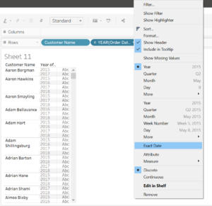
Exact order date
By changing it to exact date it may convert to a continuous format, simply right click and change back to discrete.
Now I want to know the most recent order date for each of my customers. I could do this with a table calc, but I am going to use an LOD, so that I can use this field later for subsequent LODs and in other charts, without having to adjust what it is computing by every time.

LOD: most recent order date per customer
{ FIXED [Customer Name]: MAX([Order Date])}
This LOD is relatively simple: for each customer, give me the most recent order date.
Drag this onto rows and convert to exact date, discrete.
I am going to do the same for the first customer order.
{ FIXED [Customer Name]: MIN([Order Date])}
This gives me the earliest order date contained within our data set. I am not actually going to use these calculations for anything further, but I am going to replicate them within another LOD, so these are here really just for me to check they are doing the job right.
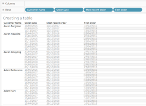
First and most recent order dates per customer
Now I want to know the amount of time between the first order date and the most recent order date. To return this, I am going to use the DATEDIFF function.
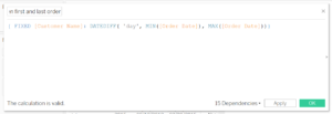
LOD: days between first and most recent order
{ FIXED [Customer Name]: DATEDIFF( ‘day’, MIN([Order Date]), MAX([Order Date]))}
This calculation is saying: for each customers, give me the difference, in days, between the first order date and the last order date.
I am going to add this onto the text shelf.
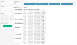
Days between first and last order, per customer
I am now going to create a new LOD to tell me on how many days has a customer made orders, this, along with the previous calculation, will go towards calculating my average.
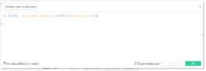
LOD: Number of days on which an order was placed
{ FIXED [Customer Name]: COUNTD([Order Date])}
This is going to tell me the distinct count of days on which a customer ordered. I use COUNT DISTINCT because a customer may have ordered twice on a single day, but I don’t want this to confuse my averaging of time between orders.
I am going to drag this into the view. If I drag it over the text already in the view, a show me text box should pop up:
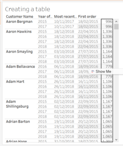
Dropping a pill onto an already existing axis
and dropping the pill into the view should result in this:
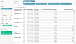
Orders per customer and range of days in which those orders were placed
What we can now see is that the average time between orders should be calculated by dividing the time between first and last order by the number of orders, at the level of each customer.
Let’s build the LOD for that:
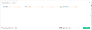
LOD: Average number of days between orders
{ FIXED [Customer Name]: SUM([Time between first and last order])/COUNTD([Order Date])}
This should divide the number of days between first and last orders per customer by the number of orders, per customer, in that date range.
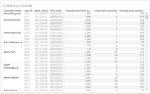
Average days between orders, per customer
You can see that a lot of my calculations are being built up incrementally, with quite a few LODs being constructed just to check my work. We can get rid of these later to keep the data pane clean, or they can be kept so that other people can build out similar tables.
The next step is to calculate the difference in days between the current date, and the most recent order date of each customer. Tableau has a handy NOW() function, which takes the current Date/Time settings from your machine (those displayed in the bottom right hand corner), as they are local to your machine, they might not always be correct, so it’s worth double checking.
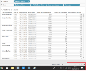
The NOW() function uses your machine’s local date-time information
We are going to use another DATEDIFF() function and the NOW() function:
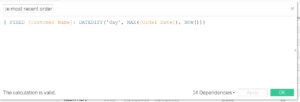
LOD: time since most recent order
{ FIXED [Customer Name]: DATEDIFF(‘day’, MAX([Order Date]), NOW())}
This calculation is saying: for each customer, give me the difference in days, between the most recent order, and today’s date. You can see this is constructed using some of the same pieces we used earlier.
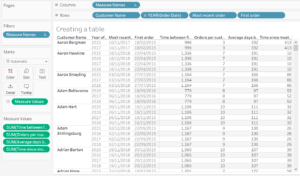
Time since most recent order, per customer
Now let’s create a bullion (true or false) calculation to tell us whether it has been longer since a customers last order than their average time between orders.

Is the time since the most recent order longer than the average time between orders?
SUM([Time since most recent order])>SUM([Average days between orders])
This will return ‘True’ if they haven’t ordered recently and ‘False’ if they have.
Add this to rows to check it is doing its job.
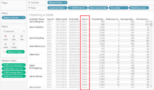
True/False response for each customer
Now, we probably don’t want to know just whether they have ordered recently or not, we probably also want to know by how long.
This is a fairly similar calculation, just replacing the > with a – sign to subtract the average time between orders from the time since most recent order.
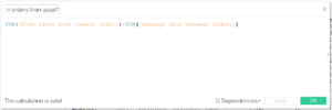
Time difference between most recent order and average order time
SUM([Time since most recent order])-SUM([Average days between orders])
This will return a negative value if a customer has ordered recently and a negative value if they haven’t.
Add this to the view to check its working.
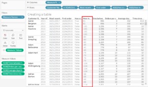
Time difference, negatives indicate a recent order and positive a less recent order
Ok, so we have some customers who haven’t ordered in a really, really long time. We can probably assume they’re long gone, so maybe we want to highlight more recent drop offs.
so let’s use the previous calculation and set a limit; this limit is flexible, I have used 30 days here but you will know your customers and can set your own limits.

Establishing a 30 day window
[How much longer has it been between orders than usual?]>=0
AND
[How much longer has it been between orders than usual?]<30
This is going to return only the customers that haven’t ordered within 30 days MORE than is usual for them. The >=0 is going to exclude those who ordered recently.
This can be added to colour to highlight customer or to a filter to reduce the data in the view, depending on how you want to visualise it.
Speaking of, let’s do so.
This is where you will need to think about what are the most important characteristics of your customers, what kind of customers are you most keen not to lose.
It might be you want to keep profitable customers, or those that have provided you with the most sales revenue, or the greatest quantity, or you could create a new measure, like sum of sales/number of orders to find the customers who have made the most valuable orders, or profit ratio/number of orders etc. How you want to prioritise your customers is up to you.
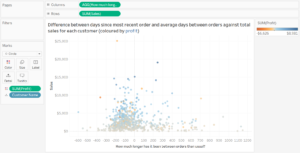
Customer distribution by time difference between last order and average time between orders, and sales
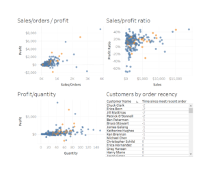
Customers within the 30 day window plotted by various values
Ok, so these kind of charts are great for seeing the current situation of ordering customers, but they’re not easily actionable, so let’s create a dashboard of simple tables that we can react to in a meaningful way. And maybe we don’t just want to be playing catch up. Maybe we want to get ahead of the curve, and target different customers in different ways, based on this ordering trend.
Let’s create a table for extremely high value customers (those who have brought the most profit overall) who we want to contact personally, regardless of how long it has been – the effort is worth the time invested, even if you get just one of the customer back.
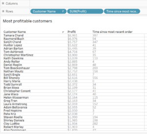
Most profitable customers, regardless of time since last order
Let’s create another table for customers within the 30 day window, ordered by sales value per order, perhaps these customers will receive a promotional email with a discount code, or some kind of incentive.
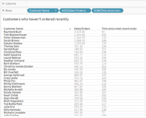
Customers within the 30 day window
Now let’s create a final table that is going to return all the customers that are within 15 days of their average time between orders, but in the other direction. These are the customers who are nearing their normal time to place an order, so maybe they’ll receive some targeted advertising to bring them back into the fold.
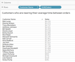
Customers who are nearing their average time between orders
Using calculations like these and presenting the data in a simple, meaningful way can enable you to react to customer drop off or even to get ahead of the curve and keep your customers interested.
While I have based this on superstore data and described it as a business venture, the uses of this are not limited to email a few customers when they stop purchasing. It can be used to check the frequency with which people are visiting medical centres or receiving treatment, how often people without a home or the elderly are accessing services there to support them, to name just a few.
I have uploaded the workbook onto my Tableau Public and made it downloadable for any who wish to take a closer look.
