


Today we took on a Power BI challenge. We were provided with a list of Tableau dashboards and asked to choose which one we would like to recreate in PBI. I picked the one I thought was more interesting, you can find it here.
As I was trying to build on the lessons learned the first day of dashboard week, I decided to allocate a bit more time to keeping notes of my progress and thought process throughout the day and to sketching, Although the latter didn’t really apply for this task as it was primarily focused on recreating particular types of charts and interactions.
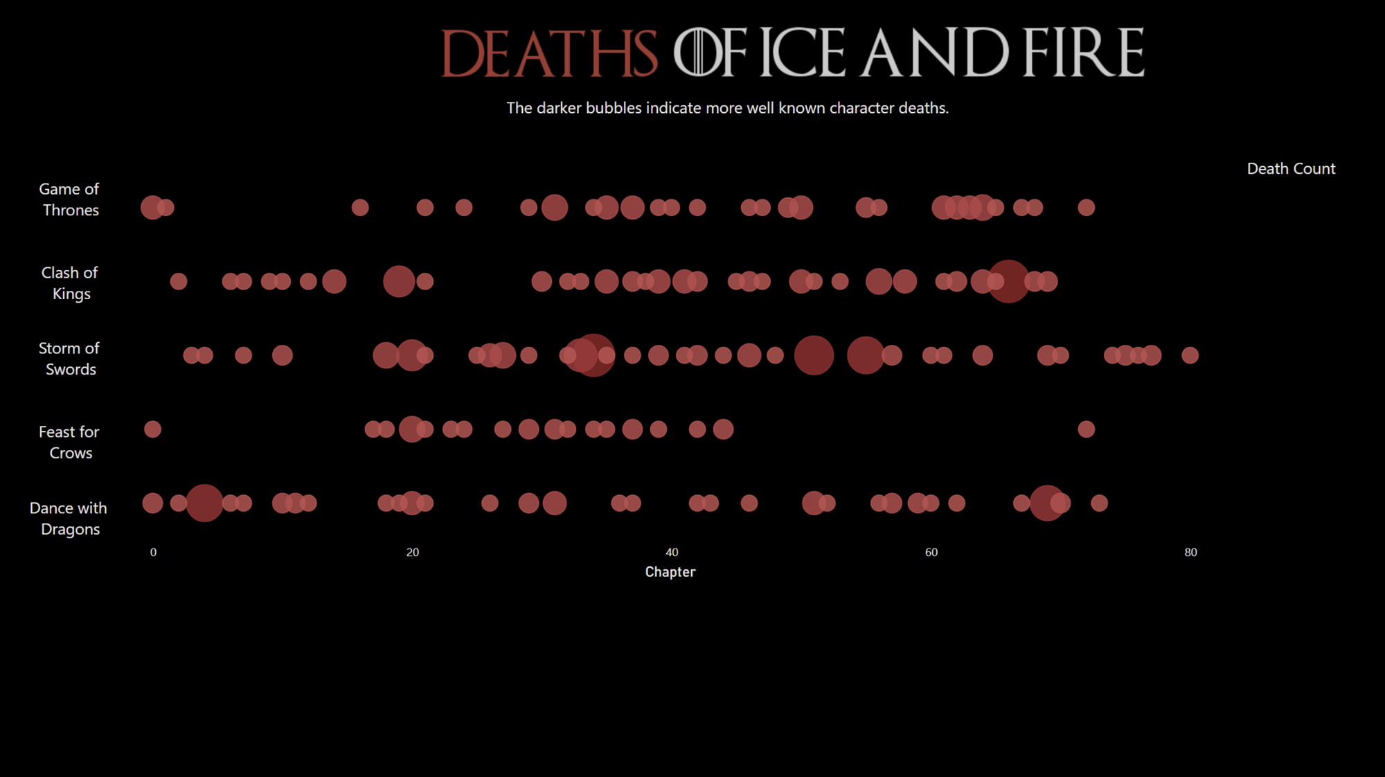
We briefly touched on Power BI during training but today has helped me better understand some differences between Tableau and PBI. When I first started working on this I expected to have difficulties with animation, annotations and using custom shapes, but thought I would have the main bubble chart and the text totals finished. I started with the easy part and I built the main chart, formatted everything and added the title and text.
Moving on to the more difficult part, I found that adding the totals as text was not as easy as I expected and I had trouble figuring out exactly how to do this or how to remove certain filters that would affect my main chart every time I would add a card with text. My initial assumptions regarding animations, annotations and custom mark types proved to be correct (sigh).
After a bit of trial and error and watching/reading tutorials, I found that many charts types or interactions in Power BI require you to download more visuals. Although this seems as it would solve the problem, even with non-native visuals I came across the same customization limitations. While the native option to Play Axis is quite intuitive it can't use 2 categorical fields (dimensions) for X and Y axes. It would error saying that only one axis can be categorical. After downloading a custom visual I again had the same issue with categorical axes so I kept looking. I also found a way to animate any SVG file (also using downloaded visuals) and while this could have worked it would have meant turning my entire chart into an SVG and losing the (potential) option to annotate.
By 2.30PM I was a bit disappointed I couldn't get everything I considered to be easy done (displaying totals for each book as text) but I am also aware this comes primarily from my limited experience with PBI. This was as far as I got with it:
So far I think that PBI and Tableau have different use cases. PBI makes reporting very easy and straight forward, having the most common chart types built-in, while Tableau is more flexible and makes it easier to customize visualizations. The plan is to work more in PBI to get a better understanding of how it uses filters/ slicers and how to integrate common charts that are not built-in and interactions in reports. I'm also curious to learn more about Fabric and how exactly it expands PBI's current functionality.