


This week, we took on the Makeover Monday 2024 Week 11 challenge, which focused on housing vacancies across USA metro areas. The dataset was sourced from an article by LendingTree, which utilised US Census Bureau data to create initial visualisations. My goal was to explore the data, refine the visual story, and present a more insightful dashboard in Tableau. Here’s how I approached the challenge:
Step 1: Exploring the Data
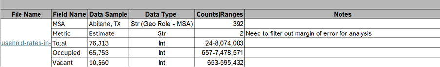
Before diving into visualization, I first explored the dataset to create a data profile. This involved understanding the structure of the dataset, identifying key variables, and checking for missing values.
Step 2: Sketching the Dashboard Layout
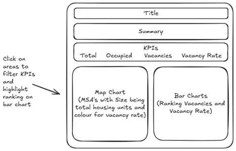
Once I had a good grasp of the data, I sketched a rough dashboard layout using Excalidraw. This helped me visualise how I wanted the dashboard to flow and which elements I needed to include.
Step 3: Building in Tableau
With my sketch as a reference, I moved on to Tableau to build the dashboard. Here’s what I implemented:
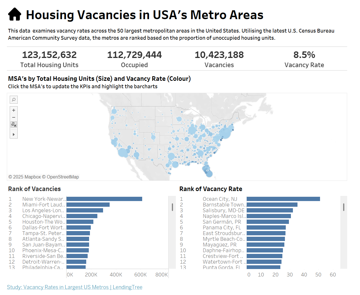
- Calculated Field for Vacancy Rate: I created a calculated field for this metric using the total number of housing units and those that were vacant.
- Map Visualization: I built a map chart where:
- The size of each metro statistical area (MSA) represents the total number of housing units.
- The colour represents the vacancy rate.
- Clicking on an MSA updates key performance indicators (KPIs) above it.
- Bar Charts for Rankings: Below the map, I included bar charts to show how each MSA ranked for total vacancies and vacancy rate which are highlighted by clicking on the map chart above.
Potential Future Enhancements
- Top & Bottom 10 Rankings: A dedicated section highlighting the top 10 and bottom 10 metro areas based on vacancies and vacancy rate would be useful as this was utilised for the initial visualisations in the LendingTree article.
This challenge was a great opportunity to put my data visualisation skills to the test, and by following a structured approach I was able to create an interactive and dashboard that allows users to analyse housing vacancies effectively.