


On the first day of week 2, DS39 were going over Viz basics. I am going to apply what we learnt to todays Make Over Monday Challenge:
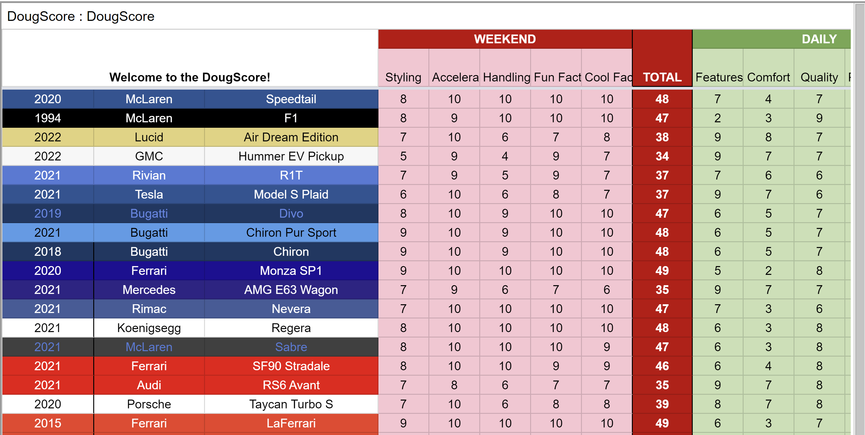
Source: Data Source - The DougScore by Doug Demuro
Positives:
Level of detail - I can see scores broken down by 'daily' or 'weekend' use.
He includes links to videos for each of the cars.
Negatives:
Lots of colour - Difficult to differentiate rows. I am unsure of what the colours signify in regards to the different car makes and models. The red and green can be difficult to see for viewers with colour blindness. Additionally, the red could have negative connotations, which after reading the description of the data, is not the message Doug wanted to portray.
Table format - Makes it difficult to make direct comparisons. No clear way to filter data to interests.
Explanation - Lots of reading needs to be done in order to understand the table.
What I would do:
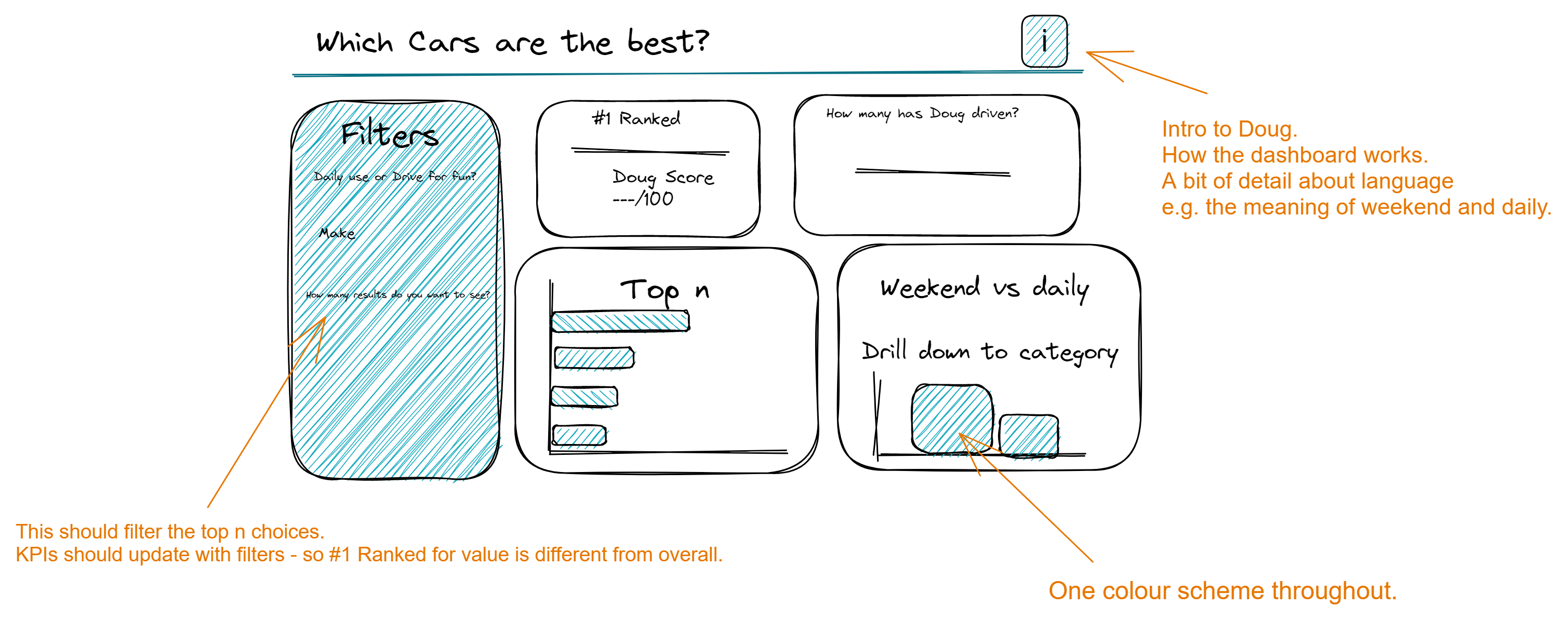
When I have made this in tableau, I will post a link here.