


The third day of dashboard week involved the creation of an infographic.
We were given an Avengers dataset relating to the number of deaths in the comic books:

Infographics are static and do not include tooltips or any interaction.
The project required us to spend a lot of time designing a sketch of the infographic we wanted to create:
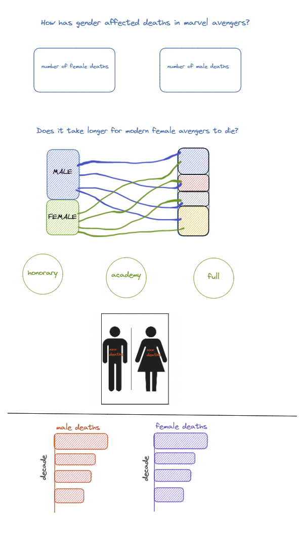
I made this (very rough) sketch of the dashboard I wanted to create in Tableau.
When I was looking through the dataset, I realised that there was a gender field that I could base my analysis on. I based my initial plan and design around this.
Before I began creating the design, I researched existing infographics on Tableau Public. I spent a lot of time creating a sankey diagram to represent the way that gender has been represented in comics over time.
Below is a screenshot of the dashboard that I created:
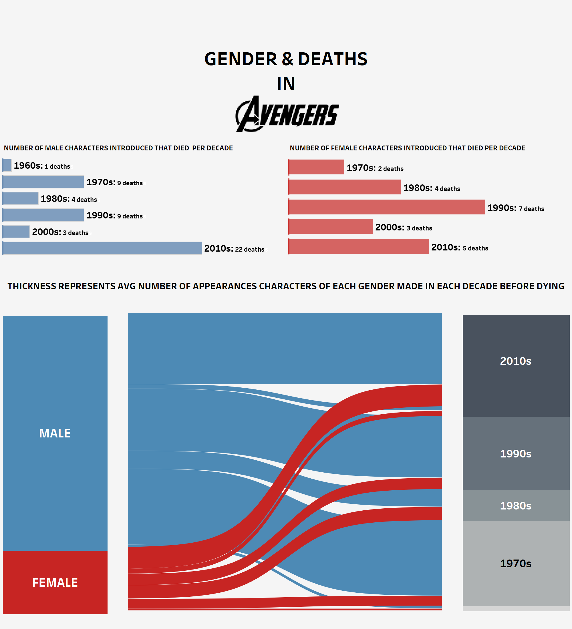
Overall, I feel like I spent way too much time focusing on making sankey diagram. Once I decided to make one, I was really stubborn and unwilling to sway from my plan. It took me around 3 hours to make the initial sankey diagram but I spent a lot of time formatting and perfecting it. I'm glad that I spent today experimenting and trying something new and I don't regret the strategy that I took. Tomorrow, I really want to focus on exploring the data before I jump into dashboarding.