A detailed breakdown of the session.
In case you missed it, one of the anticipated releases to come that was announced at TCish was map layers! If you’re anything like me, at the moment I rely on Mapbox with anything map related and then go into Tableau. Here’s everything we learned about map layers that we all have to look forward to.
I tuned into:
Map Layers: Hurricanes, Puppies & Burritos
Presented by: Raphael Hsieh – Tableau, Member of Technical Staff and Lauren Jackson – Tableau Software Engineer
Map layers were one of the most requested updates (no surprise) and has lots of great potential. We got to see some of its capabilities.
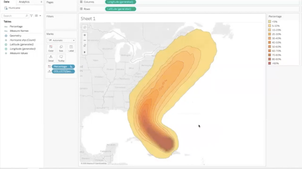
We were shown hurricane data that was presented visually through the connection of a shape file which is essentially spatial geographic data. It started out like this below but was very colourful and so with some formatting changed to this:

I was confused about where puppies and burritos fit in at this point but. After formatting the map to remove the black lines and turning off the tooltip, the puppy data set was joined. Specifically required:
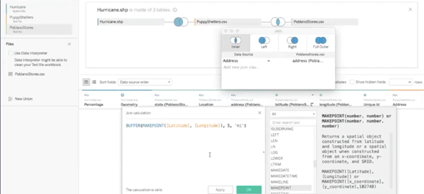
- Clicking onto the hurricane logical table and then dragging the puppy data until the join tool appeared. A geometry field needs to connect to another spatial type to create a spatial join.
- There was none in the puppy data set and so a calculation needed to be made with the longitude and latitude (this is useful when connecting any spatial types).
- They selected intersects as the operator.
When going to the sheet, there were holes in the hurricane map and so It required going back to change the join to a left join to see all of the hurricane data and puppy shelters that were affected.
To add the puppy shelters to the hurricane map:
- Another simple MAKEPOINT calculation was required.
- This was dragged onto the viz where a mark layers option appeared and it was dropped into to become a layered map.
- You can also disable these layer selections to make them a background if need be.
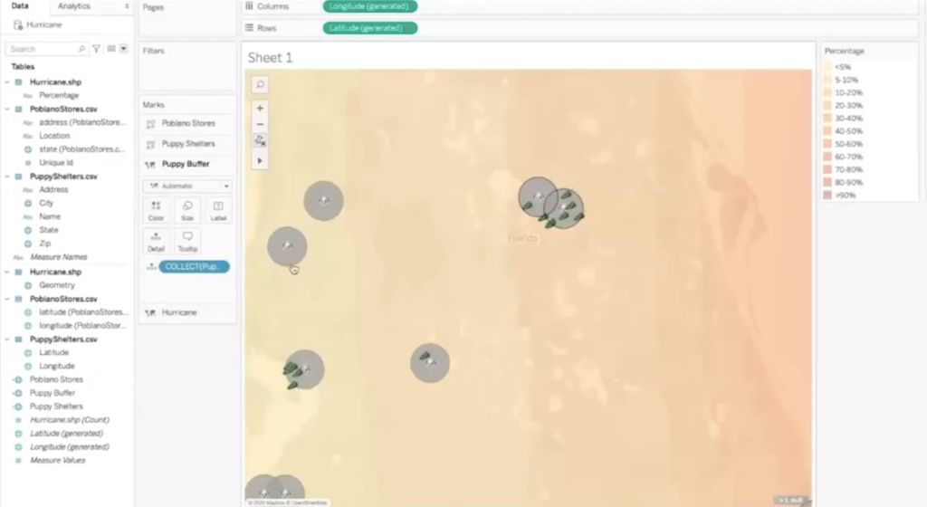
- Looking at the maps above, they are quite large, and therefore, the zoom extent was removed to see the puppy shelters in relation to the hurricane than just the whole hurricane.
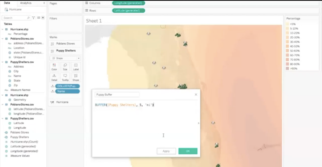
After this step, another CSV was added and a new join calculation was made. This time it was BUFFER. This creates an area of a specified radius outside a point.
Again, as in the case above, the operator required was intersect. In this case, the left join works. The third layer was to be added – the location of the poblano stores. To do this:
- A calculated field of MAKEPOINT was required again.
- Really simply, this was dragged and dropped to create a third layer.
- The marks card showed the three separate layers which could be renamed and reordered by dragging to put certain layers above others.
- This was cleaned up a bit and unique ID was added to detail that helped tableau understand that each point was a separate thing and so it would think about them all individually.
- Shaped were selected to differentiate marks and in this case, they were straightforward with peppers for the poblano stores and puppies for the shelters.
Essentially, you can add as many layers as you want with marks layers!
Next, the calculated field above meant that we’d be able to see the radius 5 miles from a puppy shelter.
- This was dragged onto layers but then there was the realisation that it was on top of the shape icons.
- As I mentioned above, you can reorder this on the marks card which was then done before disabling select and formatting.
- You can toggle through each layer but in this case 4 separate layers were added and this was the final result.

According to Tableau, this is simply the beginning and we have so much more to look forward to. Exciting news!


