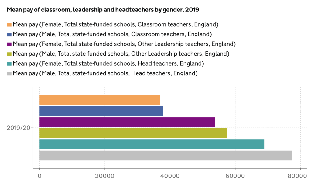
Today’s task, as with most Monday’s was to complete a Makeover Monday. Here is the original visualisation which you can find through this link: https://explore-education-statistics.service.gov.uk/find-statistics/school-workforce-in-england#releaseHeadlines-charts

What I like
- Its a very simple bar chart making it easy to compare values
- It focuses on the current addition of 2019/20
- The bars are coloured? (I’ll explain my ? below)
What I don’t like
- There are too many colours! I like distinguishing things, but within certain categories
- The colour legend and detail at the top is just very confusing. I stared at it for a good 5 minutes going female – classroom, male – classroom and so on (why it wasn’t grouped into twos, I have no idea)
- You can get a rough estimation of average salary due to the row header below, but even then, it is still very unclear as some bars are quite close to one another
- Overall, I’m not so much of a fan – can you tell?
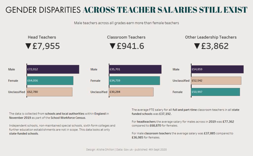
Here’s my Makeover Monday result

My interpretation of the statistics looked at gender disparity, especially as I come from a sociological background.
Bars
- I kept it simple and looked at gender, including unclassified as there are many different gender identities beyond the scientific definitions.
- I looked at this with average pay (making sure to aggregate this to average clicking the carrot on the pill, and then measure – average), across the 3 groups of head teachers, classroom teachers and other leadership teachers. I stuck to the original chart type of bars as I think they demonstrate these statistics very simply.
- I added gender to colour on the marks card and for consistency and understanding, all values are coloured the same
- On the marks card, I also ticked ‘show mark labels’ and aligned it to the left, making sure that all were being shown. Under font, I increased the size of the text and made sure that the colour was automatically matching.
- I then took the average mean pill, duplicating it onto the marks card under label. This allowed me to format the pane values to custom include a prefix of the £ sign.
- The formatting for me was a lot of trial and error, but I removed all of the grid lines. I only included the zero line under columns, making it thicker and black to stand out.
- I played with the sizing of my bars and added a border which was under colour on the marks card. This to me just made it look slightly tidier.
- I kept the tooltips simple and just tidied it up.
Contextual numbers aka BANs
- I had some help to get to this, I usually would do it manually but with some help and again, lots of trial and error, I got there.
- I created calculation 1: { FIXED [Grade]: AVG( IF [Gender] = ‘Female’ Then [Average Mean] END )}
- Then calculation 2: { FIXED [Grade]: AVG( IF [Gender] = ‘Male’ Then [Average Mean] END )}
- Duplicate the first and change gender = to ‘Male’ or ‘Female’ accordingly. This is saying that for every different grade, if the gender is male or female, return to me the average mean value (I think and hope I’ve summed this up correctly) .
- Now, in simple terms, we just need the difference of most – least and so in a new calculated field drag Calc 2 (Male one) – Calc 1 (Female one)
- When dragging grade to columns and this difference calculated field to text, you get your contextual numbers!
- I formatted mine, removing my header from the bars and included it above as well as adding a downwards arrow.
- I made sure to turn tooltips off.
Information
- So the web page actually details information that I thought was quite relevant including this note:
Comparisons between years are given but should not be used as an indication of pay awards as they do not compare like for like. For example, in each year many teachers retire and are replaced by newly qualified teachers. The older teachers, many of whom will have been in the leadership group, will have been on higher salaries than those who are new to teaching.
- This helped me in my approach as initially I wanted to do a time series, but then realised it could easily be misinterpreted
- I used the web page to identify relevant findings and information and added it below. I made sure that it was relevant to gender.
- I think it is very easy to include too much information and so I tried to keep it brief and just formatted it to fit the layout.
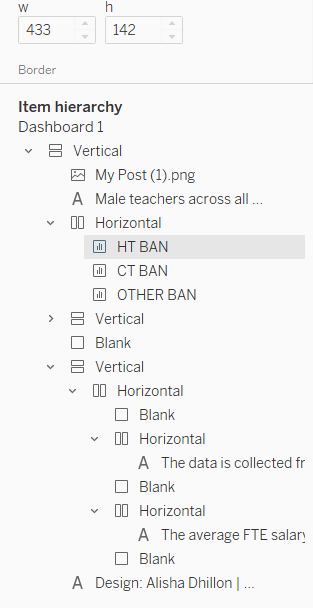
That was it really! I have to note that I did keep it all tiled, and since learning about dashboard design with Andy, I’ve started to always tile. I’ve noticed the benefits – including my entire dashboard staying put even after saving to Tableau Public. Also, naming my sheets as I went along really helped with the tiling, as you can see below. I know this sounds very basic but it is so easy to carry on without naming your sheets.

Here’s the link to my visualisation (which I’m sure I’ll end up making iterations to after some feedback):
https://public.tableau.com/profile/alisha7755#!/vizhome/MakeoverMonday-TeacherSalaries/Dashboard1
