


So, a bar chart drill down is something you might have probably done before (if not please feel free to read blogs from other DSers). What if there are more than 1 metric you want to visualise and have a drill down action as well?
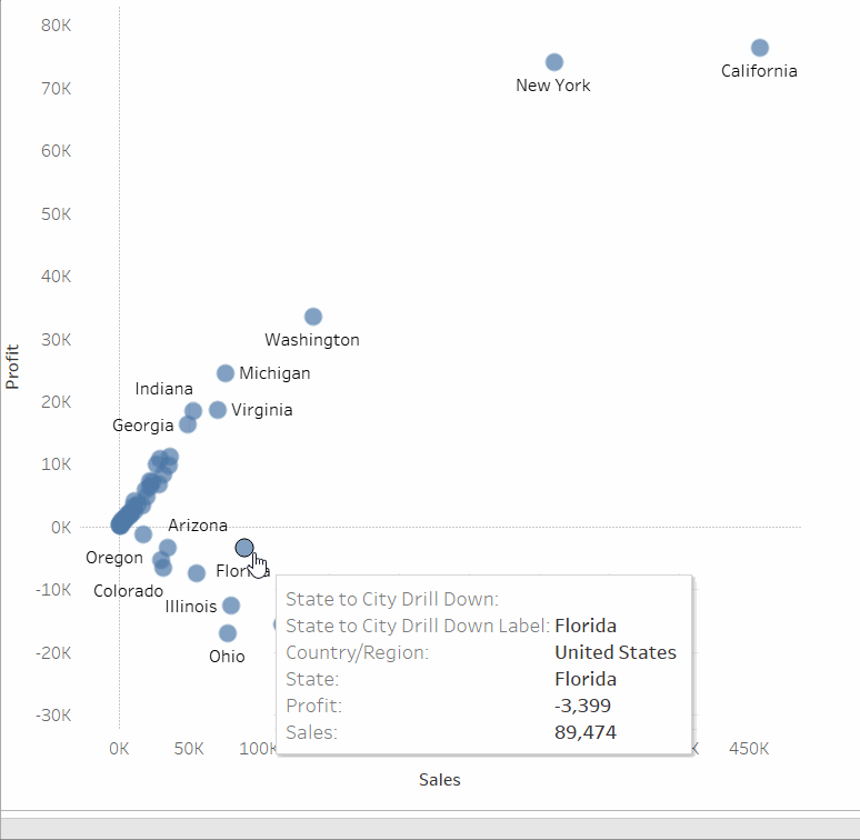
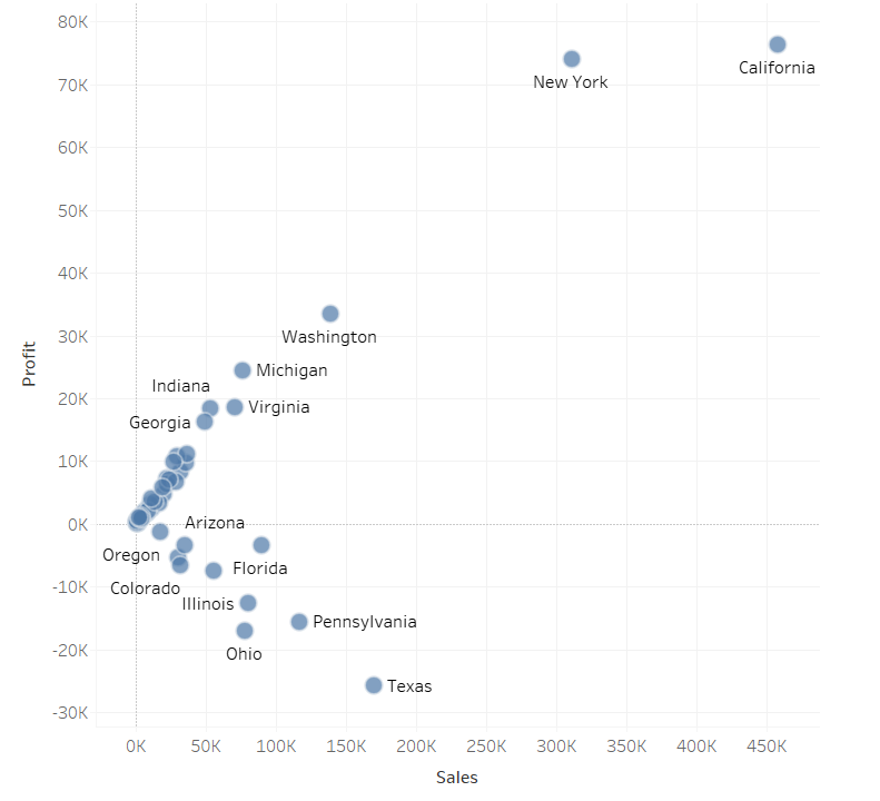
Below is an example of drill down action of State to City from the Superstore dataset. Pretty neat trick if you want a more granular level of the visualisation.
But how?
We will need to create quite a few calculated fields. So please free free to follow along.
- Confirm the level of drill down you want
- In this case I am using State and City
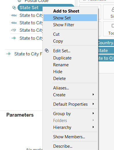
- Create a set for State (the "upper" level")
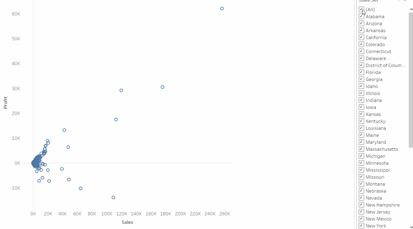
- You can either tick all States or none
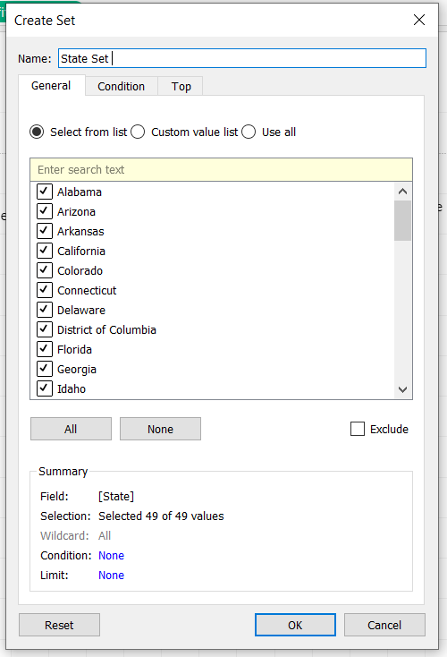
- You can either tick all States or none
- Calculated fields!
-
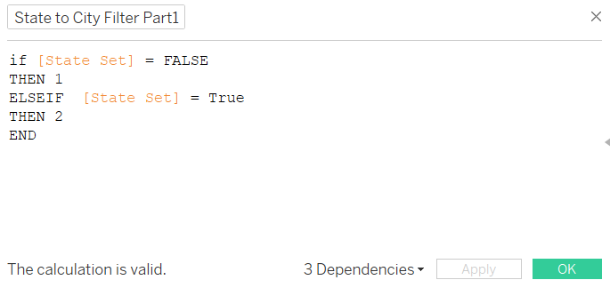
Part 1: Specify the value as below:
-
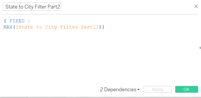
Part 2: Use an LOD calculation to fix part 1 into a max
-
Part 3: Make a boolean calculation of part 2 equals part 1
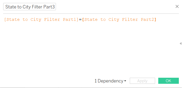
-
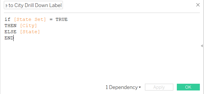
Lastly, the drill down calculation. Pretty much the same as a bar drill down calculated feilds
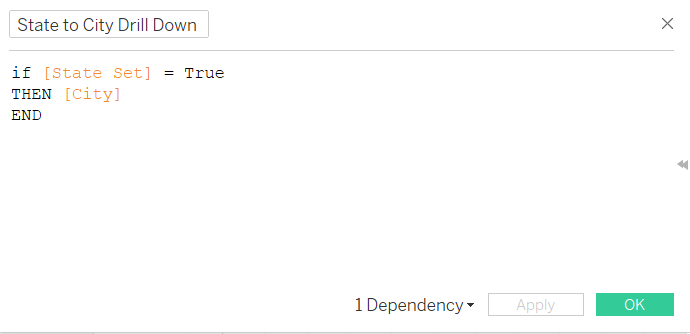
-
Now it's time to start building the chart
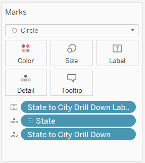
- Select 2 metrics you want to be on the scatter plot, in this case: Profit & Sales. After that put State, the drill down calculated fields into the "details" card on the left.
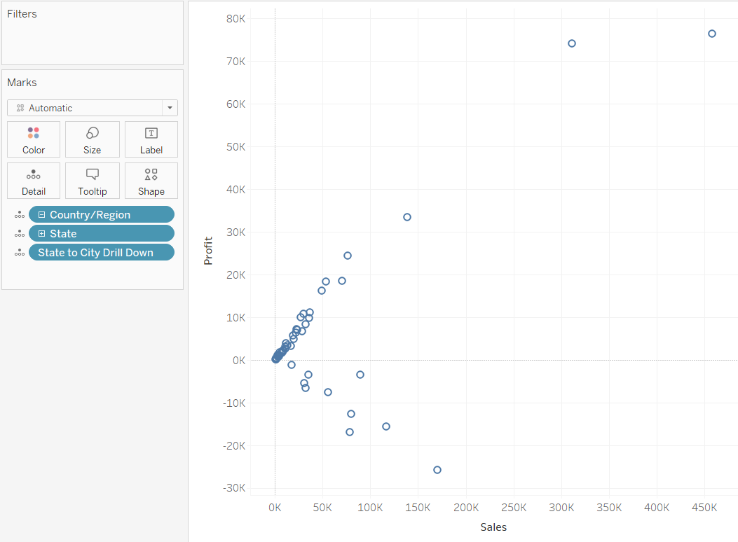
- Your view might look bit different from me, if you have chosen none of the States in the State set above you can only see the State on the scatter plot but City instead if you have chosen all States in the States Set.
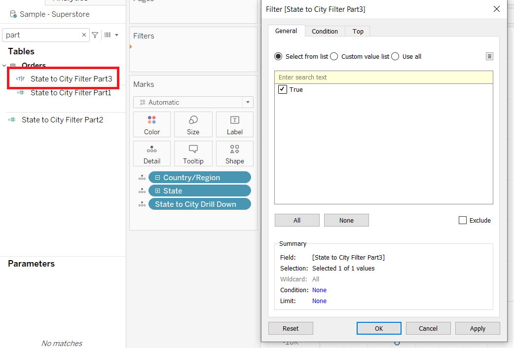
- Now put the Part 3 calculation into the filter shelf. There should only be a "True" value popping up after you put it into the fitler shelf.
- To sense check if it works click on the State Set and set it to "Show Set"
- Uncheck/check all States, and if the calculated fields are working properly your scatter should have some changes.
- If you uncheck all states the scatter should be showing states. If you have checked 1 state or more the scatter should be showing the cities of the checked states.
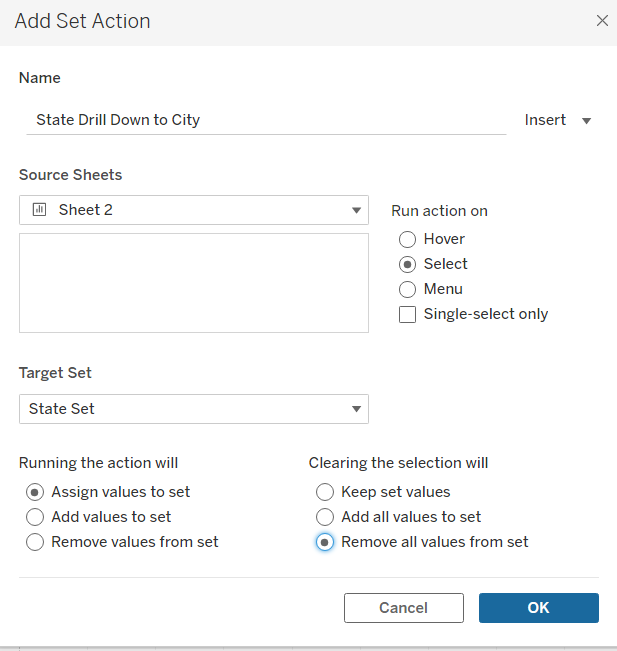
Now onto the Set Action
Go to "Worksheet" then "Action" then "Change Set Values" (remember to change the action to dashboard action if you are building a dashboard) and configure the set action as below:
After that you should be able to click on the states and drill down to the city level! Now it's some formatting issue left (If you want to stop here that's fine, but we all know we always like to trouble ourselves with formatting when it comes to Tableau).
Create another calculated field for the label and put it into the "Label" marks card and change the chart type from "Automatic" to "Circle" just so those scatters are filled circles.
Change the colour and opacity to whatever you like (visualisation best practices come in handy. Usually I wouldn't choose colours that are too bright, lower the opacity a bit and maybe add a border just so the audience can see bit clearer on each scatter)
And this is it! The scatter plot drill down is done! I personally like this trick a lot as it can provide interactivity towards the user among multiple measures. But of course it still depends on the usage. It works quite well for the client project we had last week with a dynamic metrics switcher(topic for another time) and also a dynamic level of details drill down with the scatter plot. Had quite a fun time demonstrating them in front of others.
Anyway hope you find it useful! And hope there are more other topics I can bring up next time:)