


Because our client project with Virgin Atlantic at Data School was really successful, I wanted to share a little trick we used for improving dashboard user interactivity. I highly recommend the ‘Sort by dimension’ technique to be applied to an overview dashboard, for example one with a set of Key Performance Indicators (dimensions) organizing measures. Here I am using the Sample Superstore data that comes with Tableau.
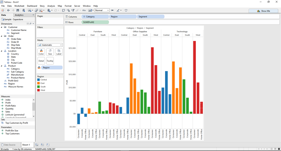
1. Build a view with 3 or more dimensions (optional: separate dimensions onto different worksheets) for a single measure:
2. Create a string parameter with the names of the dimensions above:

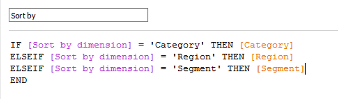
3. Create a calculated field based on a conditional statement of the Sort by dimension parameter (purple) and respective dimension (orange):
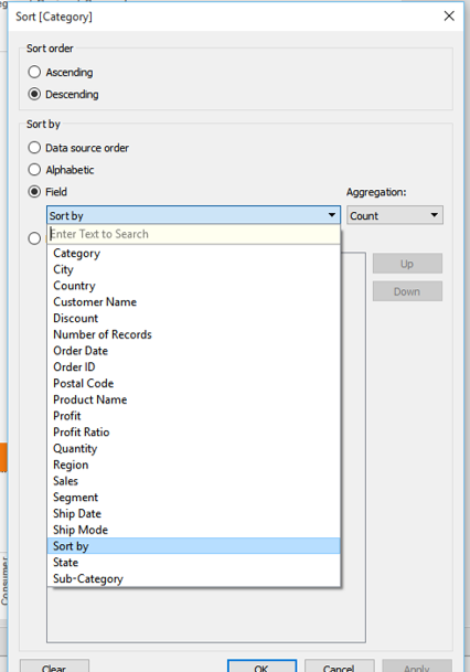
4. Edit sort on each dimension by choosing the ‘Sort by’ calculated field:
5. Show parameter control and test:

What dimensions are you sorting? Let me know on Twitter how this technique has come in handy.