


Last week we came to the end of a week spent learning Power BI. We spent Tuesday and Wednesday Morning on Power Query, followed by Power BI Desktop on Wednesday afternoon and Thursday. To end the week, on Friday, we were challenged to reproduce the dashboards that we made in Tableau for our applications to the data school but in Power BI.
This seemed a bit daunting at first as I knew how long my initial application took me and I knew that on Friday I would only have 5 hours to recreate it in a tool that we had only started learning at the start of that week.
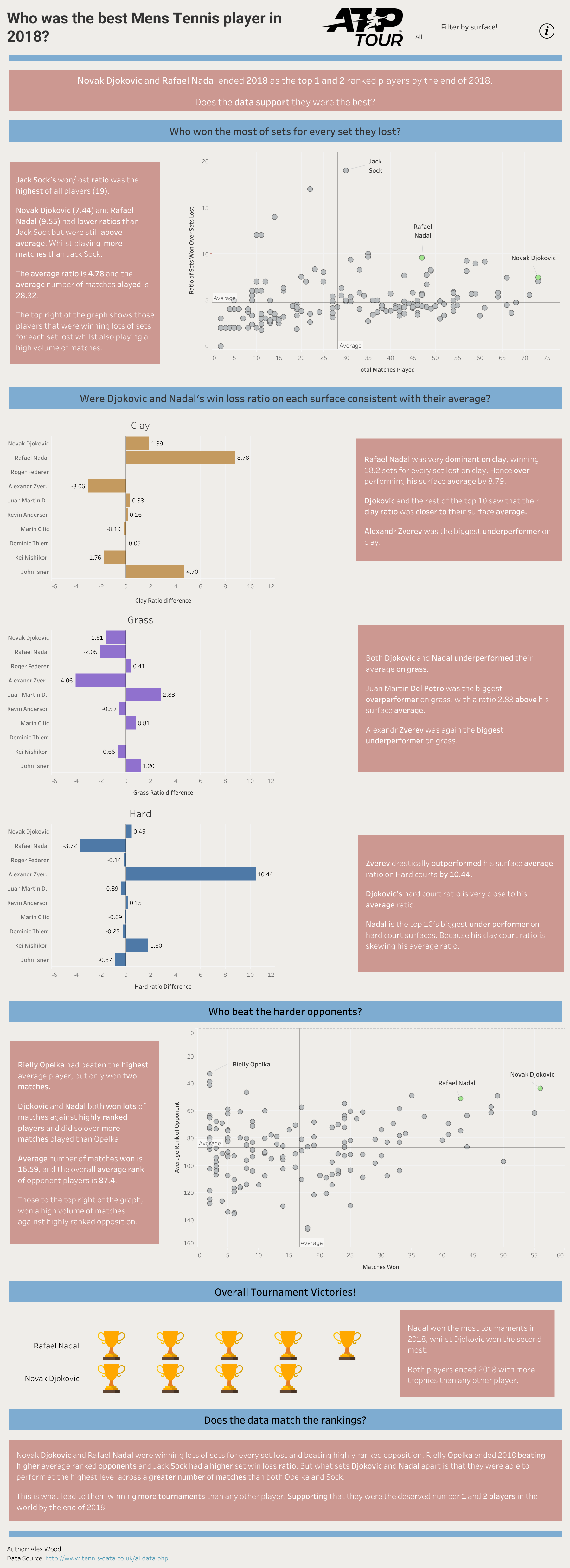
Below is my initial application that I made using Tableau Public. I am a big tennis fan, and therefore decided to focus on comparing stats of Nadal and Djokovic in 2018. It was my first time producing any sort of visualization and especially using tableau so therefore it took me a very long time to make and went through lots of iterations and used a lot of Youtube videos (Thank you Andy Kriebel).
Given the fact it tool me so long I was nervous about having to present Infront of people my replication of it in Power BI with only having 5 hours to do it.
We had spent the week investigating the different ways in which you can use Power BI. It was for this reason that I wanted to change it slightly. Instead of using the blue bars (as above) to separate the different sections of my dashboard I decided to use pages. This worked really well as it gave me the ability to let my charts and text breathe a little bit more.
I began with planning the change I wanted to make and sketch them out. I knew it would be challenging to keep the formatting consistent between Power BI and Tableau but I was hopeful of keeping it the same. Apart from the dashboard being in pages the only other change I wanted to implement was finding a better way to represent the number of tournaments won.
Overall I am really happy with the effort and outcome of this project. I was really pleased that I was able to so closely match the formatting of my initial application. The navigation between pages in Power BI worked really well. I found using the navigation was a more effective way of telling the story of the dashboard and helped direct focus to the sections. My only negative about it is that I still don't think that I have found the best way to show tournaments won.