Using parameters in Power BI are a good way to allow users to change fields within a chart.
(For this example I will use the Sample - Superstore data set)
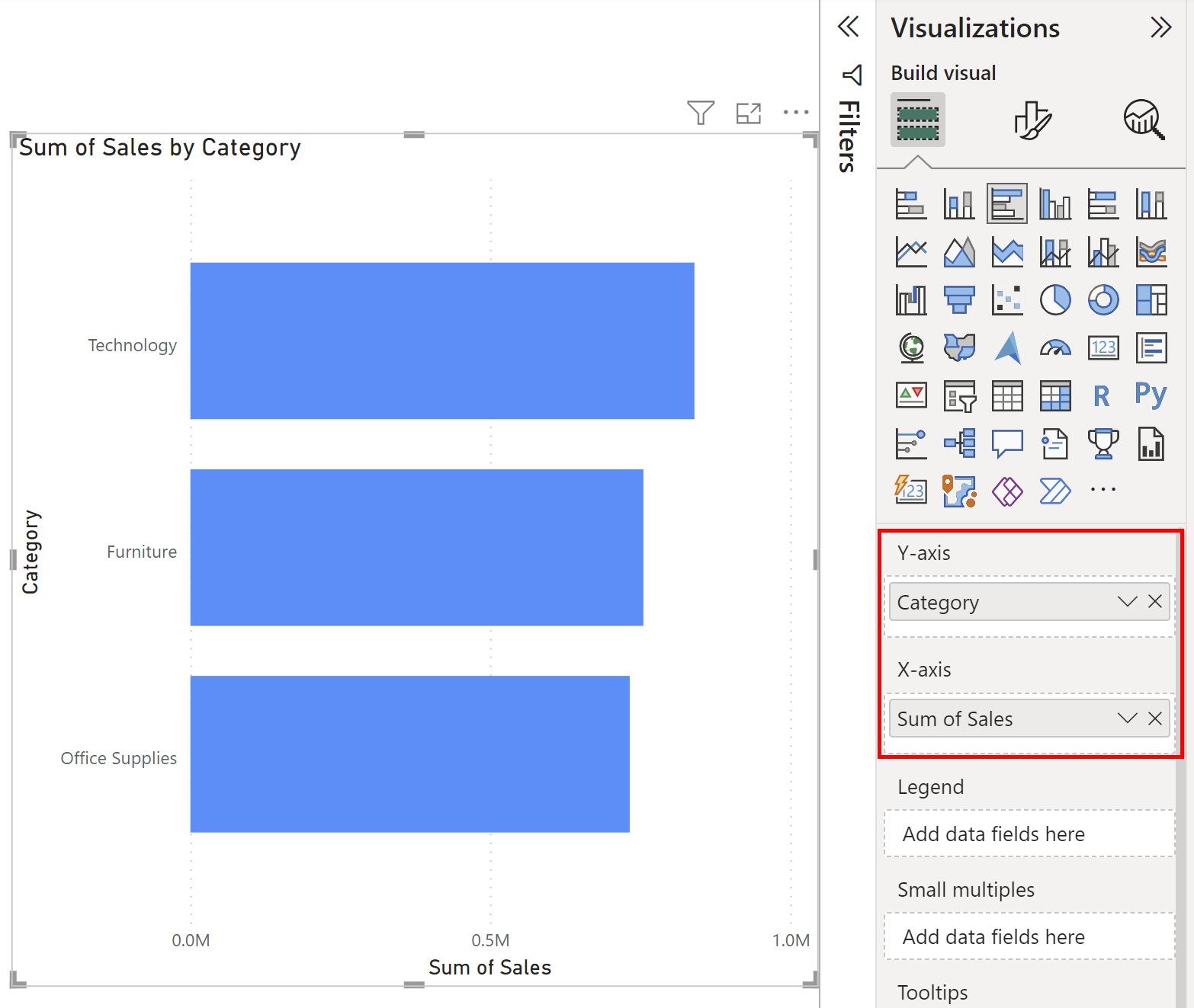
We start with a bar chart that shows the sum of sales on the x-axis and shows the different product categories on the y-axis (Shown Below).

Now if we want to give users the option change the view from category on the y-axis to sub-category we need to create a parameter. First select the Modeling tab and then New Parameter followed by the Fields option.

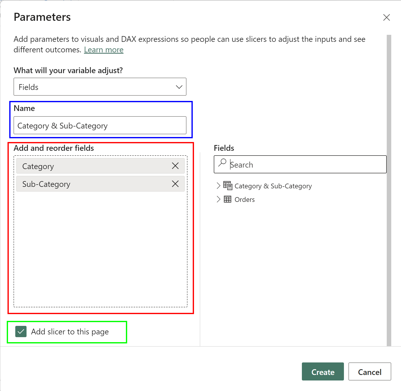
Once you select the fields option you will be met by the window shown below. The blue square indicates where you can type the name you wish to call the parameter. The red box shows the area you can drag in the fields you wish to add to the parameter which in the case of this example is category and sub-category. Make sure the "Add slicer to this page" option is ticked and click "Create".

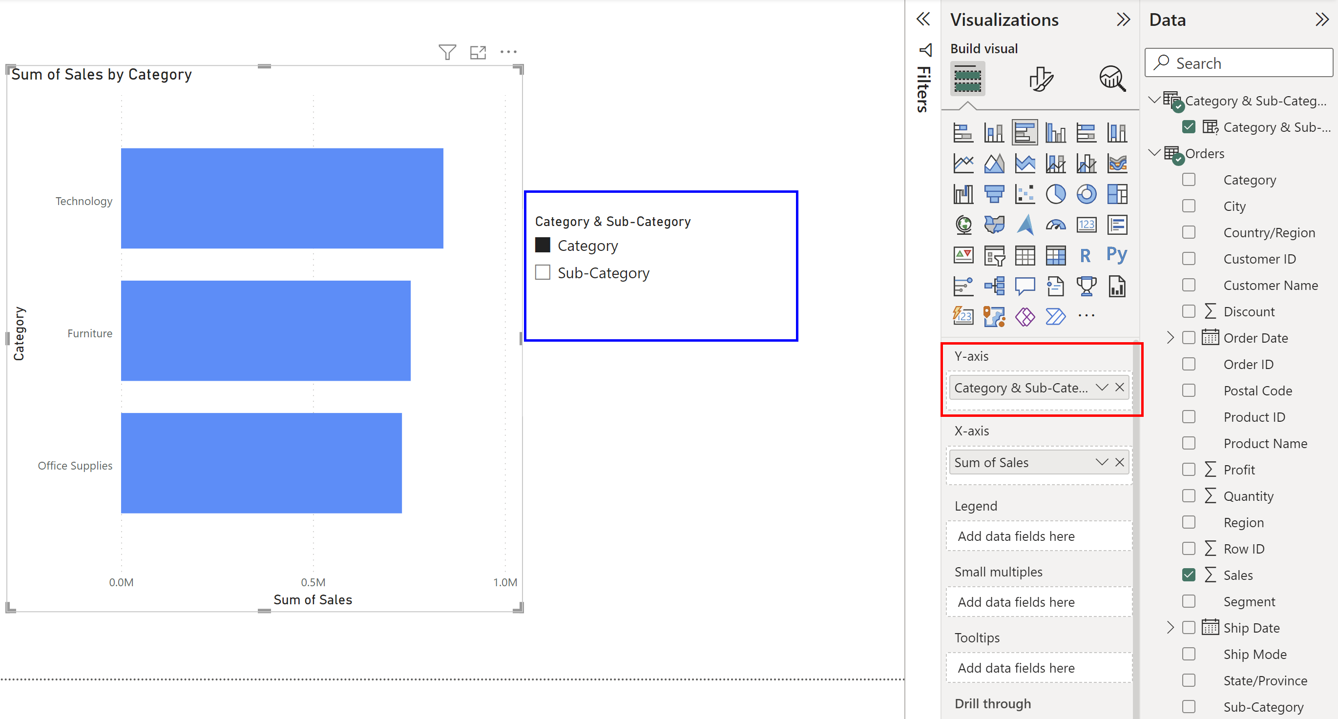
You will now have the slicer shown in the blue box below. You will notice that the slicer doesn't impact the graph yet. This is because we need to replace the field that we are using as the y-axis for the graph. This is where you select the parameter you made from the data pane. Replace the filed in the red square.

Your graph will now change based on the selection of the parameter in the slicer. Selecting the slicer > Format your Visual > Slicer Setting will allow you to choose between between a Vertical list, Tile and Dropdown. In Slicer settings you can also choose single select, multi-select or show all options in slicer.
