


You want to find out how your summer sales are performing over the years, what would you do?
If you’re like most people you would probably do something like this:
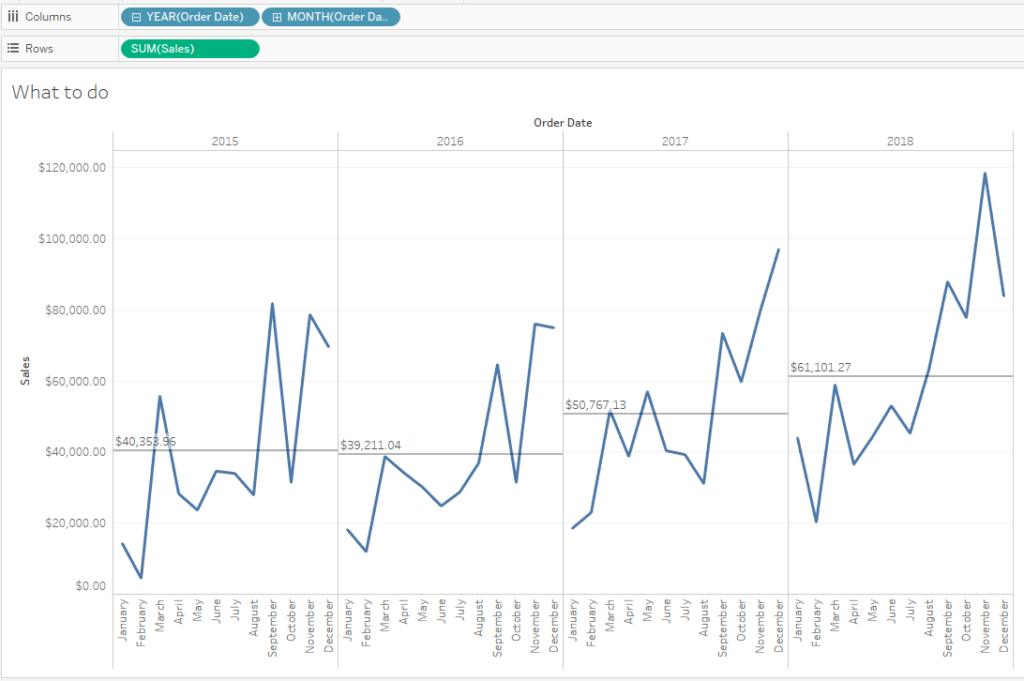
You might be content with this, after all, you can see how your summer months are performing. However, things get a bit tricky when you try to compare the months over the years. With some effort you can do it but why would you put yourself through that?
Tableau offers a super simple way to create a cycle plot, just drag the month pill to the left of the year pill in the columns shelf:
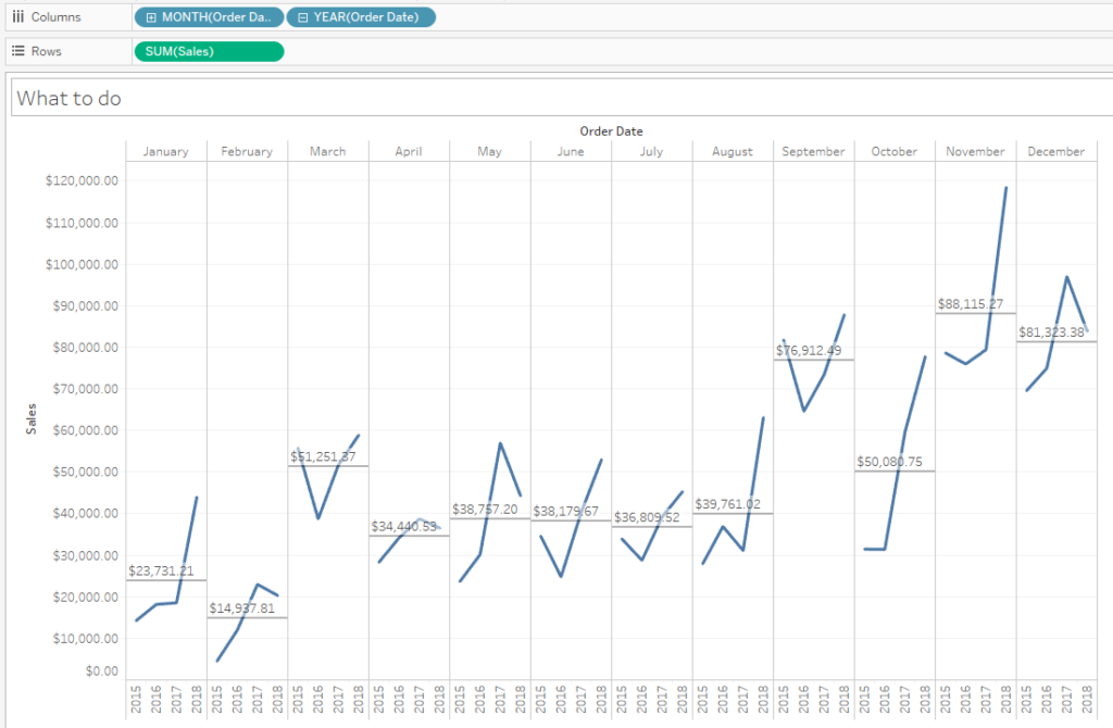
Now you can see every month clearly over the years just with a glance. You can see that generally, the sales have increased in the summer months over the years.