
Creating Dot Strip Plots
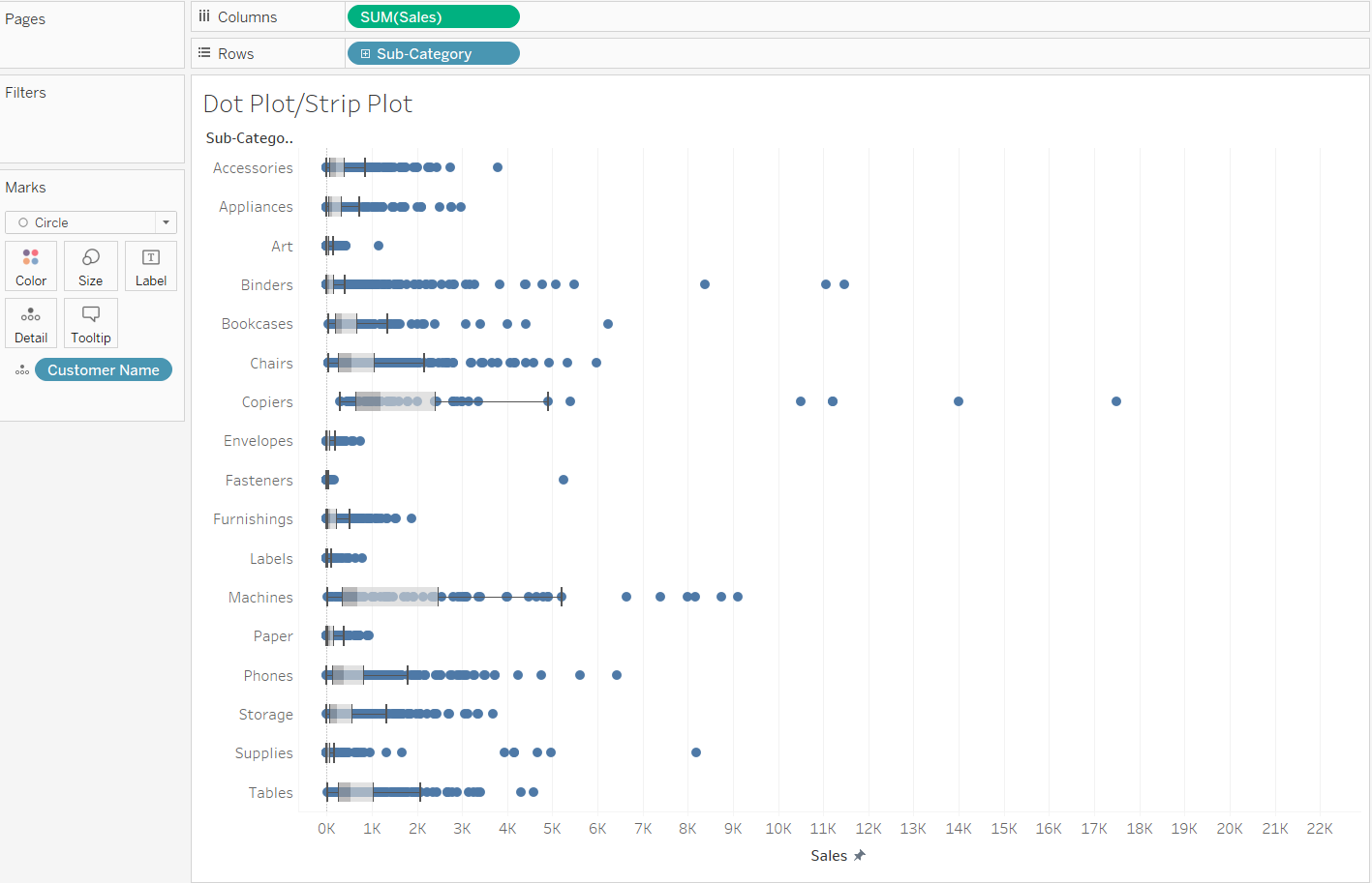
Dot strip plots are valuable for visualizing individual data points, revealing the distribution and variability within a dataset. They are particularly effective for comparing multiple groups, identifying outliers, and avoiding overplotting in dense datasets. With their simplicity and clarity, dot strip plots are excellent for both small and large datasets, providing clear insights into the spread of data across different categories or values.
How to in Tableau in 5 mins: Build a Dot Strip Plot
YouTube: How to Create a Dot Strip Plot
Step 1: Create the Dot Strip Plot
- Open a New Worksheet:
- Go to a new worksheet for creating your plot.
- Add a Dimension to Rows:
- Drag the dimension field (e.g., 'Category') to the Rows shelf. This will define the rows of your dot strip plot.
- Add a Measure to Columns and Adjust the Mark Type:
- Drag the measure field (e.g., 'Sales') to the Columns shelf.
- On the Marks card, change the mark type from 'Automatic' to 'Circle'. This will represent each data point as a dot.
- Adjust the Measure to Show Individual Marks:
- Right-click on the measure field on the Columns shelf and select 'Dimension'. This converts the measure to a dimension, ensuring each data point is shown as an individual mark.
- Configure the Axis:
- If needed, adjust the axis to better display your data. You can right-click on the axis and select 'Edit Axis' to make changes.
Step 2: Customize Your Plot
- Refine the Appearance:
- Adjust the size of the circles by using the 'Size' slider on the Marks card.
- Customize colors by dragging a field to the 'Color' mark on the Marks card.
- Add labels or tooltips as needed for additional information.
- Adjust the opacity using the ‘Opacity’ slider in the Color shelf.
- Drag from the Analytics panel either the Box Plot or Median with Quartiles onto the graph.

Create a Jitter Plot
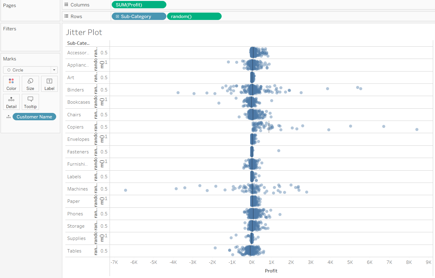
Creating a jitter plot in Tableau is a great way to display individual data points, particularly when you have a large dataset that might otherwise suffer from overplotting in a standard scatter plot.
YouTube: How to in Tableau in 5 mins: Build a Jitter Plot
Step 1: Create the Jitter Plot
- Open a New Worksheet:
- In Tableau, go to a new worksheet.
- Set Up the Axes:
- Drag your categorical field (e.g., 'Category' or 'Group') to the Rows shelf.
- Drag the measure field (e.g., 'Sales' or 'Value') to the Columns shelf.
- Change Mark Type to Circle:
- On the Marks card, change the mark type from 'Automatic' to 'Circle'. This change will represent each data point as a dot.
- Create the Jitter Effect:
- To create the jitter, you need to add some randomness to the position of each dot. You can do this by creating a calculated field.
- Go to the Data pane, right-click, and choose 'Create Calculated Field'.
- Name the field (e.g., "Jitter").
- In the calculation area, enter a formula that generates a random number. For example, you could use RAND() which creates a random number between 0 and 1. You might need to adjust this calculation based on your dataset and the extent of jitter you need. (or Type Random() in the Row or Column)
- Apply the Jitter Calculation:
- Drag your newly created 'Jitter' calculated field to the opposite axis of your measure. For example, if your measure is on Columns, drag 'Jitter' to Rows. Make the Sum(Jitter) into a Dimension by clicking on the down arrow and select Dimesnion.
- Adjust the View:
- You may need to adjust the axis to make the jitter effect more pronounced or subtle. Right-click on the axis and select 'Edit Axis' for fine-tuning.
Step 2: Customize Your Plot
- Refine the Appearance:
- Adjust the size of the circles using the 'Size' slider on the Marks card.
- Customize the colors by dragging a field to the 'Color' mark.
- Add Tooltips and Labels (Optional):
- Customize tooltips to show more information when hovering over data points.
- Add labels if necessary for clarity.
- Drag a Reference Line onto the Cell in the Analytics Panel.

Difference between Dot Strip Plot and Jitter Plots
Dot strip plots and jitter plots both display individual data points, but differ in their approach to handling overplotting. Dot strip plots align points along a line, which can lead to overlap in large datasets, making them more suitable for smaller datasets. Jitter plots, on the other hand, introduce randomness in the placement of points to spread out overlapping data, making them ideal for visualizing large datasets with many similar values.
